廣告/海報
페리페라 큐트 메이크업 광고
페리페라 톤 — 큐트·MZ + 캐릭터
페리페라 큐트 메이크업 광고摘要
這是用來製作廣告/海報內容的 ChatGPT 圖像提示詞,已整理主題、背景、風格與構圖,方便快速調整。
相關關鍵字: 페리페라 큐트 메이크업 광고, 페리페라 큐트 메이크업 광고 프롬프트, 廣告/海報 프롬프트, 廣告/海報 AI 이미지 프롬프트, ChatGPT 이미지 프롬프트, AI 이미지 생성 프롬프트, AI 프롬프트, 이미지 프롬프트
페리페라 큐트 메이크업 광고使用方式
保留原始結構並替換主體、背景、色彩或構圖,即可延伸出不同版本。
- 保留核心主體,並依品牌、季節或平台調整色彩與背景。
- 如果畫面太複雜,請減少背景元素並具體描述主體、構圖與光線。
- 複製後可要求 ChatGPT 配合平台、長寬比或文字需求調整。
提示詞原文
[Input]
- language: Korean
- output_size: 1024x1536

[Purpose]
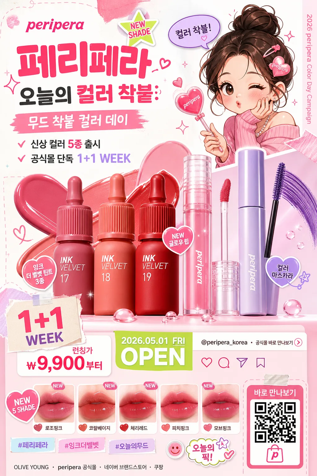
Korean beauty product advertisement poster, cute MZ-brand promo with character illustration, colorful cosmetics focus, and realistic retail-campaign details.
Vertical social feed ad layout that feels like a Peripera campaign key visual, designed to spotlight product charm, playful branding, launch information, and mobile-shopping conversion cues.

[Composition]
- Main product cluster sits in the lower-middle 45% of the frame, with {제품·소재} arranged as the hero subject and supporting items fanned around it in a balanced showroom-style display.
- Character illustration occupies the upper-right 25% area, integrated as a playful accent that points toward the product cluster, holds a tiny heart wand or speech bubble, and reinforces the cute beauty campaign tone.
- Background uses bright white, candy-pink, peach, lavender, mint, and pastel color blocks with rounded sticker shapes, swatch strokes, tiny stars, gloss droplets, makeup smears, and paper-cut layering.
- Top-left and center-left contain a strong ad copy hierarchy: brand lockup, campaign headline, short benefit line, launch date, price/promo sticker, and hashtag-style social copy.
- Include realistic beauty-poster details: mini shade chips, product swatch strip, QR-style shopping code, small SNS icons, campaign date label, store/channel line, and a tiny vertical spine credit on one side.
- Use {브랜드 톤}, {시그니처 결}, {무드·라이팅}, {컬러 팔레트}, {카피·타이포}, {레이아웃}, {캠페인명}, {출시문구}, {혜택문구}, {가격정보}, {날짜라벨}, {채널정보}, {해시태그} as the customizable art direction anchors.

[3. CORE STRUCTURE]
1. Background layer — Build a bright white cosmetic-ad base with pastel pink and multicolor geometric accents, layered rounded blobs, washi-tape stickers, makeup swatch marks, tiny sparkle icons, soft gloss bubbles, and playful paper fragments that frame the campaign.
2. Hero product area — Place {제품·소재} in a glossy commercial pack-shot style with crisp edges, vivid product surfaces, readable label areas, clear cap reflections, and a slightly elevated center focus so the product feels immediately recognizable.
3. Character illustration zone — Add a cute energetic illustration element in the upper-right or side area, with bold outlines, simplified facial features, blush cheeks, playful pose language, and a small speech bubble that says “컬러 착붙!” or “오늘 무드 완료”.
4. Copy zone — Set the brand/copy area with {카피·타이포}: large “peripera” and “페리페라”, then {캠페인명}, {출시문구}, and {혜택문구} beneath it in a lively mobile-readable hierarchy.
5. Retail information strip — Add a lower or side information band containing {가격정보}, {날짜라벨}, {채널정보}, shade chips with short Korean labels such as “로즈핑크”, “코랄베이지”, “체리레드”, and a QR-style shopping box labeled “바로 만나보기”.
6. Social proof details — Add small UI-like micro elements: heart/save/share icons, @peripera_korea-style handle, {해시태그}, “NEW SHADE”, “1+1 WEEK”, or “오늘의 픽” sticker tags where appropriate.
7. Layout balance — Ensure {레이아웃} is clearly visible as a product-plus-character composition, with the product holding visual priority and the illustration, stickers, swatches, and promo details acting as charm-building secondary elements.
8. Final polish — Add crisp highlights, controlled reflections, dewy sparkle accents, glossy ink smears, small printed texture on stickers, and a polished magazine-ad finish so the image feels like a real cosmetics promotional key visual rather than a generic illustration.

[4. STYLE RULES]
- Typography: Use Pretendard ExtraBold for Korean headline text, Noto Sans KR Medium for secondary copy, and a rounded hand-drawn accent style for small playful details; headline size should feel poster-like and mobile-readable.
- Main rendered text hierarchy: “peripera” at brand level, “페리페라” as Korean brand support, {캠페인명} as campaign headline, then {출시문구}, {혜택문구}, {가격정보}, {날짜라벨}, {채널정보}, and {해시태그} as smaller but legible poster information.
- Color palette: Use {컬러 팔레트} as the base, anchored by peripera pink, bright white, pastel peach, mint, lavender, and saturated pop colors for sticker accents, swatches, and promo badges.
- Border/shadow: Add soft drop shadows with 4px y-offset, 12px blur, and 15% opacity under the product, stickers, shade chips, QR box, and character cutout; keep product edges glossy and sharply separated from the colorful paper layers.
- Decorative graphics: Use hearts, stars, small cherries, lip-print marks, glossy droplets, rounded speech bubbles, price-badge stickers, and cosmetic texture swatches to make the advertisement feel printed, shoppable, and campaign-ready.

[5. VISUAL STYLE]
- Camera / lens: Studio pack-shot look, comparable to a Canon EOS R5 with an 85mm f/1.4 lens for product depth and a secondary 50mm perspective feel for balanced ad framing.
- Lighting: Bright studio key light from upper-left at 45°, soft fill from front-right, subtle rim highlights on product edges, and controlled reflection handling for a polished cosmetic ad look.
- Color grade: Clean white + candy pink + pastel rainbow grade with high clarity, vibrant saturation, smooth commercial contrast, glossy product highlights, and soft editorial warmth.

[6. MOOD]
Cute beauty campaign editorial — a playful Korean cosmetics ad key visual with a polished youth-brand pop aesthetic, similar in energy to a high-end magazine beauty spread mixed with a shoppable social-feed launch poster.

[7. CRITICAL]
- Korean text accuracy: 반드시 정확히 보여야 하는 문자열: “peripera”, “페리페라”, “{캠페인명}”, “{출시문구}”, “{혜택문구}”, “{가격정보}”, “{날짜라벨}”, “{채널정보}”, “{해시태그}”, 그리고 사용자가 넣는 {카피·타이포} 안의 한글 문구.
- Rendered poster copy example should include natural Korean ad text such as “신상 컬러 출시”, “입술에 착붙”, “오늘의 무드 완성”, “바로 만나보기”, “공식몰 단독 혜택”, and shade labels like “로즈핑크 / 코랄베이지 / 체리레드”.
- Layout invariant: product remains the primary hero, character illustration remains secondary, and the overall composition must stay cute, colorful, shoppable, and ad-like.
- Product label areas, price badge, date label, QR-style shopping box, and Korean headline text must be sharp enough to read at mobile poster size.
- No broken Korean characters; all visible Korean text must render cleanly and legibly.

[8. 🚫 PROHIBITED]
- Fake official seals / certifications
- Broken Korean characters
- Celebrity composites or deepfake-like faces without permission