Ads/Posters
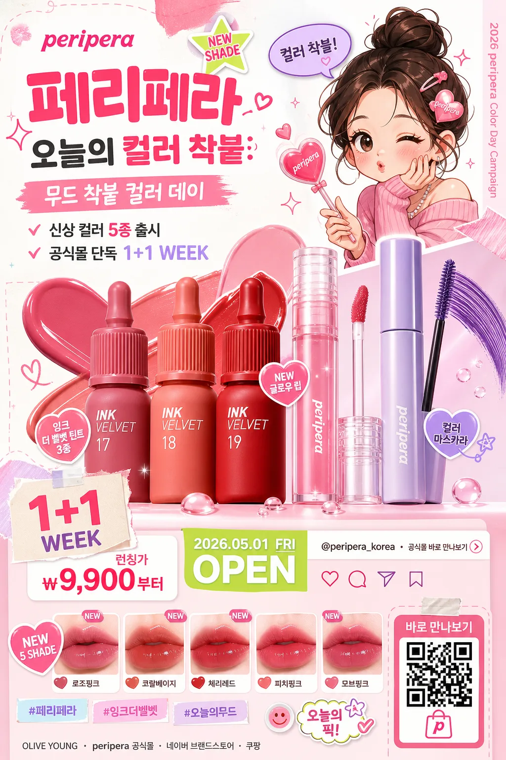
페리페라 큐트 메이크업 광고
페리페라 톤 — 큐트·MZ + 캐릭터
페리페라 큐트 메이크업 광고 summary
Copy this ChatGPT image prompt to create Ads/Posters results. Its subject, background, style, and composition are organized for quick iteration.
Related keywords: 페리페라 큐트 메이크업 광고, 페리페라 큐트 메이크업 광고 프롬프트, Ads/Posters 프롬프트, Ads/Posters AI 이미지 프롬프트, ChatGPT 이미지 프롬프트, AI 이미지 생성 프롬프트, AI 프롬프트, 이미지 프롬프트
How to use 페리페라 큐트 메이크업 광고
Keep the prompt structure and swap the subject, background, palette, or composition to create new variations.
- Keep the main subject and adjust the palette and background for your brand, season, or channel.
- If the result feels busy, simplify the background and make the subject, composition, and lighting more specific.
- After copying, ask ChatGPT to adapt it for your platform, aspect ratio, or text requirements.
Original prompt
[Input]
- language: Korean
- output_size: 1024x1536

[Purpose]
Korean beauty product advertisement poster, cute MZ-brand promo with character illustration, colorful cosmetics focus, and realistic retail-campaign details.
Vertical social feed ad layout that feels like a Peripera campaign key visual, designed to spotlight product charm, playful branding, launch information, and mobile-shopping conversion cues.

[Composition]
- Main product cluster sits in the lower-middle 45% of the frame, with {제품·소재} arranged as the hero subject and supporting items fanned around it in a balanced showroom-style display.
- Character illustration occupies the upper-right 25% area, integrated as a playful accent that points toward the product cluster, holds a tiny heart wand or speech bubble, and reinforces the cute beauty campaign tone.
- Background uses bright white, candy-pink, peach, lavender, mint, and pastel color blocks with rounded sticker shapes, swatch strokes, tiny stars, gloss droplets, makeup smears, and paper-cut layering.
- Top-left and center-left contain a strong ad copy hierarchy: brand lockup, campaign headline, short benefit line, launch date, price/promo sticker, and hashtag-style social copy.
- Include realistic beauty-poster details: mini shade chips, product swatch strip, QR-style shopping code, small SNS icons, campaign date label, store/channel line, and a tiny vertical spine credit on one side.
- Use {브랜드 톤}, {시그니처 결}, {무드·라이팅}, {컬러 팔레트}, {카피·타이포}, {레이아웃}, {캠페인명}, {출시문구}, {혜택문구}, {가격정보}, {날짜라벨}, {채널정보}, {해시태그} as the customizable art direction anchors.

[3. CORE STRUCTURE]
1. Background layer — Build a bright white cosmetic-ad base with pastel pink and multicolor geometric accents, layered rounded blobs, washi-tape stickers, makeup swatch marks, tiny sparkle icons, soft gloss bubbles, and playful paper fragments that frame the campaign.
2. Hero product area — Place {제품·소재} in a glossy commercial pack-shot style with crisp edges, vivid product surfaces, readable label areas, clear cap reflections, and a slightly elevated center focus so the product feels immediately recognizable.
3. Character illustration zone — Add a cute energetic illustration element in the upper-right or side area, with bold outlines, simplified facial features, blush cheeks, playful pose language, and a small speech bubble that says “컬러 착붙!” or “오늘 무드 완료”.
4. Copy zone — Set the brand/copy area with {카피·타이포}: large “peripera” and “페리페라”, then {캠페인명}, {출시문구}, and {혜택문구} beneath it in a lively mobile-readable hierarchy.
5. Retail information strip — Add a lower or side information band containing {가격정보}, {날짜라벨}, {채널정보}, shade chips with short Korean labels such as “로즈핑크”, “코랄베이지”, “체리레드”, and a QR-style shopping box labeled “바로 만나보기”.
6. Social proof details — Add small UI-like micro elements: heart/save/share icons, @peripera_korea-style handle, {해시태그}, “NEW SHADE”, “1+1 WEEK”, or “오늘의 픽” sticker tags where appropriate.
7. Layout balance — Ensure {레이아웃} is clearly visible as a product-plus-character composition, with the product holding visual priority and the illustration, stickers, swatches, and promo details acting as charm-building secondary elements.
8. Final polish — Add crisp highlights, controlled reflections, dewy sparkle accents, glossy ink smears, small printed texture on stickers, and a polished magazine-ad finish so the image feels like a real cosmetics promotional key visual rather than a generic illustration.

[4. STYLE RULES]
- Typography: Use Pretendard ExtraBold for Korean headline text, Noto Sans KR Medium for secondary copy, and a rounded hand-drawn accent style for small playful details; headline size should feel poster-like and mobile-readable.
- Main rendered text hierarchy: “peripera” at brand level, “페리페라” as Korean brand support, {캠페인명} as campaign headline, then {출시문구}, {혜택문구}, {가격정보}, {날짜라벨}, {채널정보}, and {해시태그} as smaller but legible poster information.
- Color palette: Use {컬러 팔레트} as the base, anchored by peripera pink, bright white, pastel peach, mint, lavender, and saturated pop colors for sticker accents, swatches, and promo badges.
- Border/shadow: Add soft drop shadows with 4px y-offset, 12px blur, and 15% opacity under the product, stickers, shade chips, QR box, and character cutout; keep product edges glossy and sharply separated from the colorful paper layers.
- Decorative graphics: Use hearts, stars, small cherries, lip-print marks, glossy droplets, rounded speech bubbles, price-badge stickers, and cosmetic texture swatches to make the advertisement feel printed, shoppable, and campaign-ready.

[5. VISUAL STYLE]
- Camera / lens: Studio pack-shot look, comparable to a Canon EOS R5 with an 85mm f/1.4 lens for product depth and a secondary 50mm perspective feel for balanced ad framing.
- Lighting: Bright studio key light from upper-left at 45°, soft fill from front-right, subtle rim highlights on product edges, and controlled reflection handling for a polished cosmetic ad look.
- Color grade: Clean white + candy pink + pastel rainbow grade with high clarity, vibrant saturation, smooth commercial contrast, glossy product highlights, and soft editorial warmth.

[6. MOOD]
Cute beauty campaign editorial — a playful Korean cosmetics ad key visual with a polished youth-brand pop aesthetic, similar in energy to a high-end magazine beauty spread mixed with a shoppable social-feed launch poster.

[7. CRITICAL]
- Korean text accuracy: 반드시 정확히 보여야 하는 문자열: “peripera”, “페리페라”, “{캠페인명}”, “{출시문구}”, “{혜택문구}”, “{가격정보}”, “{날짜라벨}”, “{채널정보}”, “{해시태그}”, 그리고 사용자가 넣는 {카피·타이포} 안의 한글 문구.
- Rendered poster copy example should include natural Korean ad text such as “신상 컬러 출시”, “입술에 착붙”, “오늘의 무드 완성”, “바로 만나보기”, “공식몰 단독 혜택”, and shade labels like “로즈핑크 / 코랄베이지 / 체리레드”.
- Layout invariant: product remains the primary hero, character illustration remains secondary, and the overall composition must stay cute, colorful, shoppable, and ad-like.
- Product label areas, price badge, date label, QR-style shopping box, and Korean headline text must be sharp enough to read at mobile poster size.
- No broken Korean characters; all visible Korean text must render cleanly and legibly.

[8. 🚫 PROHIBITED]
- Fake official seals / certifications
- Broken Korean characters
- Celebrity composites or deepfake-like faces without permission