Ads/Posters
스키·스노우보드 시즌권 광고
스키장·스노우보드 시즌권 광고. 용평·하이원·비발디 결.
스키·스노우보드 시즌권 광고 summary
Copy this ChatGPT image prompt to create Ads/Posters results. Its subject, background, style, and composition are organized for quick iteration.
Related keywords: 스키·스노우보드 시즌권 광고, 스키·스노우보드 시즌권 광고 프롬프트, Ads/Posters 프롬프트, Ads/Posters AI 이미지 프롬프트, ChatGPT 이미지 프롬프트, AI 이미지 생성 프롬프트, AI 프롬프트, 이미지 프롬프트
How to use 스키·스노우보드 시즌권 광고
Keep the prompt structure and swap the subject, background, palette, or composition to create new variations.
- Keep the main subject and adjust the palette and background for your brand, season, or channel.
- If the result feels busy, simplify the background and make the subject, composition, and lighting more specific.
- After copying, ask ChatGPT to adapt it for your platform, aspect ratio, or text requirements.
Original prompt
[Input]
- language: Korean
- output_size: 1024x1536

[Purpose]
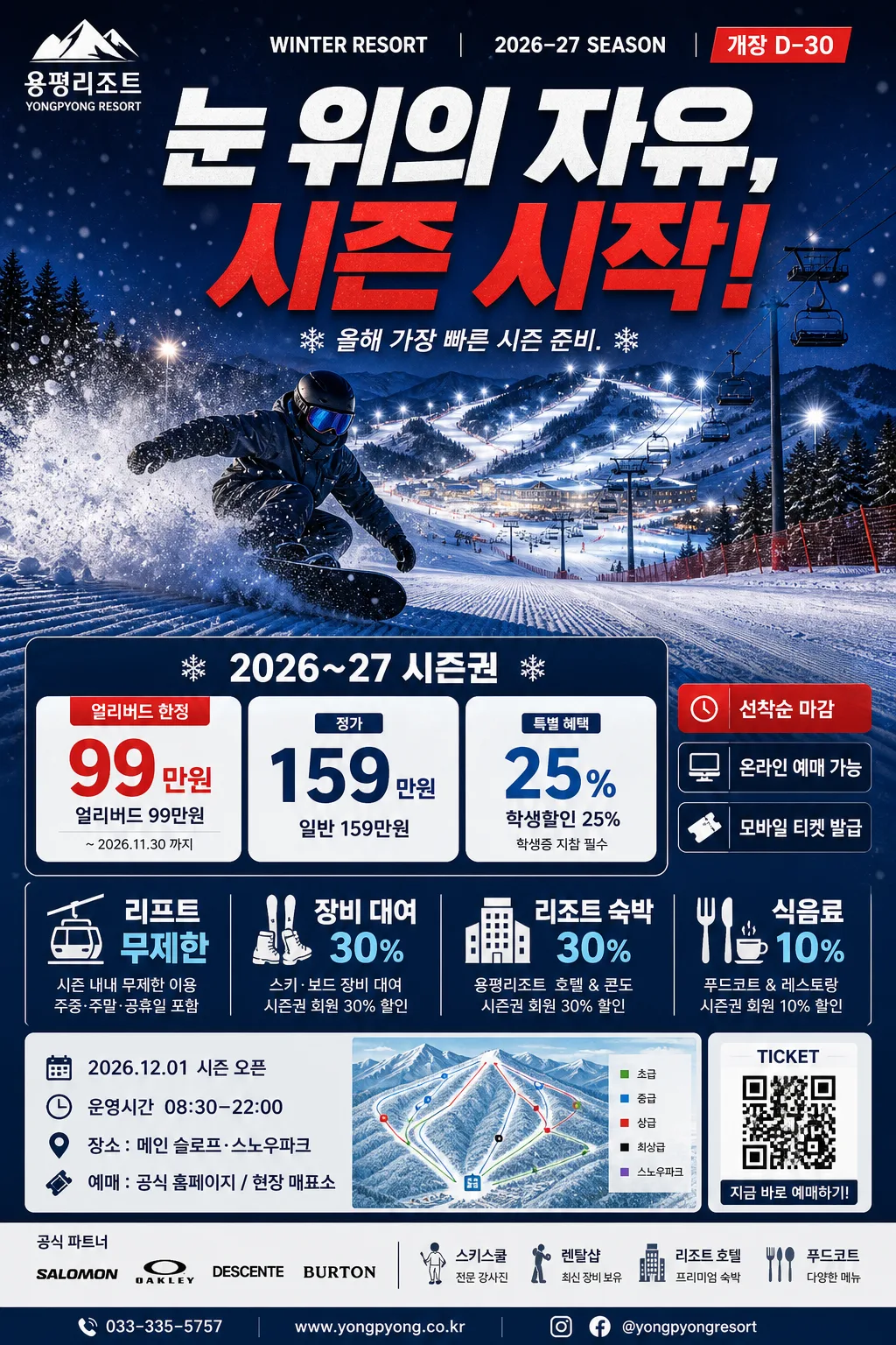
Korean ski/snowboard season pass advertisement poster, vertical A4-style promotional layout for winter resort marketing.
Designed for social-media and print-friendly campaign use with a bold headline, immersive night-slope hero scene, season pass pricing, benefit highlights, event details, sponsor area, and a direct ticket-purchase CTA.

[Composition]
- Main subject: a dramatic ski/snowboard slope hero scene occupying the upper 55% of the frame, with {hero 이미지} as the visual anchor, featuring a rider carving through powder, visible snow spray, distant chairlifts, slope floodlights, safety netting, pine silhouettes, and a warm lodge glow in the background.
- Header zone: top 16% features {헤드라인} as the primary attention point in a compact promotional masthead, supported by a small season label such as SEASON PASS 2026 and OPENING SPECIAL.
- Resort/brand callout: {스키장} placed near the header or upper-mid area as a supporting identifier, paired with a realistic resort badge-style wordmark treatment, mountain icon, and small location/date label.
- Pricing/info block: {시즌권 정보} placed in a strong mid-lower information panel with clear hierarchy, layered price cards, red urgency tag, and ticket-purchase cue.
- Benefits block: {포함 혜택} arranged in a concise lower section, using short stacked lines, icon-like pictograms, dividers, and small explanatory sublabels for quick readability.
- Poster event details: include date/time/venue lines such as 2026.12.01 시즌 오픈, 운영시간 08:30–22:00, 장소: 메인 슬로프·스노우파크, plus ticket info 예매: 공식 홈페이지 / 현장 매표소.
- Sponsor/footer area: add a realistic sponsor strip near the bottom with small text such as 공식 파트너, 스키스쿨, 렌탈샵, 리조트 호텔, 푸드코트, plus a tiny barcode/QR-style ticket block and contact line.
- Background treatment: cold winter atmosphere with icy blue-to-navy gradient field, layered snow texture, drifting snow particles, illuminated piste map lines, lift cable silhouettes, and high-contrast night-slope lighting effects.
- Framing direction: clean vertical ad composition with strong commercial hierarchy, energetic layered panels, visible campaign details, and realistic resort-advertising density suited to {비율}.
- Use {스키장}, {헤드라인}, {시즌권 정보}, {hero 이미지}, {포함 혜택}, {컬러 팔레트}, {비율} placeholders exactly as written.

[3. CORE STRUCTURE]
1) Top header strip: place {스키장} as a small but clear resort label above or beside the main headline, aligned to the upper area with strong contrast against the dark winter background. Add compact supporting text: WINTER RESORT, 2026–27 SEASON, and 개장 D-30.
2) Main headline zone: render {헤드라인} in oversized bold Korean typography, with the most important phrase emphasized in white and red accents, centered across the upper third for immediate visibility. Add a short Korean cover-line style blurb: 올해 가장 빠른 시즌 준비.
3) Hero image field: build {hero 이미지} across the central upper-to-mid area, showing a dynamic slope scene with rider silhouettes, snow spray, groomed snow tracks, chairlift towers, floodlights, mountain ridgeline, and night resort atmosphere that feels energetic and premium.
4) Season pass info panel: set {시즌권 정보} inside layered cards in the mid-lower section, using clear numeric hierarchy and spacing so pricing reads at a glance. Include red urgency tags such as 얼리버드 한정, 선착순 마감, 온라인 예매 가능.
5) Benefits panel: present {포함 혜택} as a compact list in the lower third, with separators, small ski/lift/rental/hotel/food pictograms, and short sublabels so each benefit feels like a real resort promotion.
6) Event and ticket strip: below the benefits, include date/time/venue and purchase information: 시즌 오픈 2026.12.01, 운영시간 08:30–22:00, 장소 메인 슬로프·스노우파크, 예매 공식 홈페이지 / 현장 매표소.
7) Footer information area: include sponsor logos as generic text labels, small barcode/QR-style graphic, contact 1588-2627, website winterpass.co.kr, and fine-print style notes such as 기상 상황에 따라 운영 일정 변동 가능.

[4. STYLE RULES]
- Typography: Pretendard ExtraBold for the headline at very large size, Pretendard SemiBold for labels, Noto Sans KR Medium for information blocks; keep the headline tight and the info text highly legible.
- Color palette: use {컬러 팔레트} exactly as the campaign base, with ice blue, white, navy, and red accent tones; keep whites crisp and blues cold rather than cyan-neon.
- Border/shadow: use subtle panel edges and a soft drop shadow with 4px y-offset, 12px blur, 15% opacity; use stronger red outline only for urgent price tags and CTA buttons.
- Layout accents: thin separator lines, compact info cards, small red highlight tags, slope-map contour lines, snowflake micro-patterns, ticket-stub notches, and diagonal speed streaks to reinforce urgency and winter sports energy.
- Poster realism: make the ad feel like a finished seasonal resort campaign with production details, sponsor strip, barcode area, operating schedule, and a polished print-ready hierarchy.

[5. VISUAL STYLE]
- Camera / lens: wide 24mm flat promotional perspective with a clean advertising look, combined with a high-resolution sports-action feel similar to a Canon EOS R5 + 24-70mm f/2.8 at 35mm, f/4.
- Lighting: night-slope lighting with strong practical resort lights from the upper-right and upper-left, plus cool ambient fill from the snowy ground; crisp highlights on snow spray, reflective goggles, jacket edges, lift cables, and illuminated signage.
- Color grade: icy blue, cool white, deep navy, and selective red accents; high contrast but controlled, with clean winter advertising saturation.
- Material detail: visible packed snow texture, powder crystals, frosted typography shadows, glossy laminated ticket-card panels, subtle paper grain, and realistic poster-print finish.

[6. MOOD]
Premium winter sports campaign poster — a high-energy resort advertisement with the crisp, commercial clarity of a professional ski brand launch, packed with believable season-pass details, event excitement, and a night-resort atmosphere.

[7. CRITICAL]
- Korean text accuracy: the following Korean strings must appear correctly and clearly in the rendered image: 눈 위의 자유, 시즌 시작!, 2026~27 시즌권, 얼리버드 99만원, 일반 159만원, 학생할인 25%, 리프트 무제한, 장비 대여 30%, 리조트 숙박 30%, 식음료 10%.
- Additional poster text should appear clearly where appropriate: 시즌 오픈 2026.12.01, 운영시간 08:30–22:00, 장소: 메인 슬로프·스노우파크, 예매: 공식 홈페이지 / 현장 매표소, 문의 1588-2627, 선착순 마감, 공식 파트너.
- The overall composition must preserve a bold vertical advertisement hierarchy with clear headline, price block, benefits block, event details, ticket CTA, and sponsor/footer information.
- Hero scene must remain winter-sport themed with ski/snowboard slope energy, snow splash, resort lights, mountain background, and realistic night-slope atmosphere.
- Keep all typography clean and fully legible; Korean characters must not break or deform.

[8. 🚫 PROHIBITED]
- Fake official seals / certifications
- Broken Korean characters