広告・ポスター
InterContinental 호텔 광고
InterCon 톤 — 글로벌 비즈니스 호텔
InterContinental 호텔 광고の概要
広告・ポスター画像を作るためのChatGPT画像プロンプトです。主題、背景、スタイル、構図を整理し、すぐに試せるよう構成しています。
関連キーワード: InterContinental 호텔 광고, InterContinental 호텔 광고 프롬프트, 広告・ポスター 프롬프트, 広告・ポスター AI 이미지 프롬프트, ChatGPT 이미지 프롬프트, AI 이미지 생성 프롬프트, AI 프롬프트, 이미지 프롬프트
InterContinental 호텔 광고の活用方法
元の構造を保ちながら、被写体、背景、色、構図を変更して別案に展開できます。
- 主題を維持し、ブランドや季節、媒体に合わせて色と背景を変更してください。
- 結果が複雑な場合は背景要素を減らし、被写体、構図、照明を具体化してください。
- コピー後、ChatGPTに媒体、アスペクト比、文字の有無を追加で指定できます。
プロンプト原文
[Input]
- language: Korean
- output_size: 1024x1536

[Purpose]
Luxury business hotel advertisement poster for an InterContinental-style premium campaign. Vertical editorial hero key visual suitable for lobby display, paid social ad, in-room elevator screen, concierge desk signage, and travel-magazine placement at {비율}.

[Composition]
- Main subject placement: center-weighted hotel hero scene occupying about 65% of the frame, with a top-to-bottom reading flow from wordmark to suite / lounge / dining hero image to booking information.
- Background treatment: refined {호텔 공간} atmosphere with polished marble, walnut veneer, deep blue textile accents, warm white highlights, champagne-gold reflections, fresh flowers, folded linen, glassware, menu card, luggage tag, and a discreet city-view window.
- Framing direction: tall vertical luxury poster framing with balanced architectural symmetry, layered editorial depth, and realistic hospitality details that make the space feel active and bookable.
- Use {브랜드 톤} and {시그니처 결} as the controlling visual language across the entire layout.
- Build the scene around {호텔 공간} with premium hospitality cues: welcome amenity, room key sleeve, breakfast tray, lounge seating, concierge card, and refined tabletop styling.

[3. CORE STRUCTURE]
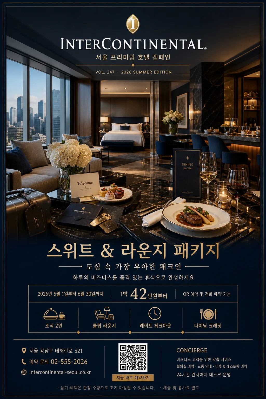
- Header zone: render the English wordmark “InterContinental” clearly at the top with a small line reading “서울 프리미엄 호텔 캠페인”; add campaign meta text such as “VOL. 247 · 2026 SUMMER EDITION”.
- Hero zone (mid 60%): render the main hotel atmosphere as a polished editorial key visual, with crisp architectural lines, premium materials, layered foreground objects, city skyline reflections, and an international luxury-hotel feel.
- Offer zone: include {프로모션명}, {메인 카피}, {서브 카피}, {기간}, and {예약정보} as a realistic hotel package advertisement.
- Detail strip: add small amenity pictograms and Korean microcopy for “조식 2인”, “클럽 라운지”, “레이트 체크아웃”, “다이닝 크레딧”, separated by fine gold dividers.
- Footer zone: include {주소}, {문의}, a small QR-style booking block, website-style line, and a slim partner / concierge information area without implying official certification.
- Brand-tone consistency: keep the entire image aligned to {브랜드 톤}, with urban luxury cues rather than tropical resort cues.
- Layout behavior: maintain the {레이아웃} structure as a hotel hero poster with a strong central anchor, refined editorial spacing, and legible information hierarchy.

[4. STYLE RULES]
- Typography: use a luxury sans-serif pairing such as Helvetica Neue, Avenir Next, or Noto Sans KR; English wordmark in medium-bold weight, Korean copy in regular to medium weight, with refined tracking, elegant line breaks, and a magazine-ad hierarchy.
- Color palette: {컬러 팔레트} plus deep navy #0B1F3A, soft pearl white #F7F5F0, muted champagne gold #C8A96A, warm walnut brown #6B4A2D, and soft glass highlight #DDE9F2.
- Graphic system: add thin gold rules, small diamond separators, hotel amenity icons, a QR booking square, a subtle map-pin label, and fine print booking notes in the lower section.
- Poster realism: include tactile print-ad details such as slight paper grain, precise baseline alignment, realistic reflections on glass and marble, and natural depth between foreground props and background architecture.
- Border/shadow: very soft drop shadow, 4px y-offset, 14px blur, 16% opacity, with crisp edge control and premium print-poster finish.

[5. VISUAL STYLE]
- Camera / lens: full-frame architectural editorial look, 35mm lens at f/5.6 for a balanced hotel-hero perspective with natural spatial depth.
- Lighting: {무드·라이팅}; soft daylight from large windows at upper-left, supplemented by gentle interior practical lights and a restrained warm rim on reflective surfaces.
- Color grade: InterContinental blue + gold + white, with clean luxury-magazine contrast, slightly cool shadows, warm highlight roll-off, realistic metal speculars, and natural skin-free interior advertising polish.

[6. MOOD]
Premium international hotel campaign — Condé Nast Traveler / Ritz-Carlton editorial advertising aesthetic, with the feeling of an executive suite opening into an evening lounge reservation.

[7. CRITICAL]
- Korean text accuracy: render these strings exactly on the poster: “한글”, “호텔 hero”, “도심 속 가장 우아한 체크인”, “스위트 & 라운지 패키지”, “2026.05.01–06.30”, “조식 2인 · 클럽 라운지 · 레이트 체크아웃”.
- Render the English wordmark “InterContinental” clearly and elegantly without distortion.
- Include realistic ad information: “예약 02-555-2026”, “서울 강남구 테헤란로 521”, “QR 예약”, and “1박 ₩420,000부터” in crisp Korean typography.
- Maintain a polished luxury-hotel composition with accurate architectural proportions, believable reflections, premium printed-poster texture, and readable microcopy.

[8. 🚫 PROHIBITED]
- Fake official seals / certifications
- Broken Korean characters
- Celebrity composites or unauthorized public-figure likenesses