광고/포스터
InterContinental 호텔 광고
InterCon 톤 — 글로벌 비즈니스 호텔
InterContinental 호텔 광고 검색 요약
InterContinental 호텔 광고은 광고/포스터 결과물을 만들 때 바로 복사해 활용할 수 있는 ChatGPT 이미지 프롬프트입니다. 주제, 배경, 스타일, 구도 조건을 함께 담아 빠르게 시안을 만들 수 있도록 구성했습니다.
관련 키워드: InterContinental 호텔 광고, InterContinental 호텔 광고 프롬프트, 광고/포스터 프롬프트, 광고/포스터 AI 이미지 프롬프트, ChatGPT 이미지 프롬프트, AI 이미지 생성 프롬프트, AI 프롬프트, 이미지 프롬프트
InterContinental 호텔 광고 활용 포인트
원본 구조를 유지하면서 피사체, 배경, 색감, 구도를 바꿔 다양한 시안으로 확장할 수 있습니다.
- 핵심 소재는 유지하고 브랜드, 계절, 채널 목적에 맞는 색감과 배경을 바꿔보세요.
- 결과가 산만하면 배경 요소를 줄이고 피사체, 구도, 조명 조건을 구체화하세요.
- 복사한 뒤 ChatGPT에서 플랫폼, 화면 비율, 텍스트 포함 여부를 추가로 요청할 수 있습니다.
프롬프트 원문
[Input]
- language: Korean
- output_size: 1024x1536

[Purpose]
Luxury business hotel advertisement poster for an InterContinental-style premium campaign. Vertical editorial hero key visual suitable for lobby display, paid social ad, in-room elevator screen, concierge desk signage, and travel-magazine placement at {비율}.

[Composition]
- Main subject placement: center-weighted hotel hero scene occupying about 65% of the frame, with a top-to-bottom reading flow from wordmark to suite / lounge / dining hero image to booking information.
- Background treatment: refined {호텔 공간} atmosphere with polished marble, walnut veneer, deep blue textile accents, warm white highlights, champagne-gold reflections, fresh flowers, folded linen, glassware, menu card, luggage tag, and a discreet city-view window.
- Framing direction: tall vertical luxury poster framing with balanced architectural symmetry, layered editorial depth, and realistic hospitality details that make the space feel active and bookable.
- Use {브랜드 톤} and {시그니처 결} as the controlling visual language across the entire layout.
- Build the scene around {호텔 공간} with premium hospitality cues: welcome amenity, room key sleeve, breakfast tray, lounge seating, concierge card, and refined tabletop styling.

[3. CORE STRUCTURE]
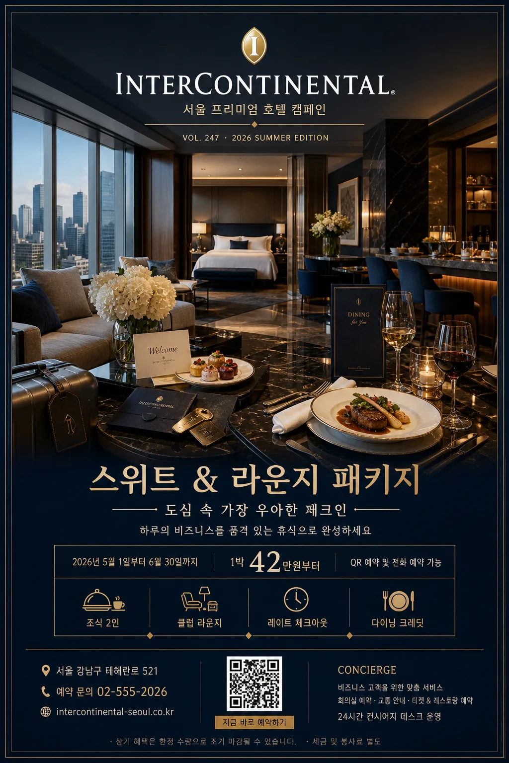
- Header zone: render the English wordmark “InterContinental” clearly at the top with a small line reading “서울 프리미엄 호텔 캠페인”; add campaign meta text such as “VOL. 247 · 2026 SUMMER EDITION”.
- Hero zone (mid 60%): render the main hotel atmosphere as a polished editorial key visual, with crisp architectural lines, premium materials, layered foreground objects, city skyline reflections, and an international luxury-hotel feel.
- Offer zone: include {프로모션명}, {메인 카피}, {서브 카피}, {기간}, and {예약정보} as a realistic hotel package advertisement.
- Detail strip: add small amenity pictograms and Korean microcopy for “조식 2인”, “클럽 라운지”, “레이트 체크아웃”, “다이닝 크레딧”, separated by fine gold dividers.
- Footer zone: include {주소}, {문의}, a small QR-style booking block, website-style line, and a slim partner / concierge information area without implying official certification.
- Brand-tone consistency: keep the entire image aligned to {브랜드 톤}, with urban luxury cues rather than tropical resort cues.
- Layout behavior: maintain the {레이아웃} structure as a hotel hero poster with a strong central anchor, refined editorial spacing, and legible information hierarchy.

[4. STYLE RULES]
- Typography: use a luxury sans-serif pairing such as Helvetica Neue, Avenir Next, or Noto Sans KR; English wordmark in medium-bold weight, Korean copy in regular to medium weight, with refined tracking, elegant line breaks, and a magazine-ad hierarchy.
- Color palette: {컬러 팔레트} plus deep navy #0B1F3A, soft pearl white #F7F5F0, muted champagne gold #C8A96A, warm walnut brown #6B4A2D, and soft glass highlight #DDE9F2.
- Graphic system: add thin gold rules, small diamond separators, hotel amenity icons, a QR booking square, a subtle map-pin label, and fine print booking notes in the lower section.
- Poster realism: include tactile print-ad details such as slight paper grain, precise baseline alignment, realistic reflections on glass and marble, and natural depth between foreground props and background architecture.
- Border/shadow: very soft drop shadow, 4px y-offset, 14px blur, 16% opacity, with crisp edge control and premium print-poster finish.

[5. VISUAL STYLE]
- Camera / lens: full-frame architectural editorial look, 35mm lens at f/5.6 for a balanced hotel-hero perspective with natural spatial depth.
- Lighting: {무드·라이팅}; soft daylight from large windows at upper-left, supplemented by gentle interior practical lights and a restrained warm rim on reflective surfaces.
- Color grade: InterContinental blue + gold + white, with clean luxury-magazine contrast, slightly cool shadows, warm highlight roll-off, realistic metal speculars, and natural skin-free interior advertising polish.

[6. MOOD]
Premium international hotel campaign — Condé Nast Traveler / Ritz-Carlton editorial advertising aesthetic, with the feeling of an executive suite opening into an evening lounge reservation.

[7. CRITICAL]
- Korean text accuracy: render these strings exactly on the poster: “한글”, “호텔 hero”, “도심 속 가장 우아한 체크인”, “스위트 & 라운지 패키지”, “2026.05.01–06.30”, “조식 2인 · 클럽 라운지 · 레이트 체크아웃”.
- Render the English wordmark “InterContinental” clearly and elegantly without distortion.
- Include realistic ad information: “예약 02-555-2026”, “서울 강남구 테헤란로 521”, “QR 예약”, and “1박 ₩420,000부터” in crisp Korean typography.
- Maintain a polished luxury-hotel composition with accurate architectural proportions, believable reflections, premium printed-poster texture, and readable microcopy.

[8. 🚫 PROHIBITED]
- Fake official seals / certifications
- Broken Korean characters
- Celebrity composites or unauthorized public-figure likenesses