Ads/Posters
무지 미니멀 브랜드 비주얼
MUJI 미니멀 (일본 결) 시그니처 시각 톤만 빌려쓰는 결. 제품·매장·인물 자유.
무지 미니멀 브랜드 비주얼 summary
Copy this ChatGPT image prompt to create Ads/Posters results. Its subject, background, style, and composition are organized for quick iteration.
Related keywords: 무지 미니멀 브랜드 비주얼, 무지 미니멀 브랜드 비주얼 프롬프트, Ads/Posters 프롬프트, Ads/Posters AI 이미지 프롬프트, ChatGPT 이미지 프롬프트, AI 이미지 생성 프롬프트, AI 프롬프트, 이미지 프롬프트
How to use 무지 미니멀 브랜드 비주얼
Keep the prompt structure and swap the subject, background, palette, or composition to create new variations.
- Keep the main subject and adjust the palette and background for your brand, season, or channel.
- If the result feels busy, simplify the background and make the subject, composition, and lighting more specific.
- After copying, ask ChatGPT to adapt it for your platform, aspect ratio, or text requirements.
Original prompt
[Input]
- language: Korean
- output_size: 1024x1024

[Purpose]
Japanese-inspired everyday retail brand visual for ads, posters, or catalog-style product presentation. Create a calm square hero image with believable store-catalog details, tactile materials, and polished commercial realism while keeping the subject clear and product-forward.

[Composition]
- Hero composition: {적용 대상 (제품·매장·인물 자유)} placed according to {레이아웃} and {비율}, centered or slightly off-center within a balanced editorial grid, with a clear area reserved for labels, price notes, and small campaign copy.
- Surface and background: matte off-white paper, warm beige wall, light wood tabletop, linen fabric, recycled paper tags, or a simple retail shelf surface with visible natural grain and tactile texture; soft imperfections are welcome for realism.
- Framing and spacing: square 1:1 layout with refined asymmetry, realistic product scale, and a composed retail-catalog feel; include enough surrounding context to make the scene feel like a real photographed brand asset.
- Visual tone anchors: {브랜드 톤·시그니처}, {컬러 팔레트}, and {라이팅·무드} should be expressed through honest materials, simple forms, soft shadows, paper labels, small tags, packaging details, and quiet lifestyle cues.
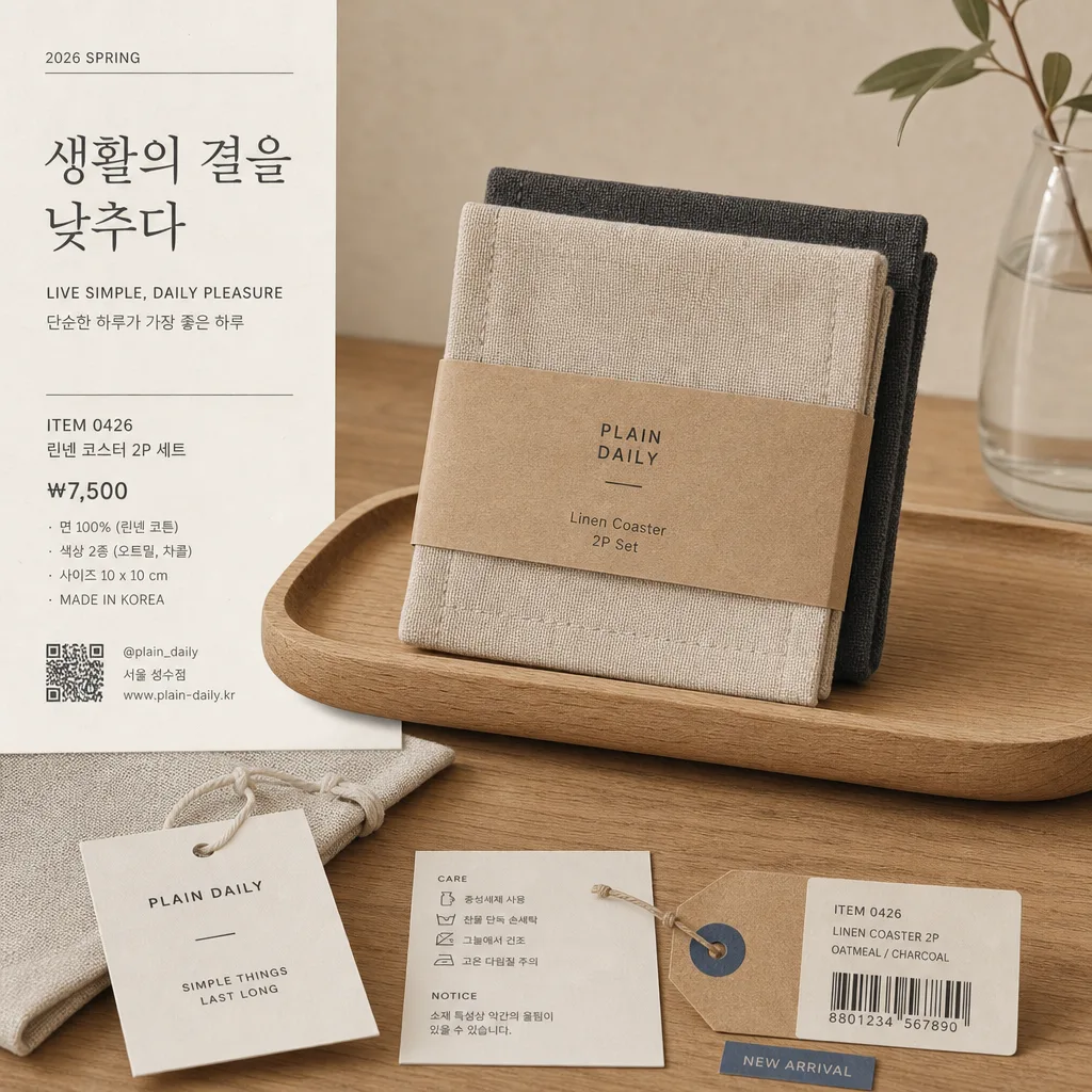
- Commercial detail layer: add a believable printed label card, small price tag, item code, barcode or QR area, material/spec line, and one short Korean campaign phrase derived from {타이포·카피}.

[3. CORE STRUCTURE]
- Main subject area: {적용 대상 (제품·매장·인물 자유)} rendered as the clear focal point, occupying about 40–55% of the frame, with crisp contours, realistic contact shadows, and visible material detail.
- Secondary support zone: include 2–4 natural supporting elements that make sense for the subject, such as a folded paper tag, linen pouch, kraft receipt, small care-label card, sample swatch, wooden tray, simple shelf marker, or neatly placed catalog slip.
- Label/caption zone: small typographic area aligned to the lower-left, lower-right, or side edge following {레이아웃}; include a short Korean headline, English subline, price, product number, and date label without overwhelming the hero subject.
- Suggested visible microcopy: Korean cover-style line such as '생활의 결을 낮추다', '매일 쓰는 좋은 기준', or {타이포·카피}; include realistic details like 'ITEM 0426', '₩7,500', '2026 SPRING', '면 100%', '서울 성수점', '@plain_daily'.
- Color block logic: use {컬러 팔레트} as a warm neutral system with beige, warm white, natural wood, charcoal, and one muted accent such as clay, olive, or muted blue; keep the accent practical, like a sticker, label stripe, or tiny shelf mark.
- Retail realism: add subtle paper fibers, soft wrinkles, label adhesive edges, tiny dust on tabletop, gentle fabric weave, and natural shadow falloff so the image reads as a photographed brand campaign rather than a flat mockup.

[4. STYLE RULES]
- Typography: use clean sans fonts such as Pretendard or Noto Sans KR for Korean, with light to regular weight for body text and medium weight for the main line; pair with understated English text in a simple grotesk style.
- Text hierarchy: create a believable retail-ad hierarchy with one short Korean headline, one smaller explanatory line, price/spec text, item code, and a tiny barcode/QR block; all text must be sharp and legible at 1024x1024.
- Color palette: {컬러 팔레트} should be interpreted as soft beige, warm white, natural wood, charcoal, muted clay, olive, or desaturated blue; avoid harsh neon saturation unless it is part of {브랜드 톤·시그니처}.
- Border/shadow: use realistic soft shadowing, paper-edge depth, and subtle contact shadows; if a poster or catalog card is visible, give it a light paper thickness and a soft 4px y-offset, 10px blur, 12% opacity style shadow.
- Graphic details: include small editorial marks such as a vertical date label, thin rule lines, item index dots, shelf-card divider, recycled-paper icon, simple hang-tag hole, or small campaign sticker, all consistent with {브랜드 톤·시그니처}.

[5. VISUAL STYLE]
- Camera / lens: full-frame 50mm lens, f/4, straight-on product/editorial framing, or a 35mm lens for a slightly wider catalog feel; no exaggerated perspective.
- Lighting: diffused natural window light from upper-left at about 45°, with a gentle fill from the opposite side and soft shadow falloff; no hard highlights.
- Color grade: low-contrast warm neutral grade with paper-white highlights, beige mids, charcoal accents, and gentle film-like grain; editorial product-catalog realism with tactile surfaces and natural depth.
- Rendering quality: high-resolution commercial photography look, clean focus on the subject and label area, realistic surface texture, accurate shadows, and crisp readable Korean typography.

[6. MOOD]
Quiet Japanese retail editorial — warm, functional, honest, and everyday. It should feel like a real seasonal catalog advertisement photographed inside a refined lifestyle store, with calm composition plus enough labels, packaging, and printed information to feel lived-in and commercially usable.

[7. CRITICAL]
- Korean text accuracy: no broken Korean characters anywhere in the image.
- Verbatim text requirements: if Korean labels are added, they must be clean and fully legible; prioritize {타이포·카피} when it is provided.
- Required realistic text elements: include at least three small but readable Korean or mixed-language details such as '생활의 결을 낮추다', '신상품', '2026 봄', '₩7,500', '서울 성수점', '면 100%', 'ITEM 0426', or '@plain_daily'.
- Brand identity handling: express the feeling of a Japanese everyday-goods retail catalog through layout, materials, palette, and typography while keeping the visual identity original and consistent with {브랜드 톤·시그니처}.
- Layout invariants: maintain a square product-centered editorial composition, with the hero subject clearly dominant and all supporting labels, tags, captions, price marks, and barcode areas arranged according to {레이아웃} and {비율}.

[8. 🚫 PROHIBITED]
- Fake official seals / certifications
- Broken Korean characters