廣告/海報
무지 미니멀 브랜드 비주얼
MUJI 미니멀 (일본 결) 시그니처 시각 톤만 빌려쓰는 결. 제품·매장·인물 자유.
무지 미니멀 브랜드 비주얼摘要
這是用來製作廣告/海報內容的 ChatGPT 圖像提示詞,已整理主題、背景、風格與構圖,方便快速調整。
相關關鍵字: 무지 미니멀 브랜드 비주얼, 무지 미니멀 브랜드 비주얼 프롬프트, 廣告/海報 프롬프트, 廣告/海報 AI 이미지 프롬프트, ChatGPT 이미지 프롬프트, AI 이미지 생성 프롬프트, AI 프롬프트, 이미지 프롬프트
무지 미니멀 브랜드 비주얼使用方式
保留原始結構並替換主體、背景、色彩或構圖,即可延伸出不同版本。
- 保留核心主體,並依品牌、季節或平台調整色彩與背景。
- 如果畫面太複雜,請減少背景元素並具體描述主體、構圖與光線。
- 複製後可要求 ChatGPT 配合平台、長寬比或文字需求調整。
提示詞原文
[Input]
- language: Korean
- output_size: 1024x1024

[Purpose]
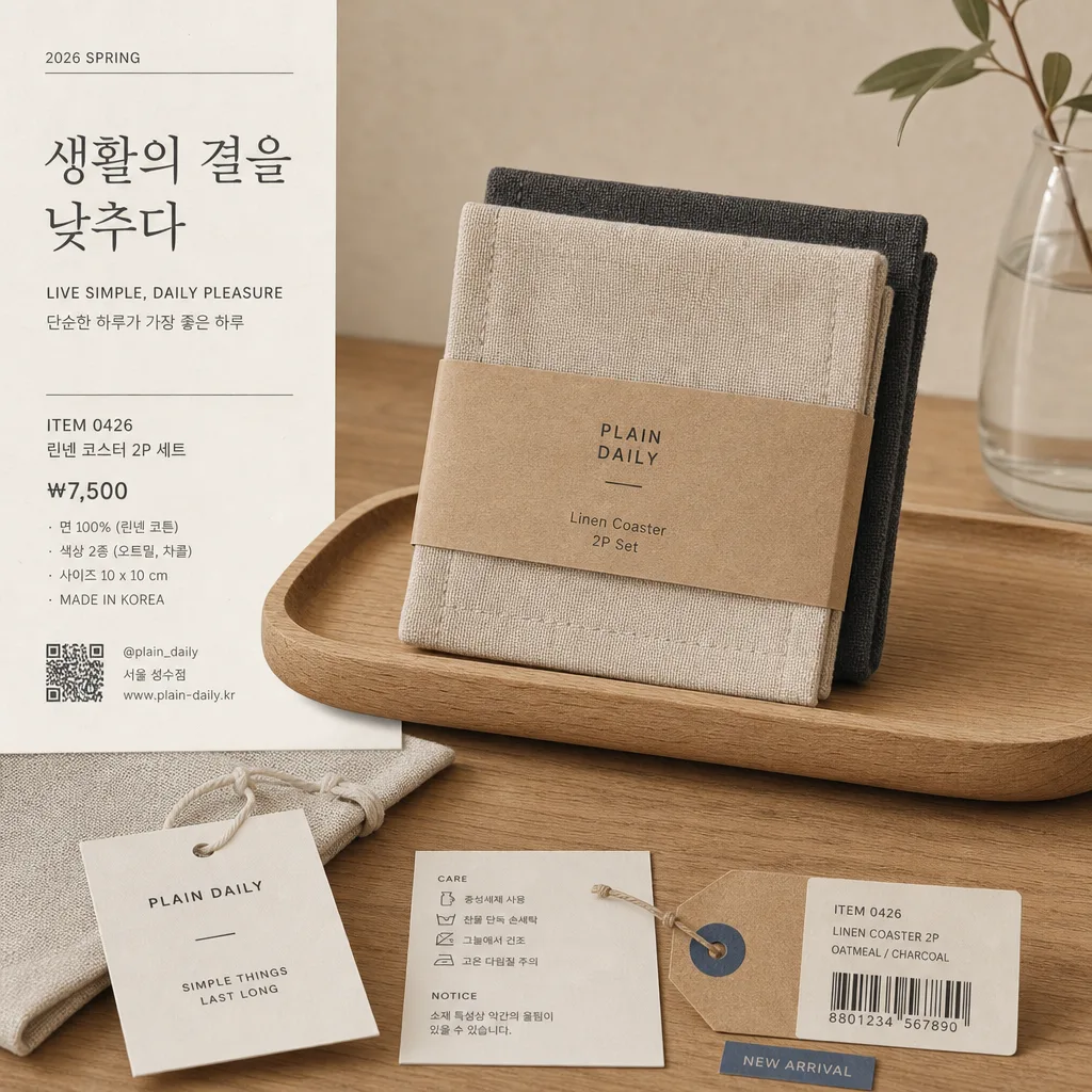
Japanese-inspired everyday retail brand visual for ads, posters, or catalog-style product presentation. Create a calm square hero image with believable store-catalog details, tactile materials, and polished commercial realism while keeping the subject clear and product-forward.

[Composition]
- Hero composition: {적용 대상 (제품·매장·인물 자유)} placed according to {레이아웃} and {비율}, centered or slightly off-center within a balanced editorial grid, with a clear area reserved for labels, price notes, and small campaign copy.
- Surface and background: matte off-white paper, warm beige wall, light wood tabletop, linen fabric, recycled paper tags, or a simple retail shelf surface with visible natural grain and tactile texture; soft imperfections are welcome for realism.
- Framing and spacing: square 1:1 layout with refined asymmetry, realistic product scale, and a composed retail-catalog feel; include enough surrounding context to make the scene feel like a real photographed brand asset.
- Visual tone anchors: {브랜드 톤·시그니처}, {컬러 팔레트}, and {라이팅·무드} should be expressed through honest materials, simple forms, soft shadows, paper labels, small tags, packaging details, and quiet lifestyle cues.
- Commercial detail layer: add a believable printed label card, small price tag, item code, barcode or QR area, material/spec line, and one short Korean campaign phrase derived from {타이포·카피}.

[3. CORE STRUCTURE]
- Main subject area: {적용 대상 (제품·매장·인물 자유)} rendered as the clear focal point, occupying about 40–55% of the frame, with crisp contours, realistic contact shadows, and visible material detail.
- Secondary support zone: include 2–4 natural supporting elements that make sense for the subject, such as a folded paper tag, linen pouch, kraft receipt, small care-label card, sample swatch, wooden tray, simple shelf marker, or neatly placed catalog slip.
- Label/caption zone: small typographic area aligned to the lower-left, lower-right, or side edge following {레이아웃}; include a short Korean headline, English subline, price, product number, and date label without overwhelming the hero subject.
- Suggested visible microcopy: Korean cover-style line such as '생활의 결을 낮추다', '매일 쓰는 좋은 기준', or {타이포·카피}; include realistic details like 'ITEM 0426', '₩7,500', '2026 SPRING', '면 100%', '서울 성수점', '@plain_daily'.
- Color block logic: use {컬러 팔레트} as a warm neutral system with beige, warm white, natural wood, charcoal, and one muted accent such as clay, olive, or muted blue; keep the accent practical, like a sticker, label stripe, or tiny shelf mark.
- Retail realism: add subtle paper fibers, soft wrinkles, label adhesive edges, tiny dust on tabletop, gentle fabric weave, and natural shadow falloff so the image reads as a photographed brand campaign rather than a flat mockup.

[4. STYLE RULES]
- Typography: use clean sans fonts such as Pretendard or Noto Sans KR for Korean, with light to regular weight for body text and medium weight for the main line; pair with understated English text in a simple grotesk style.
- Text hierarchy: create a believable retail-ad hierarchy with one short Korean headline, one smaller explanatory line, price/spec text, item code, and a tiny barcode/QR block; all text must be sharp and legible at 1024x1024.
- Color palette: {컬러 팔레트} should be interpreted as soft beige, warm white, natural wood, charcoal, muted clay, olive, or desaturated blue; avoid harsh neon saturation unless it is part of {브랜드 톤·시그니처}.
- Border/shadow: use realistic soft shadowing, paper-edge depth, and subtle contact shadows; if a poster or catalog card is visible, give it a light paper thickness and a soft 4px y-offset, 10px blur, 12% opacity style shadow.
- Graphic details: include small editorial marks such as a vertical date label, thin rule lines, item index dots, shelf-card divider, recycled-paper icon, simple hang-tag hole, or small campaign sticker, all consistent with {브랜드 톤·시그니처}.

[5. VISUAL STYLE]
- Camera / lens: full-frame 50mm lens, f/4, straight-on product/editorial framing, or a 35mm lens for a slightly wider catalog feel; no exaggerated perspective.
- Lighting: diffused natural window light from upper-left at about 45°, with a gentle fill from the opposite side and soft shadow falloff; no hard highlights.
- Color grade: low-contrast warm neutral grade with paper-white highlights, beige mids, charcoal accents, and gentle film-like grain; editorial product-catalog realism with tactile surfaces and natural depth.
- Rendering quality: high-resolution commercial photography look, clean focus on the subject and label area, realistic surface texture, accurate shadows, and crisp readable Korean typography.

[6. MOOD]
Quiet Japanese retail editorial — warm, functional, honest, and everyday. It should feel like a real seasonal catalog advertisement photographed inside a refined lifestyle store, with calm composition plus enough labels, packaging, and printed information to feel lived-in and commercially usable.

[7. CRITICAL]
- Korean text accuracy: no broken Korean characters anywhere in the image.
- Verbatim text requirements: if Korean labels are added, they must be clean and fully legible; prioritize {타이포·카피} when it is provided.
- Required realistic text elements: include at least three small but readable Korean or mixed-language details such as '생활의 결을 낮추다', '신상품', '2026 봄', '₩7,500', '서울 성수점', '면 100%', 'ITEM 0426', or '@plain_daily'.
- Brand identity handling: express the feeling of a Japanese everyday-goods retail catalog through layout, materials, palette, and typography while keeping the visual identity original and consistent with {브랜드 톤·시그니처}.
- Layout invariants: maintain a square product-centered editorial composition, with the hero subject clearly dominant and all supporting labels, tags, captions, price marks, and barcode areas arranged according to {레이아웃} and {비율}.

[8. 🚫 PROHIBITED]
- Fake official seals / certifications
- Broken Korean characters