広告・ポスター
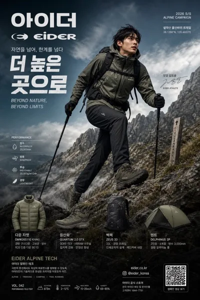
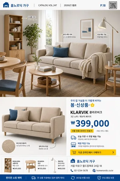
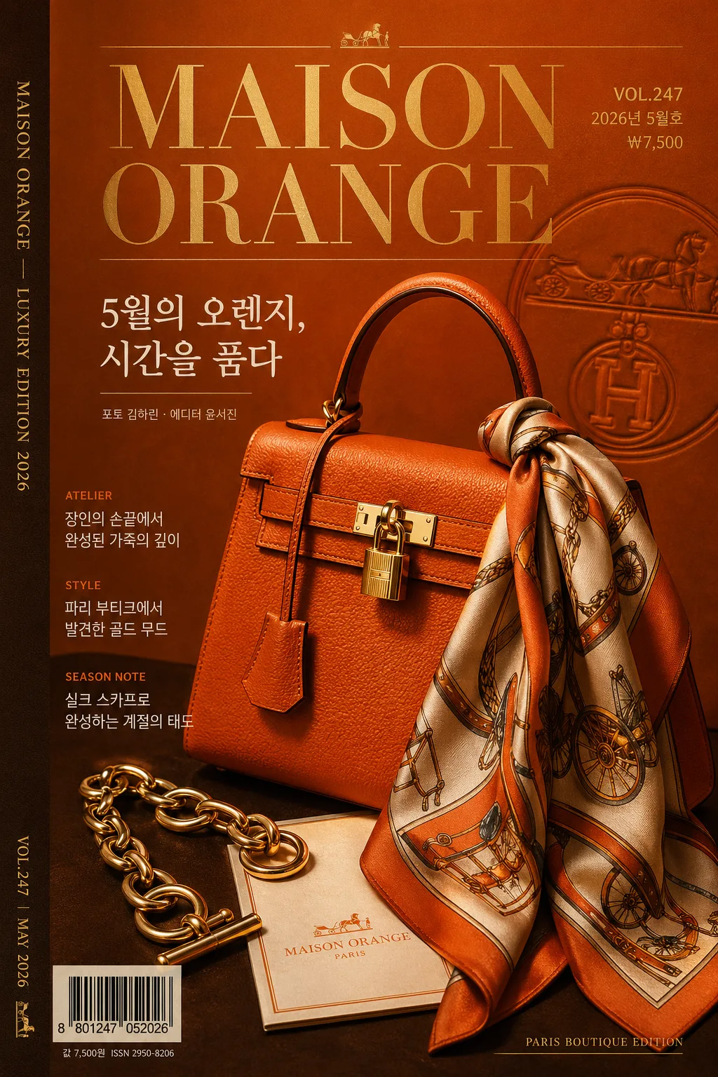
에르메스 골드 럭셔리 브랜드 비주얼
Hermes 럭셔리 골드 시그니처 시각 톤만 빌려쓰는 결. 제품·매장·인물 자유.
에르메스 골드 럭셔리 브랜드 비주얼の概要
広告・ポスター画像を作るためのChatGPT画像プロンプトです。主題、背景、スタイル、構図を整理し、すぐに試せるよう構成しています。
関連キーワード: 에르메스 골드 럭셔리 브랜드 비주얼, 에르메스 골드 럭셔리 브랜드 비주얼 프롬프트, 広告・ポスター 프롬프트, 広告・ポスター AI 이미지 프롬프트, ChatGPT 이미지 프롬프트, AI 이미지 생성 프롬프트, AI 프롬프트, 이미지 프롬프트
에르메스 골드 럭셔리 브랜드 비주얼の活用方法
元の構造を保ちながら、被写体、背景、色、構図を変更して別案に展開できます。
- 主題を維持し、ブランドや季節、媒体に合わせて色と背景を変更してください。
- 結果が複雑な場合は背景要素を減らし、被写体、構図、照明を具体化してください。
- コピー後、ChatGPTに媒体、アスペクト比、文字の有無を追加で指定できます。
プロンプト原文
[Input]
- language: Korean
- output_size: 1024x1536

[Purpose]
Hermes-inspired luxury brand visual for a premium magazine cover, catalog cover, or boutique campaign poster. A high-end editorial composition using orange-brown-gold fashion-house color language, realistic printed-cover details, and refined luxury advertising polish.

[Composition]
- Hero subject: {적용 대상} occupies the central 55–65% of the frame as a premium still-life or editorial portrait, with crisp silhouette, rich leather / metal / paper texture, and strong tonal contrast against the backdrop.
- Cover environment: deep orange-to-warm brown luxury backdrop with tactile matte paper grain, satin studio surface, faint embossed monogram-like patterning, gold foil glints, and soft contact shadows.
- Framing: vertical 1024x1536 magazine-cover layout with hero slightly offset, headline above or beside the subject, feature blurbs stepping down the left or right edge, barcode and price near the lower corner, and a slim spine-credit strip along one side.
- Tone and brand cues: apply {브랜드 톤·시그니처} with Paris boutique editorial energy, premium catalog realism, warm highlights, and elegant printed-magazine finishing.

[3. CORE STRUCTURE]
1. Main hero zone (mid 60%): place {적용 대상} as the visual anchor with crisp edge definition, realistic specular highlights, leather-like or polished-material reflections, and a studio-catalog placement that feels tactile and expensive.
2. Background layer: build a warm luxury field using {컬러 팔레트}, with orange dominant, cocoa brown as depth, antique gold accents on rules / small ornaments / foil text, ivory paper tone in small panels, and charcoal for fine typography.
3. Magazine masthead zone: upper 12–18% contains the main masthead “{메인 헤드라인}” in Didot or Bodoni-style serif, plus {이슈 번호}, {발행일}, and {가격} in compact editorial type.
4. Feature headline zone: add 2–3 Korean cover lines: “{특집 헤드라인 1}”, “{특집 헤드라인 2}”, “{특집 헤드라인 3}”, arranged as realistic magazine teasers with small section labels such as STYLE, ATELIER, SEASON NOTE.
5. Supporting copy zone: place “{한글 부제}” near the hero or below the masthead, with refined Korean kerning, plus a small photographer / editor credit “{크레딧}”.
6. Print-detail zone: include a small barcode block labeled “{바코드 번호}”, a lower-corner issue note, a thin side spine text “{스파인 문구}”, fine gold divider rules, and small catalog metadata that reinforces a real luxury publication.
7. Layout discipline: follow {레이아웃} with a strong editorial grid, layered type hierarchy, believable cover furniture, and intentionally placed decorative graphics such as fine gold rules, embossed pattern fragments, foil dots, and boutique-catalog labels.

[4. STYLE RULES]
- Typography: Didot or Bodoni-inspired serif for the main headline, 56–82 pt range; Noto Sans KR or Pretendard for Korean feature lines, 18–28 pt, medium weight, tight readable tracking; tiny metadata and barcode captions in 9–12 pt.
- Color palette: use {컬러 팔레트} with emphasis on Hermes-like orange, cocoa brown, antique gold, warm white, and charcoal.
- Printed details: add thin gold rules, small folio numbers, issue metadata, barcode, price, side spine credit, and subtle foil-stamped ornaments integrated into the cover design.
- Texture and finish: matte coated-paper grain, satin shadows, leather or polished object highlights, slight ink density variation, and premium editorial print realism.

[5. VISUAL STYLE]
- Camera / lens: Phase One IQ4 look with a 85mm medium-format portrait lens at f/4 for a polished editorial still, or 50mm studio lens for a product poster feel.
- Lighting: studio key light from upper-left at 45°, soft fill from front-right, controlled specular highlight on the hero, with dramatic shadow falloff for luxury depth.
- Color grade: warm orange, walnut brown, muted gold, and ivory paper tones with a cinematic high-end fashion finish.
- Rendering: realistic luxury magazine cover mockup, sharp printed typography, tactile paper texture, believable barcode and cover-line placement, high-resolution editorial retouching.

[6. MOOD]
Luxury fashion-house campaign — Hermès editorial spread energy with the sophistication of a Paris boutique catalog, warm golden-hour studio drama, and collectible magazine-cover realism.

[7. CRITICAL]
- Korean text accuracy: no broken Hangul characters anywhere in the image; all Korean cover lines must be clean, readable, and correctly kerned.
- Required rendered Korean copy: “{한글 부제}”, “{특집 헤드라인 1}”, “{특집 헤드라인 2}”, “{특집 헤드라인 3}”, “{발행일}”, “{가격}”.
- Required cover furniture: show “{이슈 번호}”, a barcode labeled “{바코드 번호}”, side spine text “{스파인 문구}”, and small credit “{크레딧}”.
- Layout invariant: maintain a premium hero-plus-masthead structure with clear hierarchy, realistic magazine details, warm orange-brown-gold palette, and refined luxury editorial polish.

[8. 🚫 PROHIBITED]
- Fake official seals / counterfeit certification marks
- Broken Korean characters / garbled typography
- Unauthorized celebrity composites or deceptive endorsement imagery