廣告/海報
에르메스 골드 럭셔리 브랜드 비주얼
Hermes 럭셔리 골드 시그니처 시각 톤만 빌려쓰는 결. 제품·매장·인물 자유.
에르메스 골드 럭셔리 브랜드 비주얼摘要
這是用來製作廣告/海報內容的 ChatGPT 圖像提示詞,已整理主題、背景、風格與構圖,方便快速調整。
相關關鍵字: 에르메스 골드 럭셔리 브랜드 비주얼, 에르메스 골드 럭셔리 브랜드 비주얼 프롬프트, 廣告/海報 프롬프트, 廣告/海報 AI 이미지 프롬프트, ChatGPT 이미지 프롬프트, AI 이미지 생성 프롬프트, AI 프롬프트, 이미지 프롬프트
에르메스 골드 럭셔리 브랜드 비주얼使用方式
保留原始結構並替換主體、背景、色彩或構圖,即可延伸出不同版本。
- 保留核心主體,並依品牌、季節或平台調整色彩與背景。
- 如果畫面太複雜,請減少背景元素並具體描述主體、構圖與光線。
- 複製後可要求 ChatGPT 配合平台、長寬比或文字需求調整。
提示詞原文
[Input]
- language: Korean
- output_size: 1024x1536

[Purpose]
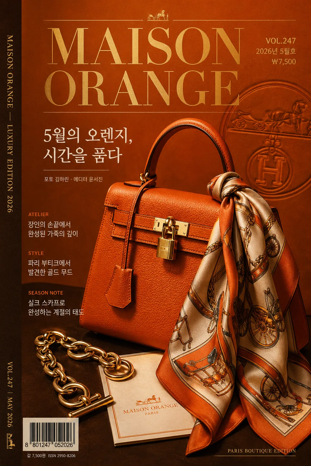
Hermes-inspired luxury brand visual for a premium magazine cover, catalog cover, or boutique campaign poster. A high-end editorial composition using orange-brown-gold fashion-house color language, realistic printed-cover details, and refined luxury advertising polish.

[Composition]
- Hero subject: {적용 대상} occupies the central 55–65% of the frame as a premium still-life or editorial portrait, with crisp silhouette, rich leather / metal / paper texture, and strong tonal contrast against the backdrop.
- Cover environment: deep orange-to-warm brown luxury backdrop with tactile matte paper grain, satin studio surface, faint embossed monogram-like patterning, gold foil glints, and soft contact shadows.
- Framing: vertical 1024x1536 magazine-cover layout with hero slightly offset, headline above or beside the subject, feature blurbs stepping down the left or right edge, barcode and price near the lower corner, and a slim spine-credit strip along one side.
- Tone and brand cues: apply {브랜드 톤·시그니처} with Paris boutique editorial energy, premium catalog realism, warm highlights, and elegant printed-magazine finishing.

[3. CORE STRUCTURE]
1. Main hero zone (mid 60%): place {적용 대상} as the visual anchor with crisp edge definition, realistic specular highlights, leather-like or polished-material reflections, and a studio-catalog placement that feels tactile and expensive.
2. Background layer: build a warm luxury field using {컬러 팔레트}, with orange dominant, cocoa brown as depth, antique gold accents on rules / small ornaments / foil text, ivory paper tone in small panels, and charcoal for fine typography.
3. Magazine masthead zone: upper 12–18% contains the main masthead “{메인 헤드라인}” in Didot or Bodoni-style serif, plus {이슈 번호}, {발행일}, and {가격} in compact editorial type.
4. Feature headline zone: add 2–3 Korean cover lines: “{특집 헤드라인 1}”, “{특집 헤드라인 2}”, “{특집 헤드라인 3}”, arranged as realistic magazine teasers with small section labels such as STYLE, ATELIER, SEASON NOTE.
5. Supporting copy zone: place “{한글 부제}” near the hero or below the masthead, with refined Korean kerning, plus a small photographer / editor credit “{크레딧}”.
6. Print-detail zone: include a small barcode block labeled “{바코드 번호}”, a lower-corner issue note, a thin side spine text “{스파인 문구}”, fine gold divider rules, and small catalog metadata that reinforces a real luxury publication.
7. Layout discipline: follow {레이아웃} with a strong editorial grid, layered type hierarchy, believable cover furniture, and intentionally placed decorative graphics such as fine gold rules, embossed pattern fragments, foil dots, and boutique-catalog labels.

[4. STYLE RULES]
- Typography: Didot or Bodoni-inspired serif for the main headline, 56–82 pt range; Noto Sans KR or Pretendard for Korean feature lines, 18–28 pt, medium weight, tight readable tracking; tiny metadata and barcode captions in 9–12 pt.
- Color palette: use {컬러 팔레트} with emphasis on Hermes-like orange, cocoa brown, antique gold, warm white, and charcoal.
- Printed details: add thin gold rules, small folio numbers, issue metadata, barcode, price, side spine credit, and subtle foil-stamped ornaments integrated into the cover design.
- Texture and finish: matte coated-paper grain, satin shadows, leather or polished object highlights, slight ink density variation, and premium editorial print realism.

[5. VISUAL STYLE]
- Camera / lens: Phase One IQ4 look with a 85mm medium-format portrait lens at f/4 for a polished editorial still, or 50mm studio lens for a product poster feel.
- Lighting: studio key light from upper-left at 45°, soft fill from front-right, controlled specular highlight on the hero, with dramatic shadow falloff for luxury depth.
- Color grade: warm orange, walnut brown, muted gold, and ivory paper tones with a cinematic high-end fashion finish.
- Rendering: realistic luxury magazine cover mockup, sharp printed typography, tactile paper texture, believable barcode and cover-line placement, high-resolution editorial retouching.

[6. MOOD]
Luxury fashion-house campaign — Hermès editorial spread energy with the sophistication of a Paris boutique catalog, warm golden-hour studio drama, and collectible magazine-cover realism.

[7. CRITICAL]
- Korean text accuracy: no broken Hangul characters anywhere in the image; all Korean cover lines must be clean, readable, and correctly kerned.
- Required rendered Korean copy: “{한글 부제}”, “{특집 헤드라인 1}”, “{특집 헤드라인 2}”, “{특집 헤드라인 3}”, “{발행일}”, “{가격}”.
- Required cover furniture: show “{이슈 번호}”, a barcode labeled “{바코드 번호}”, side spine text “{스파인 문구}”, and small credit “{크레딧}”.
- Layout invariant: maintain a premium hero-plus-masthead structure with clear hierarchy, realistic magazine details, warm orange-brown-gold palette, and refined luxury editorial polish.

[8. 🚫 PROHIBITED]
- Fake official seals / counterfeit certification marks
- Broken Korean characters / garbled typography
- Unauthorized celebrity composites or deceptive endorsement imagery