広告・ポスター
오프화이트 인더스트리얼 비주얼
Off-White 인더스트리얼 시그니처 시각 톤만 빌려쓰는 결. 제품·매장·인물 자유.
오프화이트 인더스트리얼 비주얼の概要
広告・ポスター画像を作るためのChatGPT画像プロンプトです。主題、背景、スタイル、構図を整理し、すぐに試せるよう構成しています。
関連キーワード: 오프화이트 인더스트리얼 비주얼, 오프화이트 인더스트리얼 비주얼 프롬프트, 広告・ポスター 프롬프트, 広告・ポスター AI 이미지 프롬프트, ChatGPT 이미지 프롬프트, AI 이미지 생성 프롬프트, AI 프롬프트, 이미지 프롬프트
오프화이트 인더스트리얼 비주얼の活用方法
元の構造を保ちながら、被写体、背景、色、構図を変更して別案に展開できます。
- 主題を維持し、ブランドや季節、媒体に合わせて色と背景を変更してください。
- 結果が複雑な場合は背景要素を減らし、被写体、構図、照明を具体化してください。
- コピー後、ChatGPTに媒体、アスペクト比、文字の有無を追加で指定できます。
プロンプト原文
[Input]
- language: Korean
- output_size: 1024x1536

[Purpose]
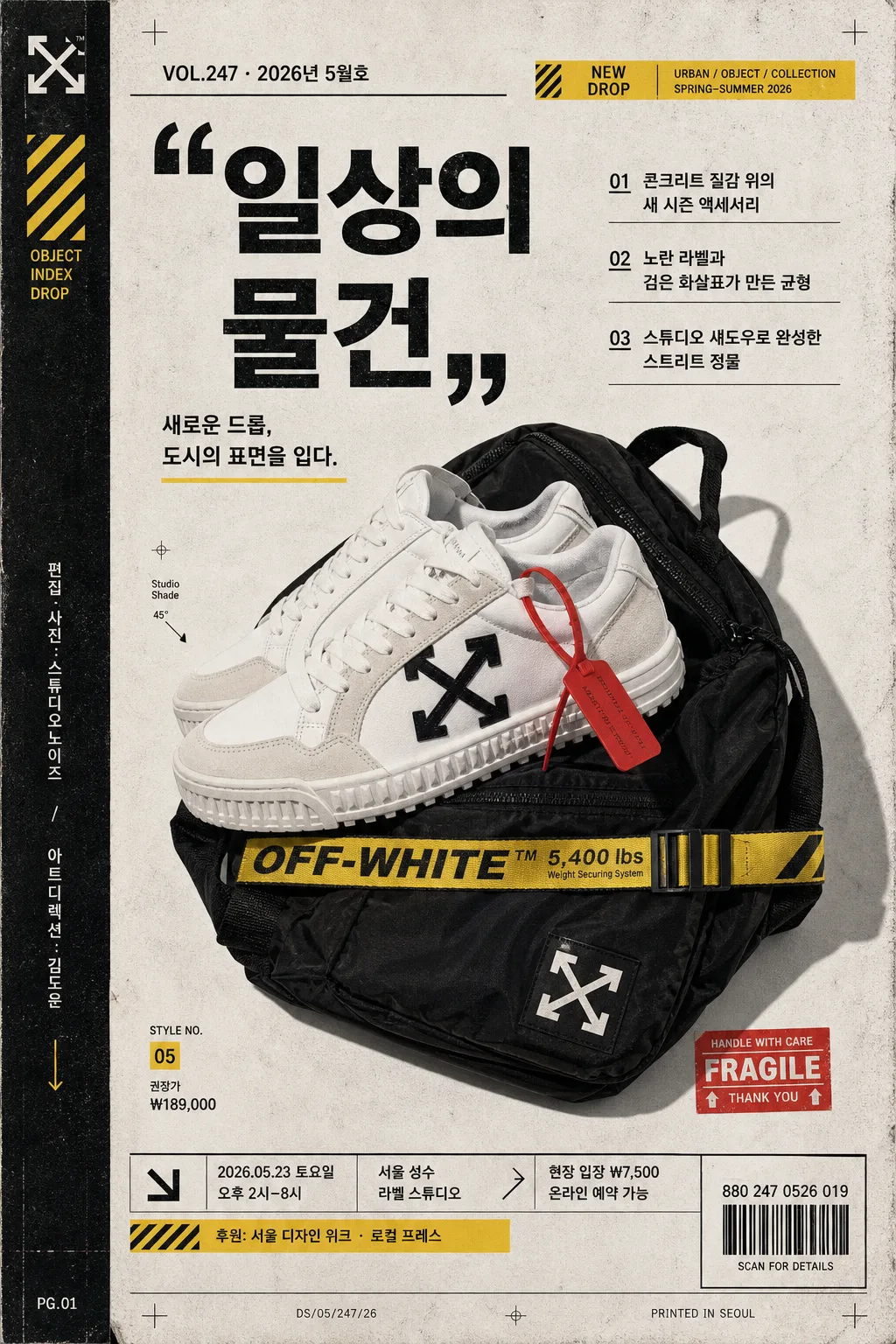
오프화이트 인더스트리얼 시그니처를 연상시키는 광고/포스터/카탈로그 스타일의 세로형 비주얼.
제품 hero와 인용부호형 카피, 발행 정보, 바코드, 행사 디테일, 작은 기사형 헤드라인이 함께 읽히는 패션/디자인 에디토리얼 무드.

[Composition]
- Main subject placement: {메인 대상} is the central hero, occupying about 58% of the frame height, slightly off-center to create editorial tension and a collectible poster-page feeling.
- Background treatment: matte off-white / warm gray paper-like surface with subtle concrete texture, printed noise, faint fold marks, registration ticks, and screen-print ink variation; keep the backdrop industrial and tactile rather than glossy.
- Poster page framing: build the layout as a vertical drop-sheet with a narrow spine strip on the left, cropped alignment marks, a bottom information footer, a small barcode label, and sticker-like yellow/red accent tags.
- Typography zones: place {메인 카피} as the dominant quote-style headline; support it with {국문 서브카피}, 2–3 Korean feature headlines, product/date details, and small catalog captions.

[3. CORE STRUCTURE]
1) Hero area (middle 55%): {메인 대상} presented as the main visual anchor, cut cleanly with sharp edges or crisp product contours, enhanced by a hard-edged studio shadow, faint scan grain, dust specks, and a slightly worn print layer.
2) Quote-led text zone (upper or side band): place {메인 카피} in bold industrial typography, using oversized quotation marks as a visual device, with tight leading, assertive spacing, and a strong black-on-warm-white contrast.
3) Korean editorial headlines: add three compact feature lines — {국문 헤드라인 1}, {국문 헤드라인 2}, {국문 헤드라인 3} — arranged like a magazine contents teaser or campaign proof annotation.
4) Color accent system: apply {컬러 팔레트} as diagonal tape strips, arrow markers, small label blocks, warning-tag rectangles, caption dividers, and corner registration marks.
5) Brand-tone overlay: infuse {시그니처 톤} into the layout rhythm, making the page feel like a fashion drop sheet, lookbook spread, poster proof, and streetwear catalog artifact.
6) Realistic poster information: include {발행 정보}, {드롭 날짜}, {행사 시간}, {장소}, {티켓 정보}, {제품 정보}, {스폰서 라인}, and a scannable-looking barcode area labeled {바코드 번호}.
7) Spine and footer details: add a vertical spine credit reading {스파인 크레딧}, tiny page code numbers, crop marks, paper edge wear, micro captions, and a compact footer tied to {레이아웃 방향}.
8) Light and texture pass: combine {라이팅 무드} with halftone traces, risograph-like ink noise, subtle scratches, and tactile paper fibers while keeping the product silhouette premium and sharp.

[4. STYLE RULES]
- Typography: bold grotesk sans-serif such as Helvetica Neue, Akzidenz-Grotesk, or Pretendard Bold for main copy; Korean detail text in Pretendard Medium or Noto Sans KR Medium at compact editorial sizes.
- Color palette: use {컬러 팔레트} with an off-white base, deep black text, selective yellow/red accents, and muted ink-like saturation; emphasize poster-print contrast.
- Graphic devices: include quotation marks, arrows, diagonal stripes, industrial label stickers, thin rules, page numbers, registration crosses, barcode block, and a magazine-style issue/date line.
- Border/shadow: thin black structural rules, hard studio shadow with 4px y-offset, 14px blur, 18% opacity; add slight paper-edge vignette, taped corners, and worn ink at the margins.

[5. VISUAL STYLE]
- Camera / lens: studio product/editorial look shot on a Hasselblad X2D 100C with 80mm lens at f/8, straight-on framing.
- Lighting: {라이팅 무드}; hard key light from upper-left at 45° with a subtle fill from right, creating crisp shadow geometry and a fashion-campaign feel.
- Color grade: stark black-white industrial grade with muted warm paper tones, restrained yellow/red accents, fine vintage grain, subtle halftone, and authentic print-proof texture.

[6. MOOD]
High-fashion industrial editorial — like an Off-White-inspired lookbook page mixed with a collectible design poster, a campaign drop sheet, and a modern streetwear catalog spread.

[7. CRITICAL]
- Korean text accuracy: the following strings must appear exactly as written in the rendered image when used: {메인 카피}, {국문 서브카피}, {국문 헤드라인 1}, {국문 헤드라인 2}, {국문 헤드라인 3}.
- Publication and event details must be readable: {발행 정보}, {드롭 날짜}, {행사 시간}, {장소}, {티켓 정보}, {제품 정보}, {스폰서 라인}, {바코드 번호}.
- Layout invariants: keep the hero object dominant, the quote-style headline highly visible, the barcode/footer/spine details legible, and the industrial editorial hierarchy clear.
- Render the overall piece as a believable printed poster/catalog proof with tactile paper, ink texture, alignment marks, and real-world campaign information.

[8. 🚫 PROHIBITED]
- Broken Korean characters
- Fake official seals / certifications
- Celebrity composites or recognizable public-figure likeness