광고/포스터
오프화이트 인더스트리얼 비주얼
Off-White 인더스트리얼 시그니처 시각 톤만 빌려쓰는 결. 제품·매장·인물 자유.
오프화이트 인더스트리얼 비주얼 검색 요약
오프화이트 인더스트리얼 비주얼은 광고/포스터 결과물을 만들 때 바로 복사해 활용할 수 있는 ChatGPT 이미지 프롬프트입니다. 주제, 배경, 스타일, 구도 조건을 함께 담아 빠르게 시안을 만들 수 있도록 구성했습니다.
관련 키워드: 오프화이트 인더스트리얼 비주얼, 오프화이트 인더스트리얼 비주얼 프롬프트, 광고/포스터 프롬프트, 광고/포스터 AI 이미지 프롬프트, ChatGPT 이미지 프롬프트, AI 이미지 생성 프롬프트, AI 프롬프트, 이미지 프롬프트
오프화이트 인더스트리얼 비주얼 활용 포인트
원본 구조를 유지하면서 피사체, 배경, 색감, 구도를 바꿔 다양한 시안으로 확장할 수 있습니다.
- 핵심 소재는 유지하고 브랜드, 계절, 채널 목적에 맞는 색감과 배경을 바꿔보세요.
- 결과가 산만하면 배경 요소를 줄이고 피사체, 구도, 조명 조건을 구체화하세요.
- 복사한 뒤 ChatGPT에서 플랫폼, 화면 비율, 텍스트 포함 여부를 추가로 요청할 수 있습니다.
프롬프트 원문
[Input]
- language: Korean
- output_size: 1024x1536

[Purpose]
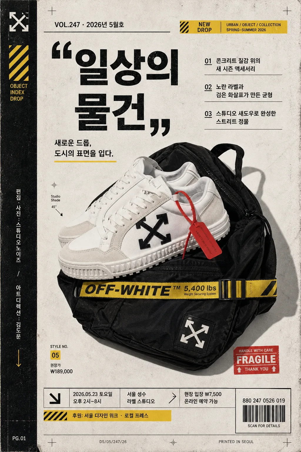
오프화이트 인더스트리얼 시그니처를 연상시키는 광고/포스터/카탈로그 스타일의 세로형 비주얼.
제품 hero와 인용부호형 카피, 발행 정보, 바코드, 행사 디테일, 작은 기사형 헤드라인이 함께 읽히는 패션/디자인 에디토리얼 무드.

[Composition]
- Main subject placement: {메인 대상} is the central hero, occupying about 58% of the frame height, slightly off-center to create editorial tension and a collectible poster-page feeling.
- Background treatment: matte off-white / warm gray paper-like surface with subtle concrete texture, printed noise, faint fold marks, registration ticks, and screen-print ink variation; keep the backdrop industrial and tactile rather than glossy.
- Poster page framing: build the layout as a vertical drop-sheet with a narrow spine strip on the left, cropped alignment marks, a bottom information footer, a small barcode label, and sticker-like yellow/red accent tags.
- Typography zones: place {메인 카피} as the dominant quote-style headline; support it with {국문 서브카피}, 2–3 Korean feature headlines, product/date details, and small catalog captions.

[3. CORE STRUCTURE]
1) Hero area (middle 55%): {메인 대상} presented as the main visual anchor, cut cleanly with sharp edges or crisp product contours, enhanced by a hard-edged studio shadow, faint scan grain, dust specks, and a slightly worn print layer.
2) Quote-led text zone (upper or side band): place {메인 카피} in bold industrial typography, using oversized quotation marks as a visual device, with tight leading, assertive spacing, and a strong black-on-warm-white contrast.
3) Korean editorial headlines: add three compact feature lines — {국문 헤드라인 1}, {국문 헤드라인 2}, {국문 헤드라인 3} — arranged like a magazine contents teaser or campaign proof annotation.
4) Color accent system: apply {컬러 팔레트} as diagonal tape strips, arrow markers, small label blocks, warning-tag rectangles, caption dividers, and corner registration marks.
5) Brand-tone overlay: infuse {시그니처 톤} into the layout rhythm, making the page feel like a fashion drop sheet, lookbook spread, poster proof, and streetwear catalog artifact.
6) Realistic poster information: include {발행 정보}, {드롭 날짜}, {행사 시간}, {장소}, {티켓 정보}, {제품 정보}, {스폰서 라인}, and a scannable-looking barcode area labeled {바코드 번호}.
7) Spine and footer details: add a vertical spine credit reading {스파인 크레딧}, tiny page code numbers, crop marks, paper edge wear, micro captions, and a compact footer tied to {레이아웃 방향}.
8) Light and texture pass: combine {라이팅 무드} with halftone traces, risograph-like ink noise, subtle scratches, and tactile paper fibers while keeping the product silhouette premium and sharp.

[4. STYLE RULES]
- Typography: bold grotesk sans-serif such as Helvetica Neue, Akzidenz-Grotesk, or Pretendard Bold for main copy; Korean detail text in Pretendard Medium or Noto Sans KR Medium at compact editorial sizes.
- Color palette: use {컬러 팔레트} with an off-white base, deep black text, selective yellow/red accents, and muted ink-like saturation; emphasize poster-print contrast.
- Graphic devices: include quotation marks, arrows, diagonal stripes, industrial label stickers, thin rules, page numbers, registration crosses, barcode block, and a magazine-style issue/date line.
- Border/shadow: thin black structural rules, hard studio shadow with 4px y-offset, 14px blur, 18% opacity; add slight paper-edge vignette, taped corners, and worn ink at the margins.

[5. VISUAL STYLE]
- Camera / lens: studio product/editorial look shot on a Hasselblad X2D 100C with 80mm lens at f/8, straight-on framing.
- Lighting: {라이팅 무드}; hard key light from upper-left at 45° with a subtle fill from right, creating crisp shadow geometry and a fashion-campaign feel.
- Color grade: stark black-white industrial grade with muted warm paper tones, restrained yellow/red accents, fine vintage grain, subtle halftone, and authentic print-proof texture.

[6. MOOD]
High-fashion industrial editorial — like an Off-White-inspired lookbook page mixed with a collectible design poster, a campaign drop sheet, and a modern streetwear catalog spread.

[7. CRITICAL]
- Korean text accuracy: the following strings must appear exactly as written in the rendered image when used: {메인 카피}, {국문 서브카피}, {국문 헤드라인 1}, {국문 헤드라인 2}, {국문 헤드라인 3}.
- Publication and event details must be readable: {발행 정보}, {드롭 날짜}, {행사 시간}, {장소}, {티켓 정보}, {제품 정보}, {스폰서 라인}, {바코드 번호}.
- Layout invariants: keep the hero object dominant, the quote-style headline highly visible, the barcode/footer/spine details legible, and the industrial editorial hierarchy clear.
- Render the overall piece as a believable printed poster/catalog proof with tactile paper, ink texture, alignment marks, and real-world campaign information.

[8. 🚫 PROHIBITED]
- Broken Korean characters
- Fake official seals / certifications
- Celebrity composites or recognizable public-figure likeness