Ads/Posters
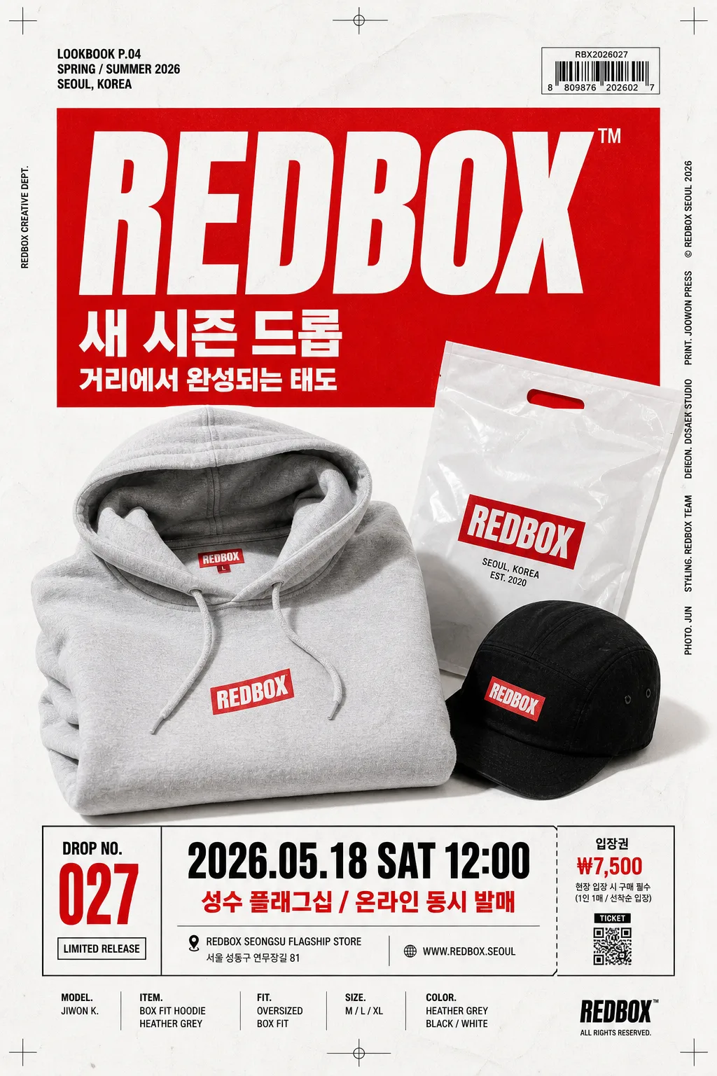
슈프림 빨강 박스 브랜드 비주얼
Supreme 빨강 박스 로고 시그니처 시각 톤만 빌려쓰는 결. 제품·매장·인물 자유.
슈프림 빨강 박스 브랜드 비주얼 summary
Copy this ChatGPT image prompt to create Ads/Posters results. Its subject, background, style, and composition are organized for quick iteration.
Related keywords: 슈프림 빨강 박스 브랜드 비주얼, 슈프림 빨강 박스 브랜드 비주얼 프롬프트, Ads/Posters 프롬프트, Ads/Posters AI 이미지 프롬프트, ChatGPT 이미지 프롬프트, AI 이미지 생성 프롬프트, AI 프롬프트, 이미지 프롬프트
How to use 슈프림 빨강 박스 브랜드 비주얼
Keep the prompt structure and swap the subject, background, palette, or composition to create new variations.
- Keep the main subject and adjust the palette and background for your brand, season, or channel.
- If the result feels busy, simplify the background and make the subject, composition, and lighting more specific.
- After copying, ask ChatGPT to adapt it for your platform, aspect ratio, or text requirements.
Original prompt
[Input]
- language: Korean
- output_size: 1024x1536

[Purpose]
Advertising poster / catalog visual that captures the iconic red-box streetwear brand language as a realistic fashion drop key visual. Make it feel like a printed streetwear campaign poster photographed for an editorial catalog: bold red block identity, real product or model presence, credible event information, retail details, and sharp Korean promotional typography.

[Composition]
- Main subject: {적용 대상 (제품·매장·인물 자유)} placed as the central hero, occupying about 55–65% of the frame, with a strong poster-like presence and believable physical detail such as fabric weave, product edges, store fixtures, skin texture, tags, seams, or packaging surfaces when appropriate.
- Brand tone: {브랜드 톤·시그니처} expressed through a large red rectangular brand block, bold streetwear typography, drop-announcement cues, and disciplined graphic hierarchy.
- Background treatment: studio-white or near-white printed-paper backdrop with realistic matte poster grain, faint paper fibers, light handling marks, and subtle contact shadows that make the layout feel physically printed and photographed.
- Framing direction: vertical editorial poster layout, centered hierarchy, crisp red-box anchor, catalog-style crop marks, small production credits, and balanced top/bottom information zones.
- Palette usage: keep {컬러 팔레트} dominant, with vivid red as the primary visual anchor, white as the clean poster field, and black reserved for headline, labels, captions, small ticket text, barcode marks, and fine outlines.

[3. CORE STRUCTURE]
1. Hero area (mid 60%): {적용 대상 (제품·매장·인물 자유)} presented directly with a polished studio catalog look, centered or slightly lower-center; include natural details such as garment folds, matte plastic packaging, product label texture, shoe sole marks, store counter reflections, or realistic portrait lighting depending on the subject.
2. Brand block area: a bold red rectangle or panel integrated into the composition as the signature visual anchor; keep it flat, graphic, ink-like, and print-based rather than glossy 3D. Inside or near it, place a fictional Korean/English drop title in bold type, not a copied official wordmark.
3. Copy area: {타이포·카피} placed in a compact stacked treatment aligned to the red block edges or bottom third. Add realistic short Korean poster copy such as “새 시즌 드롭”, “한정 발매”, “오늘의 실루엣”, or “거리에서 완성되는 태도”.
4. Event / retail detail band: include a credible poster information strip with Korean details: “DROP NO. 027”, “2026.05.18 SAT 12:00”, “성수 플래그십 / 온라인 동시 발매”, “입장권 ₩7,500”, “문의 @redbox.seoul”.
5. Catalog production details: add a small barcode area, tiny QR-like ticket block, page/catalog code such as “LOOKBOOK P.04”, model or product credit “MODEL: JIWON K.” / “ITEM: BOX FIT HOODIE”, and fine-print staff credit text along one edge.
6. Layout discipline: {레이아웃} should feel bold and editorial, with one dominant focal point, one primary red block, and several small realistic poster details that support the campaign without competing with the hero subject.
7. Size logic: {비율} with tall poster proportions, strong vertical reading order, and enough breathing room around the hero and red block for a premium streetwear catalog impression.

[4. STYLE RULES]
- Typography: bold condensed sans-serif such as Helvetica Neue Condensed, DIN Condensed, or Noto Sans KR Bold; headline size large and tight, subcopy smaller and controlled, with believable Korean typesetting and consistent baseline alignment.
- Color palette: {컬러 팔레트} with vivid brand red #D6001C, pure white #FFFFFF, and deep black #111111; use tiny gray registration marks or paper shadows only if they support the printed-poster realism.
- Graphic details: include crop marks, small barcode block, ticket-stub line, micro captions, date label, and sponsor/partner area rendered as simple text labels such as “STUDIO PARTNER”, “SEOUL DROP GUIDE”, “STYLE CREDIT”.
- Shadow / depth: use clean contact shadows under the product or person, slight paper curl or poster surface variation, and subtle soft drop shadow where needed to separate object from background.
- Print feel: clean matte poster finish, slightly compressed contrast, crisp text edges, realistic ink density, faint paper grain, and no metallic effects.

[5. VISUAL STYLE]
- Camera / lens: studio product photography look, full-frame camera with 85mm f/1.8 or 70–200mm at 135mm, straight-on or slightly elevated angle for a polished catalog poster.
- Lighting: hard studio key light from upper-left at roughly 45°, controlled fill on the right, strong but clean shadow edges, with realistic specular control on fabric, skin, packaging, glass, or store fixtures.
- Color grade: high-contrast red / white / black grade, slightly cool neutrals with saturated brand red preserved, editorial fashion-ad look.
- Realism cues: preserve visible material texture, accurate shadows, natural garment drape, readable printed labels, slight poster paper grain, and believable physical scale between the hero subject and graphic elements.

[6. MOOD]
Iconic streetwear campaign poster — confrontational, premium, and instantly recognizable like a high-end fashion drop announcement photographed for a magazine spread, with retail-event credibility and bold Korean street-culture energy.

[7. CRITICAL]
- Korean text accuracy: the following Korean strings must appear exactly and clearly if shown: {브랜드 톤·시그니처}, {적용 대상 (제품·매장·인물 자유)}, {컬러 팔레트}, {라이팅·무드}, {타이포·카피}, {레이아웃}, {비율}.
- Render additional Korean poster text cleanly and legibly, for example: “새 시즌 드롭”, “한정 발매”, “2026.05.18 SAT 12:00”, “성수 플래그십”, “입장권 ₩7,500”, “문의 @redbox.seoul”.
- Keep the visual language red-box streetwear editorial, but make the image feel like a real printed campaign poster with believable product/model details, barcode area, ticket information, date label, credits, and matte paper texture.
- If a logo-like red rectangle is used, make it a fictional campaign block or typographic label rather than a distorted imitation wordmark.

[8. 🚫 PROHIBITED]
- Fake official seals / certifications
- Broken Korean characters
- Celebrity composites / unauthorized likeness