Ads/Posters
코카콜라 아이코닉 빨강 비주얼
Coca-Cola 아이코닉 빨강 시그니처 시각 톤만 빌려쓰는 결. 제품·매장·인물 자유.
코카콜라 아이코닉 빨강 비주얼 summary
Copy this ChatGPT image prompt to create Ads/Posters results. Its subject, background, style, and composition are organized for quick iteration.
Related keywords: 코카콜라 아이코닉 빨강 비주얼, 코카콜라 아이코닉 빨강 비주얼 프롬프트, Ads/Posters 프롬프트, Ads/Posters AI 이미지 프롬프트, ChatGPT 이미지 프롬프트, AI 이미지 생성 프롬프트, AI 프롬프트, 이미지 프롬프트
How to use 코카콜라 아이코닉 빨강 비주얼
Keep the prompt structure and swap the subject, background, palette, or composition to create new variations.
- Keep the main subject and adjust the palette and background for your brand, season, or channel.
- If the result feels busy, simplify the background and make the subject, composition, and lighting more specific.
- After copying, ask ChatGPT to adapt it for your platform, aspect ratio, or text requirements.
Original prompt
[Input]
- language: Korean
- output_size: 1024x1536

[Purpose]
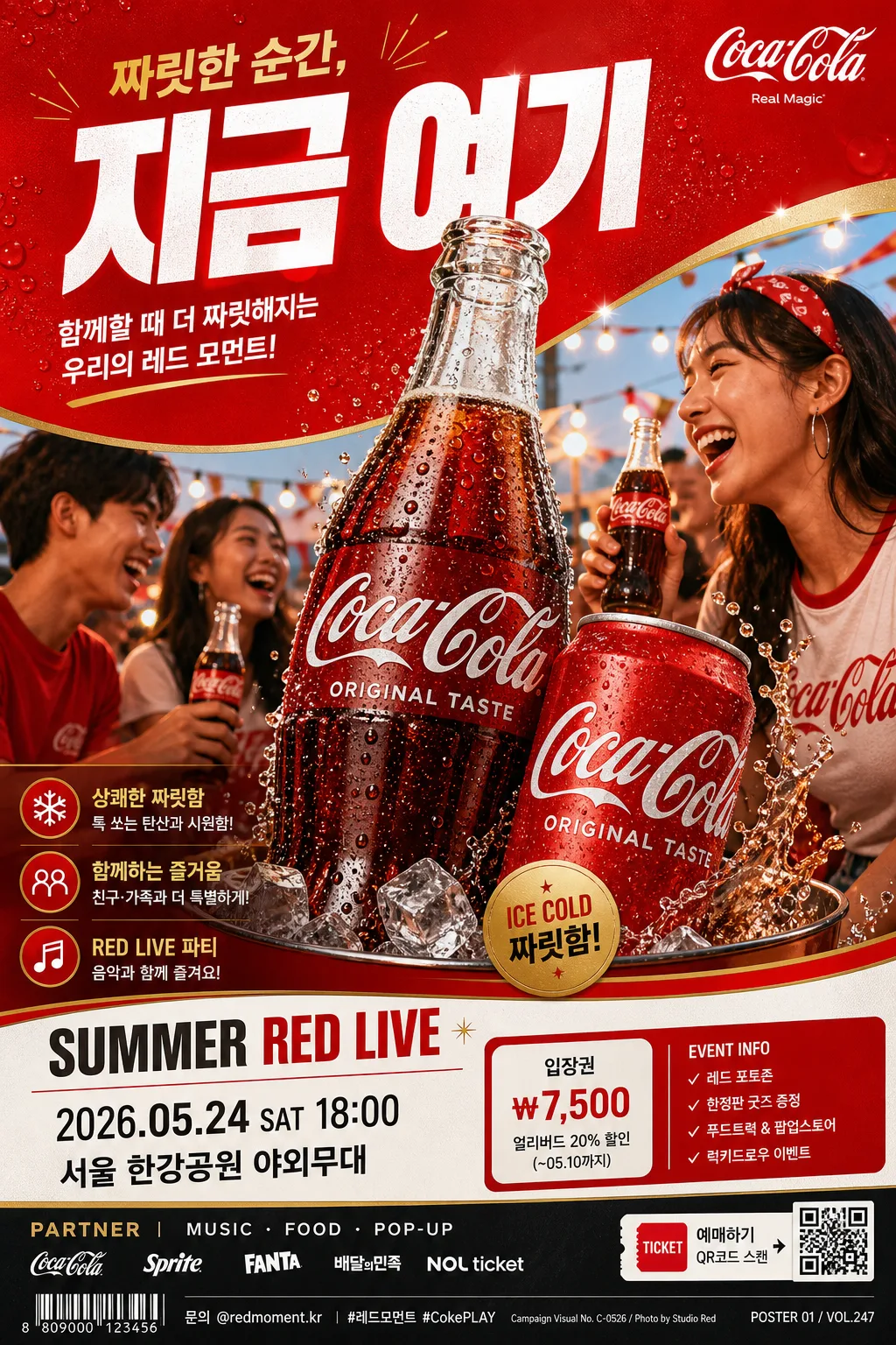
Advertising poster / catalog visual built around the iconic red visual language of Coca-Cola: high-energy brand mood, cheerful social warmth, sparkling refreshment, and instantly recognizable red-white-gold commercial composition.

[Composition]
- Create a premium vertical advertising poster in {비율}, with {적용 대상 (제품·매장·인물 자유)} as the central hero subject occupying about 55–60% of the frame.
- Keep a strong vertical hierarchy: oversized headline zone at the top, hero focal point in the middle, supporting copy, event-style details, and campaign footer near the lower third.
- Background should use {컬러 팔레트} with a rich high-contrast red field, glossy coated-paper texture, subtle condensation sparkle, faint curved ribbon graphics, and white/gold accent panels that feel like a real printed campaign poster.
- Place {적용 대상 (제품·매장·인물 자유)} as the central focus; if people appear, frame them in a lively side profile or three-quarter angle with candid social warmth, natural smiles, hands reaching for a drink, or a shared toast moment.
- Use {브랜드 톤·시그니처} to guide the overall energy, with bold commercial art direction, crisp product styling, realistic reflections, and lively soda-campaign atmosphere.
- Integrate realistic poster information: a short Korean headline, 2–3 small Korean feature blurbs, date/time/venue line, ticket or event info strip, sponsor/partner area, campaign code, and a small barcode/QR-style block in the footer.

[3. CORE STRUCTURE]
- Top header zone (15–18%): large, bold headline area with strong white or cream typography on red, tightly aligned and highly legible. Set bold Korean headline using {타이포·카피}, for example: “짜릿한 순간, 지금 여기” or “오늘의 빨강을 열다”.
- Hero zone (middle 50–55%): showcase {적용 대상 (제품·매장·인물 자유)} with a premium campaign look, crisp edges, realistic droplets, glass highlights, metallic cap or can reflections, ice sparkle, and photographic separation from the background.
- Accent zone (around hero edges): add dynamic highlights, reflective sheen, soft carbonation bubbles, curved white ribbon strokes, gold glints, small starburst marks, and motion streaks in gold and white to echo a classic soft-drink campaign feel.
- Lower copy zone (bottom 15–20%): place short supporting text in a neat sans-serif hierarchy with real poster details, such as “2026.05.24 SAT 18:00”, “서울 한강공원 야외무대”, “입장권 ₩7,500”, “SUMMER RED LIVE”, and “문의 @redmoment.kr”.
- Footer details: include a small sponsor strip reading “PARTNER | MUSIC · FOOD · POP-UP”, a compact barcode/QR-style rectangle, tiny production credit text such as “Campaign Visual No. C-0526 / Photo by Studio Red”, and a discreet page/catalog marker like “POSTER 01 / VOL.247”.
- If a secondary human element appears, position it at the side with natural interaction and social warmth, such as a hand holding a chilled bottle, friends laughing in the background, or a model turning toward the hero product.
- Follow {레이아웃} while adding enough real campaign information and tactile print elements to make the image feel like an actual outdoor poster, store display, or catalog advertising page.

[4. STYLE RULES]
- Typography: bold English sans-serif such as Helvetica Neue, Franklin Gothic, or Pretendard Bold for the main headline; smaller Korean subtitle in Noto Sans KR Medium or Pretendard Medium.
- Font sizing: headline very large and condensed-feel, subtitle about 30–40% of headline size, with confident spacing, tight leading, and professional editorial alignment.
- Color palette: {컬러 팔레트} with vivid Coca-Cola-style red (#E41D1B / #CC0000), crisp white (#FFFFFF), metallic gold (#C9A24A), and deep charcoal (#1F1F1F).
- Border/shadow: premium print shadow, soft drop shadow 4px y-offset, 12px blur, 15% opacity; use glossy highlight edges, specular reflections, and laminated poster sheen where they enhance realism.
- Add real-world printed-ad details: tiny registration marks, micro credit line, campaign number, subtle paper grain, fold-safe alignment guides, small legal-style footer copy, price/date labels, and a compact barcode area.
- Keep the visual system iconic and poster-like: strong contrast, clean separation, vivid red impact, crisp white typography, glossy product lighting, and polished commercial finish.

[5. VISUAL STYLE]
- Camera / lens: commercial advertising photography on a full-frame camera, Canon EOS R5 with 85mm f/1.4 for people or products, or 50mm f/1.8 for a slightly wider campaign frame.
- Lighting: {라이팅·무드}; hard-soft studio key from upper-left at 45° with a subtle fill from right, plus controlled rim light to make the red surfaces pop; if using a lifestyle scene, blend with warm afternoon window light and natural reflections.
- Color grade: saturated red-forward grade with clean white highlights, slight amber warmth, and deep charcoal shadows; keep skin tones natural if people appear.
- Material realism: visible chilled condensation, tiny droplets, ice reflections, glossy label/can highlights, coated paper texture, slightly raised ink impression, and realistic shadow contact under the hero subject.
- Depth and atmosphere: shallow-to-medium depth of field on the hero subject, gentle background falloff, subtle bokeh or sparkle near highlights, and print-ready sharpness on all main Korean text.

[6. MOOD]
Classic global soda-campaign energy — a polished billboard/poster look inspired by high-impact commercial art direction, summer event advertising, memorable brand visuals, and cheerful shared refreshment moments.

[7. CRITICAL]
- Korean text accuracy: if Korean text appears, it must be clean and correctly rendered with no broken characters.
- Include realistic Korean poster copy such as “짜릿한 순간, 지금 여기”, “차갑게 즐기는 레드 타임”, “2026.05.24 SAT 18:00”, “서울 한강공원 야외무대”, “입장권 ₩7,500”, and “문의 @redmoment.kr”.
- The image should strongly evoke the iconic Coca-Cola red-white campaign language in composition, typography hierarchy, lighting mood, glossy product energy, and celebratory red visual rhythm.
- All typography must feel professionally typeset, aligned, and print-ready, including small footer text, barcode labels, sponsor strip, and micro credit lines.

[8. 🚫 PROHIBITED]
- Fake official seals / certifications
- Broken Korean characters
- Celebrity composites or unauthorized likeness