Ads/Posters
KFC 켄터키 스타일 비주얼
KFC 켄터키 결 시그니처 시각 톤만 빌려쓰는 결. 제품·매장·인물 자유.
KFC 켄터키 스타일 비주얼 summary
Copy this ChatGPT image prompt to create Ads/Posters results. Its subject, background, style, and composition are organized for quick iteration.
Related keywords: KFC 켄터키 스타일 비주얼, KFC 켄터키 스타일 비주얼 프롬프트, Ads/Posters 프롬프트, Ads/Posters AI 이미지 프롬프트, ChatGPT 이미지 프롬프트, AI 이미지 생성 프롬프트, AI 프롬프트, 이미지 프롬프트
How to use KFC 켄터키 스타일 비주얼
Keep the prompt structure and swap the subject, background, palette, or composition to create new variations.
- Keep the main subject and adjust the palette and background for your brand, season, or channel.
- If the result feels busy, simplify the background and make the subject, composition, and lighting more specific.
- After copying, ask ChatGPT to adapt it for your platform, aspect ratio, or text requirements.
Original prompt
[Input]
- language: Korean
- output_size: 1024x1536

[Purpose]
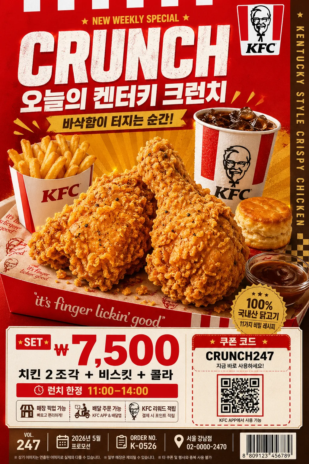
KFC-inspired Kentucky-style food poster/catalog visual using a bold red-and-gold fast-food advertising language. Designed as a vertical promotional key visual with product hero emphasis, real menu-board density, appetizing food detail, and strong commercial readability for a quick-service restaurant campaign.

[Composition]
- The main hero occupies about 55–60% of the frame, placed slightly below center so the upper headline and lower retail information feel like a finished in-store poster.
- Background uses a rich studio-advertising setup with KFC red dominance, clean white panels, warm brown-gold supporting blocks, printed tray-paper texture, subtle packaging edges, and small retail details that make the scene feel real.
- Keep the framing tight and commercial, with {적용 대상 (제품·매장·인물 자유)} as the central subject and clear readable placement for headline, price, coupon, and menu information.
- Use {브랜드 톤·시그니처} as the visual anchor, with strong top-to-bottom hierarchy, bold color rhythm, realistic fast-food packaging cues, and appetizing surface detail.
- Apply {비율} as the final vertical poster proportion, maintaining a premium catalog-ready crop suitable for storefront signage, delivery app banners, and printed menu inserts.

[3. CORE STRUCTURE]
1. Hero area (mid 55%): {적용 대상 (제품·매장·인물 자유)} rendered as the primary visual focus, shot as a crisp commercial subject with crunchy fried texture, warm oil sheen, visible seasoning specks, clean edge separation, and a slightly elevated angle. Add natural companion elements where appropriate, such as a red paper bucket, fries sleeve, biscuit, sauce cup, branded paper liner, napkin corner, a few realistic crumbs, and condensation on a drink cup, without overpowering the hero.
2. Supporting color blocks: bold red and white panels frame the subject, with warm brown and golden accents reinforcing the Kentucky fast-food mood. Include diagonal stripe panels, small checkerboard diner accents, subtle paper grain, and a golden burst shape behind the hero for promotional energy.
3. Headline zone (upper 15%): {타이포·카피} placed in a large advertisement-style arrangement with strong hierarchy, wide tracking for the main line, and a compact subtitle beneath. Add short Korean promo copy such as “오늘의 켄터키 크런치”, “바삭함이 터지는 순간”, and a small line “NEW WEEKLY SPECIAL” as secondary type.
4. Price / info zone (lower 20%): {레이아웃} translated into a clear retail structure, with the biggest numeric element emphasized and smaller supporting details aligned neatly below or beside it. Include realistic menu information: “SET ₩7,500”, “치킨 2조각 + 비스킷 + 콜라”, “런치 한정 11:00–14:00”, “매장 픽업 가능”, and a small coupon/QR-style box labeled “쿠폰 코드: CRUNCH247”.
5. Catalog and poster metadata: add tiny but readable production details like “VOL.247”, “2026년 5월 프로모션”, “ORDER NO. K-0526”, “서울 강남점 · 02-0000-2470”, and a small barcode area in the lower corner. Add a narrow vertical side text strip reading “KENTUCKY STYLE CRISPY CHICKEN” for a believable printed-ad finish.
6. Texture and finish: subtle fried-food gloss, paper-print poster texture, laminated menu-board sheen, warm reflections on sauce, soft shadow under packaging, and polished studio cutout treatment so the image looks like a premium fast-food campaign board rather than a flat mockup.

[4. STYLE RULES]
- Typography: bold sans-serif display fonts such as Pretendard ExtraBold or Noto Sans KR Black for Korean, paired with a compact condensed English style; headline size large, subtitle medium, supporting info small. Use realistic hierarchy with price numerals oversized, coupon text tiny but sharp, and feature blurbs arranged like a finished QSR retail poster.
- Color palette: {컬러 팔레트} with dominant #C8102E red, clean white #FFFFFF, warm brown #6B3F2A, and golden yellow #D9A441. Allow deep fryer-gold highlights, toasted shadows, creamy paper whites, and small black type accents for menu readability.
- Border/shadow: use a soft but defined drop shadow under the hero subject, around 4px vertical offset, 14px blur, 18% opacity, plus thin clean separators for copy blocks. Add subtle die-cut label shapes, coupon boxes, small barcode framing, and printed divider rules to create a realistic promotional layout.
- Food realism: fried surfaces should show irregular ridges, crisp coating, tiny salt crystals, darker browned edges, and warm highlights. Paper packaging may show folds, slight grease translucency, and printed red-white patterning.
- Brand tone: {브랜드 톤·시그니처} should feel like a confident Kentucky fast-food campaign, with energetic retail graphics, strong red-white-gold contrast, and appetizing commercial polish.

[5. VISUAL STYLE]
- Camera / lens: studio commercial food photography with a 90mm macro lens at f/8, sharp subject detail, shallow but controlled depth separation, and clean perspective.
- Lighting: studio key light from upper-left at 45° with a warm golden fill from the right, plus subtle rim light to define edges and texture. Reflect {라이팅·무드} through warm highlights on the food, gentle gloss on packaging, and controlled specular shine on sauce and drink surfaces.
- Color grade: saturated fast-food red, creamy white highlights, toasted brown shadows, and golden amber gloss with print-ad fidelity.
- Rendering quality: high-resolution commercial print finish, crisp Korean typography, realistic menu-board material, lightly textured paper background, and detailed product photography suitable for a premium restaurant promotion.

[6. MOOD]
Fast-food campaign poster — bold Kentucky diner advertising energy with a polished commercial menu-board feel, like a premium QSR key visual. The mood should feel appetizing, loud, warm, and retail-ready, with believable in-store promotional information and a sense of fresh hot food just served.

[7. CRITICAL]
- Korean text accuracy: the rendered image must keep all Korean text strings clean and correctly spelled if present, especially {브랜드 톤·시그니처}, {적용 대상 (제품·매장·인물 자유)}, {타이포·카피}, {레이아웃}, and any added Korean retail text such as “오늘의 켄터키 크런치”, “바삭함이 터지는 순간”, “SET ₩7,500”, “치킨 2조각 + 비스킷 + 콜라”, “런치 한정 11:00–14:00”, “매장 픽업 가능”, and “쿠폰 코드: CRUNCH247”.
- Composition must remain a vertical commercial poster with a strong hero-first hierarchy, not a casual lifestyle scene.
- The final image should look like a real printed fast-food promotional poster/catalog page with product photography, price information, barcode/coupon area, store/contact microcopy, and professional retail typography.
- Maintain the red-white-gold Kentucky-style visual language, the concrete camera/lens setup, and the {컬러 팔레트} identity throughout.

[8. 🚫 PROHIBITED]
- Fake official seals / certifications
- Broken Korean characters
- Celebrity composites or unauthorized likeness