廣告/海報
KFC 켄터키 스타일 비주얼
KFC 켄터키 결 시그니처 시각 톤만 빌려쓰는 결. 제품·매장·인물 자유.
KFC 켄터키 스타일 비주얼摘要
這是用來製作廣告/海報內容的 ChatGPT 圖像提示詞,已整理主題、背景、風格與構圖,方便快速調整。
相關關鍵字: KFC 켄터키 스타일 비주얼, KFC 켄터키 스타일 비주얼 프롬프트, 廣告/海報 프롬프트, 廣告/海報 AI 이미지 프롬프트, ChatGPT 이미지 프롬프트, AI 이미지 생성 프롬프트, AI 프롬프트, 이미지 프롬프트
KFC 켄터키 스타일 비주얼使用方式
保留原始結構並替換主體、背景、色彩或構圖,即可延伸出不同版本。
- 保留核心主體,並依品牌、季節或平台調整色彩與背景。
- 如果畫面太複雜,請減少背景元素並具體描述主體、構圖與光線。
- 複製後可要求 ChatGPT 配合平台、長寬比或文字需求調整。
提示詞原文
[Input]
- language: Korean
- output_size: 1024x1536

[Purpose]
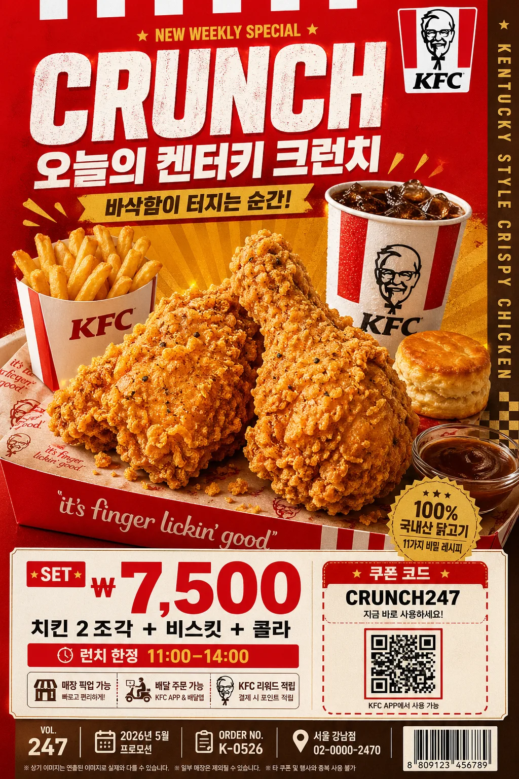
KFC-inspired Kentucky-style food poster/catalog visual using a bold red-and-gold fast-food advertising language. Designed as a vertical promotional key visual with product hero emphasis, real menu-board density, appetizing food detail, and strong commercial readability for a quick-service restaurant campaign.

[Composition]
- The main hero occupies about 55–60% of the frame, placed slightly below center so the upper headline and lower retail information feel like a finished in-store poster.
- Background uses a rich studio-advertising setup with KFC red dominance, clean white panels, warm brown-gold supporting blocks, printed tray-paper texture, subtle packaging edges, and small retail details that make the scene feel real.
- Keep the framing tight and commercial, with {적용 대상 (제품·매장·인물 자유)} as the central subject and clear readable placement for headline, price, coupon, and menu information.
- Use {브랜드 톤·시그니처} as the visual anchor, with strong top-to-bottom hierarchy, bold color rhythm, realistic fast-food packaging cues, and appetizing surface detail.
- Apply {비율} as the final vertical poster proportion, maintaining a premium catalog-ready crop suitable for storefront signage, delivery app banners, and printed menu inserts.

[3. CORE STRUCTURE]
1. Hero area (mid 55%): {적용 대상 (제품·매장·인물 자유)} rendered as the primary visual focus, shot as a crisp commercial subject with crunchy fried texture, warm oil sheen, visible seasoning specks, clean edge separation, and a slightly elevated angle. Add natural companion elements where appropriate, such as a red paper bucket, fries sleeve, biscuit, sauce cup, branded paper liner, napkin corner, a few realistic crumbs, and condensation on a drink cup, without overpowering the hero.
2. Supporting color blocks: bold red and white panels frame the subject, with warm brown and golden accents reinforcing the Kentucky fast-food mood. Include diagonal stripe panels, small checkerboard diner accents, subtle paper grain, and a golden burst shape behind the hero for promotional energy.
3. Headline zone (upper 15%): {타이포·카피} placed in a large advertisement-style arrangement with strong hierarchy, wide tracking for the main line, and a compact subtitle beneath. Add short Korean promo copy such as “오늘의 켄터키 크런치”, “바삭함이 터지는 순간”, and a small line “NEW WEEKLY SPECIAL” as secondary type.
4. Price / info zone (lower 20%): {레이아웃} translated into a clear retail structure, with the biggest numeric element emphasized and smaller supporting details aligned neatly below or beside it. Include realistic menu information: “SET ₩7,500”, “치킨 2조각 + 비스킷 + 콜라”, “런치 한정 11:00–14:00”, “매장 픽업 가능”, and a small coupon/QR-style box labeled “쿠폰 코드: CRUNCH247”.
5. Catalog and poster metadata: add tiny but readable production details like “VOL.247”, “2026년 5월 프로모션”, “ORDER NO. K-0526”, “서울 강남점 · 02-0000-2470”, and a small barcode area in the lower corner. Add a narrow vertical side text strip reading “KENTUCKY STYLE CRISPY CHICKEN” for a believable printed-ad finish.
6. Texture and finish: subtle fried-food gloss, paper-print poster texture, laminated menu-board sheen, warm reflections on sauce, soft shadow under packaging, and polished studio cutout treatment so the image looks like a premium fast-food campaign board rather than a flat mockup.

[4. STYLE RULES]
- Typography: bold sans-serif display fonts such as Pretendard ExtraBold or Noto Sans KR Black for Korean, paired with a compact condensed English style; headline size large, subtitle medium, supporting info small. Use realistic hierarchy with price numerals oversized, coupon text tiny but sharp, and feature blurbs arranged like a finished QSR retail poster.
- Color palette: {컬러 팔레트} with dominant #C8102E red, clean white #FFFFFF, warm brown #6B3F2A, and golden yellow #D9A441. Allow deep fryer-gold highlights, toasted shadows, creamy paper whites, and small black type accents for menu readability.
- Border/shadow: use a soft but defined drop shadow under the hero subject, around 4px vertical offset, 14px blur, 18% opacity, plus thin clean separators for copy blocks. Add subtle die-cut label shapes, coupon boxes, small barcode framing, and printed divider rules to create a realistic promotional layout.
- Food realism: fried surfaces should show irregular ridges, crisp coating, tiny salt crystals, darker browned edges, and warm highlights. Paper packaging may show folds, slight grease translucency, and printed red-white patterning.
- Brand tone: {브랜드 톤·시그니처} should feel like a confident Kentucky fast-food campaign, with energetic retail graphics, strong red-white-gold contrast, and appetizing commercial polish.

[5. VISUAL STYLE]
- Camera / lens: studio commercial food photography with a 90mm macro lens at f/8, sharp subject detail, shallow but controlled depth separation, and clean perspective.
- Lighting: studio key light from upper-left at 45° with a warm golden fill from the right, plus subtle rim light to define edges and texture. Reflect {라이팅·무드} through warm highlights on the food, gentle gloss on packaging, and controlled specular shine on sauce and drink surfaces.
- Color grade: saturated fast-food red, creamy white highlights, toasted brown shadows, and golden amber gloss with print-ad fidelity.
- Rendering quality: high-resolution commercial print finish, crisp Korean typography, realistic menu-board material, lightly textured paper background, and detailed product photography suitable for a premium restaurant promotion.

[6. MOOD]
Fast-food campaign poster — bold Kentucky diner advertising energy with a polished commercial menu-board feel, like a premium QSR key visual. The mood should feel appetizing, loud, warm, and retail-ready, with believable in-store promotional information and a sense of fresh hot food just served.

[7. CRITICAL]
- Korean text accuracy: the rendered image must keep all Korean text strings clean and correctly spelled if present, especially {브랜드 톤·시그니처}, {적용 대상 (제품·매장·인물 자유)}, {타이포·카피}, {레이아웃}, and any added Korean retail text such as “오늘의 켄터키 크런치”, “바삭함이 터지는 순간”, “SET ₩7,500”, “치킨 2조각 + 비스킷 + 콜라”, “런치 한정 11:00–14:00”, “매장 픽업 가능”, and “쿠폰 코드: CRUNCH247”.
- Composition must remain a vertical commercial poster with a strong hero-first hierarchy, not a casual lifestyle scene.
- The final image should look like a real printed fast-food promotional poster/catalog page with product photography, price information, barcode/coupon area, store/contact microcopy, and professional retail typography.
- Maintain the red-white-gold Kentucky-style visual language, the concrete camera/lens setup, and the {컬러 팔레트} identity throughout.

[8. 🚫 PROHIBITED]
- Fake official seals / certifications
- Broken Korean characters
- Celebrity composites or unauthorized likeness