광고/포스터
이케아 카탈로그 스타일 비주얼
IKEA 카탈로그 시그니처 시각 톤만 빌려쓰는 결. 제품·매장·인물 자유.
이케아 카탈로그 스타일 비주얼 검색 요약
이케아 카탈로그 스타일 비주얼은 광고/포스터 결과물을 만들 때 바로 복사해 활용할 수 있는 ChatGPT 이미지 프롬프트입니다. 주제, 배경, 스타일, 구도 조건을 함께 담아 빠르게 시안을 만들 수 있도록 구성했습니다.
관련 키워드: 이케아 카탈로그 스타일 비주얼, 이케아 카탈로그 스타일 비주얼 프롬프트, 광고/포스터 프롬프트, 광고/포스터 AI 이미지 프롬프트, ChatGPT 이미지 프롬프트, AI 이미지 생성 프롬프트, AI 프롬프트, 이미지 프롬프트
이케아 카탈로그 스타일 비주얼 활용 포인트
원본 구조를 유지하면서 피사체, 배경, 색감, 구도를 바꿔 다양한 시안으로 확장할 수 있습니다.
- 핵심 소재는 유지하고 브랜드, 계절, 채널 목적에 맞는 색감과 배경을 바꿔보세요.
- 결과가 산만하면 배경 요소를 줄이고 피사체, 구도, 조명 조건을 구체화하세요.
- 복사한 뒤 ChatGPT에서 플랫폼, 화면 비율, 텍스트 포함 여부를 추가로 요청할 수 있습니다.
프롬프트 원문
[Input]
- language: Korean
- output_size: 1024x1536

[Purpose]
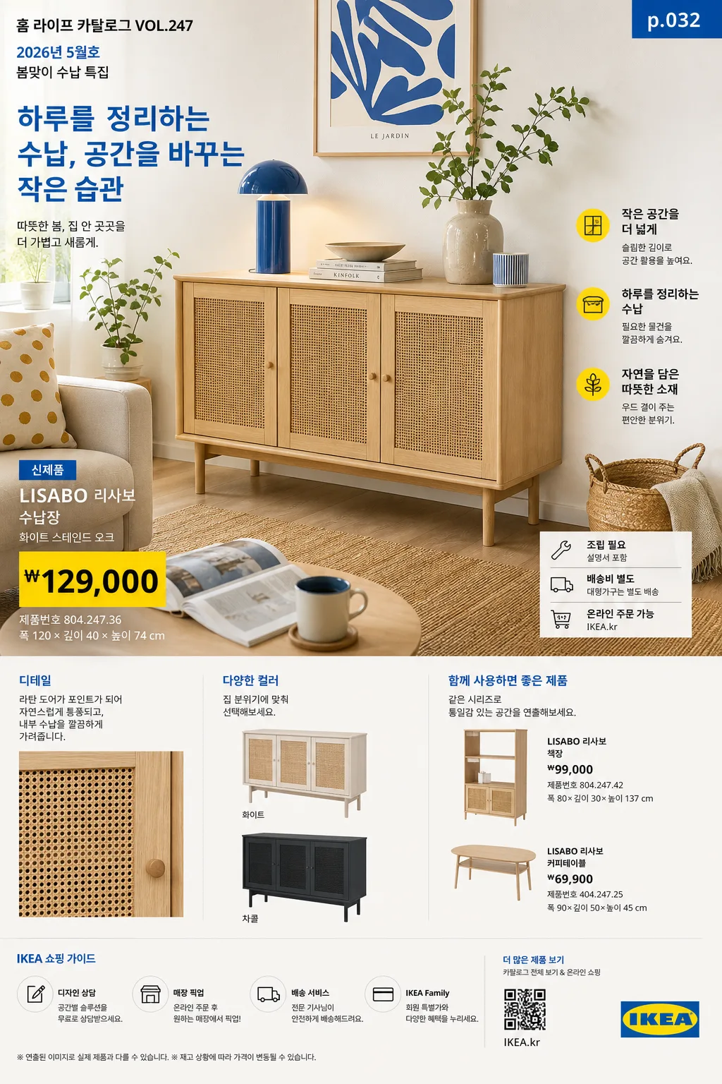
IKEA catalog-style advertising poster / catalog visual that borrows the recognizable room-set editorial language, price-box retail layout, practical product callouts, and warm Scandinavian home-furnishing presentation.
Target use: product showcase, store promo, seasonal catalog page, or lifestyle poster with an unmistakable Scandinavian catalog feel and enough real retail details to look printed and shoppable.

[Composition]
- Main scene: a bright lived-in room-set composition with {적용 대상 (제품·매장·인물 자유)} staged as the focal subject, occupying about 55–65% of the frame.
- Background treatment: warm-white walls, light oak or birch floor, natural woven textures, books, plants, ceramics, textiles, cushions, lamps, baskets, and everyday home objects arranged with believable showroom styling.
- Spacing and framing: strong editorial grid, clear visual hierarchy, and a balanced left-right distribution between hero area, product callouts, seasonal notes, and retail information blocks.
- Visual tone: use {브랜드 톤·시그니처} as the overall styling direction, with catalog-like product clarity supported by realistic home details, material texture, and practical room context.
- Catalog context: make the page feel like one page from a real annual home catalog, including issue/date labeling, product names, price blocks, SKU-like numbers, dimensions, and small shopping guidance.

[3. CORE STRUCTURE]
1) Hero room-set area (top 55–60%): arrange {적용 대상 (제품·매장·인물 자유)} in a staged interior scene, centered slightly off-center for a natural catalog composition, with believable styling objects such as a side table, rug, wall shelf, lamp glow, framed print, folded throw, houseplant, storage box, cup, magazine, and small personal items.
2) Secondary product detail area: show two or three supporting product views with consistent angles, smaller scale, close-up material crops, color variations, and practical accessory pairings so the spread feels like a furniture catalog page rather than a plain poster.
3) Price / information blocks: place structured retail-style info boxes with crisp alignment, using {타이포·카피} typography treatment and clear separation rules. Include Korean product names and realistic retail text such as “신제품”, “조립 필요”, “온라인 주문 가능”, “매장 픽업”, “배송비 별도”, “₩79,900”, “₩129,000”, “폭 120 × 깊이 40 × 높이 74 cm”, and “제품번호 804.247.36”.
4) Catalog metadata: add a small top label like “홈 라이프 카탈로그 VOL.247”, “2026년 5월호”, “봄맞이 수납 특집”, plus a small page number such as “p.032” and a tiny barcode / QR-style shopping area near the lower edge.
5) Feature copy and callouts: include 2–3 short Korean blurbs placed around the room-set, for example “작은 공간을 더 넓게”, “하루를 정리하는 수납”, “오늘 바로 바꾸는 거실”, and a main catalog line based on {타이포·카피}.
6) Layout anchoring: follow {레이아웃} so the page reads like a real catalog spread, with hero image, supporting product tiles, material close-ups, product callouts, price cards, barcode area, date label, and shopping notes clearly segmented.
7) Color application: apply {컬러 팔레트} to furniture, accents, textiles, graphic blocks, labels, and small decorative elements while keeping the base environment bright, airy, and neutral.
8) Light and atmosphere: use {라이팅·무드} but make it directional and realistic, with daylight entering from a visible or implied window direction, preserving fabric weave, wood grain, matte plastic, metal edges, paper texture, and natural contact shadows.

[4. STYLE RULES]
- Typography: use bold sans-serif catalog typography such as Helvetica Neue, Akzidenz-Grotesk, or Pretendard Bold for headers; Noto Sans KR for Korean body copy; price text in compact bold numerals, 22–40px for headers and 14–22px for support text.
- Color palette: {컬러 팔레트} plus clean off-white #F6F3EE, soft gray #D9D9D9, pale blue retail accents, muted yellow price tags, and warm birch wood tones for grounding.
- Graphic treatment: thin divider lines, structured price-box outlines, small colored tabs, product-number labels, simple arrow callouts, barcode / QR-style shopping block, and soft natural contact shadows under furniture.
- Realism details: show tactile materials and practical home styling — linen wrinkles, woven rug fibers, wood grain, ceramic glaze, plant leaves, paper catalog edges, shelf objects, cable management, storage bins, and slight natural imperfections.
- Retail page authenticity: include a small footer line such as “가격은 2026.05 기준 · 일부 매장 재고 상이”, a compact store guidance line such as “온라인 주문 / 매장 픽업 가능”, and a small credit line like “스타일링 김하린 · 사진 박준서”.

[5. VISUAL STYLE]
- Camera / lens: clean interior editorial photography, full-frame 24mm or 35mm lens, f/5.6 to f/8, straight-on or slightly elevated catalog perspective, precise perspective correction.
- Lighting: bright diffused daylight from large window direction, soft fill from the opposite side, subtle bounce on white walls, controlled shadow softness for showroom clarity.
- Color grade: Scandinavian retail catalog grade with cool-white neutrality, pale blue accents, warm birch wood, restrained yellow highlights, realistic skin/material tones if people appear, and clean printed-catalog contrast.
- Image finish: looks like a high-resolution printed catalog page photographed or exported cleanly, with crisp layout edges, accurate product silhouettes, and readable Korean retail text.

[6. MOOD]
Scandinavian home catalog editorial — crisp IKEA-style room-set spread with orderly retail clarity, warm everyday design energy, practical shopping details, and a cozy realistic home atmosphere.

[7. CRITICAL]
- Korean text accuracy: any Korean copy included in the design must render cleanly with no broken characters.
- Include realistic Korean catalog text elements: “홈 라이프 카탈로그 VOL.247”, “2026년 5월호”, “신제품”, “온라인 주문 가능”, “매장 픽업”, “제품번호 804.247.36”, “₩79,900”, “₩129,000”, “가격은 2026.05 기준”, and short feature blurbs such as “작은 공간을 더 넓게” or “오늘 바로 바꾸는 거실”.
- Layout invariant: maintain the iconic catalog-like hierarchy of room-set hero, supporting product views, product callouts, page metadata, barcode / QR-style shopping block, and price/info blocks; the page must feel like a furniture catalog spread, not a generic ad.
- Keep {브랜드 톤·시그니처}, {적용 대상 (제품·매장·인물 자유)}, {컬러 팔레트}, {라이팅·무드}, {타이포·카피}, {레이아웃}, and {비율} visually respected exactly as the user’s chosen direction.

[8. 🚫 PROHIBITED]
- Fake official seals / certifications
- Broken Korean characters