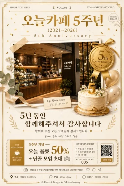
廣告/海報
이케아 카탈로그 스타일 비주얼
IKEA 카탈로그 시그니처 시각 톤만 빌려쓰는 결. 제품·매장·인물 자유.
이케아 카탈로그 스타일 비주얼摘要
這是用來製作廣告/海報內容的 ChatGPT 圖像提示詞,已整理主題、背景、風格與構圖,方便快速調整。
相關關鍵字: 이케아 카탈로그 스타일 비주얼, 이케아 카탈로그 스타일 비주얼 프롬프트, 廣告/海報 프롬프트, 廣告/海報 AI 이미지 프롬프트, ChatGPT 이미지 프롬프트, AI 이미지 생성 프롬프트, AI 프롬프트, 이미지 프롬프트
이케아 카탈로그 스타일 비주얼使用方式
保留原始結構並替換主體、背景、色彩或構圖,即可延伸出不同版本。
- 保留核心主體,並依品牌、季節或平台調整色彩與背景。
- 如果畫面太複雜,請減少背景元素並具體描述主體、構圖與光線。
- 複製後可要求 ChatGPT 配合平台、長寬比或文字需求調整。
提示詞原文
[Input]
- language: Korean
- output_size: 1024x1536

[Purpose]
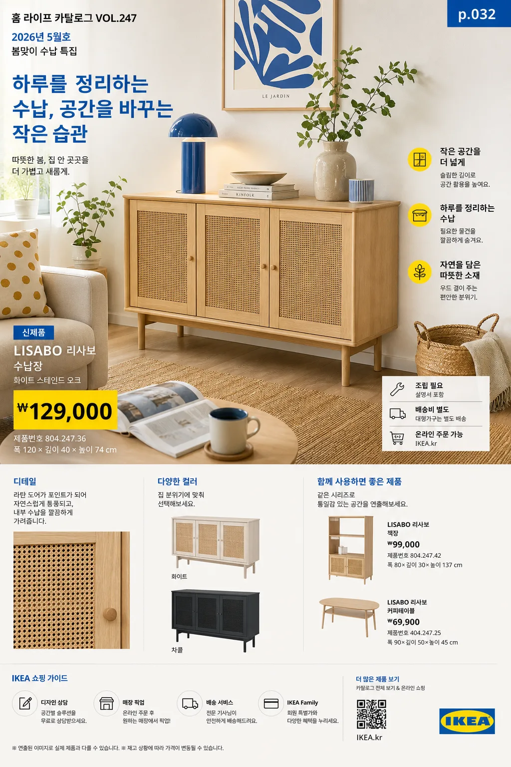
IKEA catalog-style advertising poster / catalog visual that borrows the recognizable room-set editorial language, price-box retail layout, practical product callouts, and warm Scandinavian home-furnishing presentation.
Target use: product showcase, store promo, seasonal catalog page, or lifestyle poster with an unmistakable Scandinavian catalog feel and enough real retail details to look printed and shoppable.

[Composition]
- Main scene: a bright lived-in room-set composition with {적용 대상 (제품·매장·인물 자유)} staged as the focal subject, occupying about 55–65% of the frame.
- Background treatment: warm-white walls, light oak or birch floor, natural woven textures, books, plants, ceramics, textiles, cushions, lamps, baskets, and everyday home objects arranged with believable showroom styling.
- Spacing and framing: strong editorial grid, clear visual hierarchy, and a balanced left-right distribution between hero area, product callouts, seasonal notes, and retail information blocks.
- Visual tone: use {브랜드 톤·시그니처} as the overall styling direction, with catalog-like product clarity supported by realistic home details, material texture, and practical room context.
- Catalog context: make the page feel like one page from a real annual home catalog, including issue/date labeling, product names, price blocks, SKU-like numbers, dimensions, and small shopping guidance.

[3. CORE STRUCTURE]
1) Hero room-set area (top 55–60%): arrange {적용 대상 (제품·매장·인물 자유)} in a staged interior scene, centered slightly off-center for a natural catalog composition, with believable styling objects such as a side table, rug, wall shelf, lamp glow, framed print, folded throw, houseplant, storage box, cup, magazine, and small personal items.
2) Secondary product detail area: show two or three supporting product views with consistent angles, smaller scale, close-up material crops, color variations, and practical accessory pairings so the spread feels like a furniture catalog page rather than a plain poster.
3) Price / information blocks: place structured retail-style info boxes with crisp alignment, using {타이포·카피} typography treatment and clear separation rules. Include Korean product names and realistic retail text such as “신제품”, “조립 필요”, “온라인 주문 가능”, “매장 픽업”, “배송비 별도”, “₩79,900”, “₩129,000”, “폭 120 × 깊이 40 × 높이 74 cm”, and “제품번호 804.247.36”.
4) Catalog metadata: add a small top label like “홈 라이프 카탈로그 VOL.247”, “2026년 5월호”, “봄맞이 수납 특집”, plus a small page number such as “p.032” and a tiny barcode / QR-style shopping area near the lower edge.
5) Feature copy and callouts: include 2–3 short Korean blurbs placed around the room-set, for example “작은 공간을 더 넓게”, “하루를 정리하는 수납”, “오늘 바로 바꾸는 거실”, and a main catalog line based on {타이포·카피}.
6) Layout anchoring: follow {레이아웃} so the page reads like a real catalog spread, with hero image, supporting product tiles, material close-ups, product callouts, price cards, barcode area, date label, and shopping notes clearly segmented.
7) Color application: apply {컬러 팔레트} to furniture, accents, textiles, graphic blocks, labels, and small decorative elements while keeping the base environment bright, airy, and neutral.
8) Light and atmosphere: use {라이팅·무드} but make it directional and realistic, with daylight entering from a visible or implied window direction, preserving fabric weave, wood grain, matte plastic, metal edges, paper texture, and natural contact shadows.

[4. STYLE RULES]
- Typography: use bold sans-serif catalog typography such as Helvetica Neue, Akzidenz-Grotesk, or Pretendard Bold for headers; Noto Sans KR for Korean body copy; price text in compact bold numerals, 22–40px for headers and 14–22px for support text.
- Color palette: {컬러 팔레트} plus clean off-white #F6F3EE, soft gray #D9D9D9, pale blue retail accents, muted yellow price tags, and warm birch wood tones for grounding.
- Graphic treatment: thin divider lines, structured price-box outlines, small colored tabs, product-number labels, simple arrow callouts, barcode / QR-style shopping block, and soft natural contact shadows under furniture.
- Realism details: show tactile materials and practical home styling — linen wrinkles, woven rug fibers, wood grain, ceramic glaze, plant leaves, paper catalog edges, shelf objects, cable management, storage bins, and slight natural imperfections.
- Retail page authenticity: include a small footer line such as “가격은 2026.05 기준 · 일부 매장 재고 상이”, a compact store guidance line such as “온라인 주문 / 매장 픽업 가능”, and a small credit line like “스타일링 김하린 · 사진 박준서”.

[5. VISUAL STYLE]
- Camera / lens: clean interior editorial photography, full-frame 24mm or 35mm lens, f/5.6 to f/8, straight-on or slightly elevated catalog perspective, precise perspective correction.
- Lighting: bright diffused daylight from large window direction, soft fill from the opposite side, subtle bounce on white walls, controlled shadow softness for showroom clarity.
- Color grade: Scandinavian retail catalog grade with cool-white neutrality, pale blue accents, warm birch wood, restrained yellow highlights, realistic skin/material tones if people appear, and clean printed-catalog contrast.
- Image finish: looks like a high-resolution printed catalog page photographed or exported cleanly, with crisp layout edges, accurate product silhouettes, and readable Korean retail text.

[6. MOOD]
Scandinavian home catalog editorial — crisp IKEA-style room-set spread with orderly retail clarity, warm everyday design energy, practical shopping details, and a cozy realistic home atmosphere.

[7. CRITICAL]
- Korean text accuracy: any Korean copy included in the design must render cleanly with no broken characters.
- Include realistic Korean catalog text elements: “홈 라이프 카탈로그 VOL.247”, “2026년 5월호”, “신제품”, “온라인 주문 가능”, “매장 픽업”, “제품번호 804.247.36”, “₩79,900”, “₩129,000”, “가격은 2026.05 기준”, and short feature blurbs such as “작은 공간을 더 넓게” or “오늘 바로 바꾸는 거실”.
- Layout invariant: maintain the iconic catalog-like hierarchy of room-set hero, supporting product views, product callouts, page metadata, barcode / QR-style shopping block, and price/info blocks; the page must feel like a furniture catalog spread, not a generic ad.
- Keep {브랜드 톤·시그니처}, {적용 대상 (제품·매장·인물 자유)}, {컬러 팔레트}, {라이팅·무드}, {타이포·카피}, {레이아웃}, and {비율} visually respected exactly as the user’s chosen direction.

[8. 🚫 PROHIBITED]
- Fake official seals / certifications
- Broken Korean characters