Ads/Posters
보험·재무 설계사 퍼스널 브랜드 광고
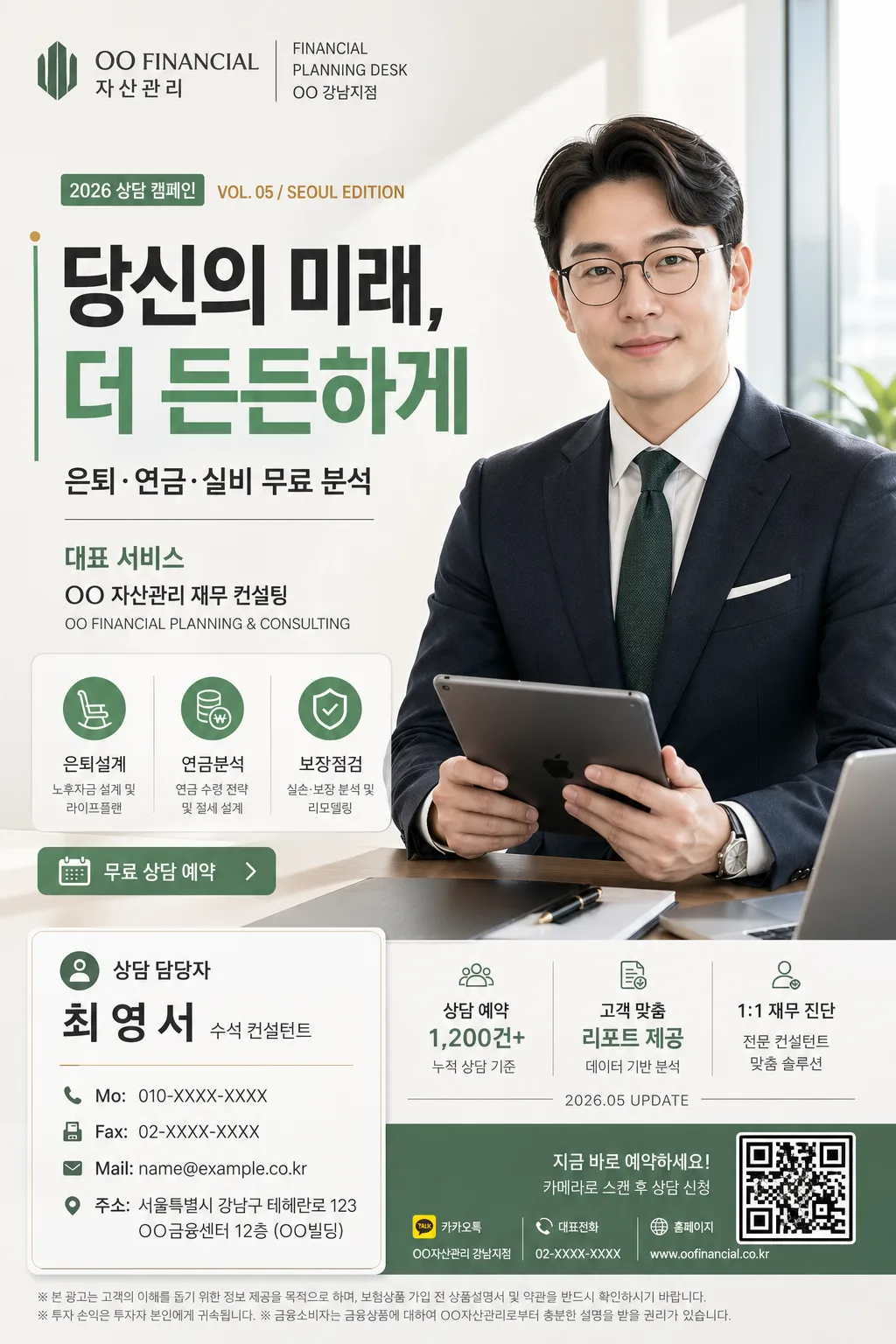
본인 사진 → 보험·재무 설계사 영업 광고 결. 회사 BI + 헤드라인 + 명함 박스 + 정장 hero.
보험·재무 설계사 퍼스널 브랜드 광고 summary
Copy this ChatGPT image prompt to create Ads/Posters results. Its subject, background, style, and composition are organized for quick iteration.
Related keywords: 보험·재무 설계사 퍼스널 브랜드 광고, 보험·재무 설계사 퍼스널 브랜드 광고 프롬프트, Ads/Posters 프롬프트, Ads/Posters AI 이미지 프롬프트, ChatGPT 이미지 프롬프트, AI 이미지 생성 프롬프트, AI 프롬프트, 이미지 프롬프트
How to use 보험·재무 설계사 퍼스널 브랜드 광고
Keep the prompt structure and swap the subject, background, palette, or composition to create new variations.
- Keep the main subject and adjust the palette and background for your brand, season, or channel.
- If the result feels busy, simplify the background and make the subject, composition, and lighting more specific.
- After copying, ask ChatGPT to adapt it for your platform, aspect ratio, or text requirements.
Original prompt
[Input]
- reference_image: {참고 이미지}
- language: Korean
- output_size: 1024x1536

[Purpose]
Korean insurance/financial planner personal-brand advertisement, A4 vertical flyer for social media and print lead generation.
Premium corporate editorial promo poster with a strong left-side headline, right-side portrait hero, bottom-left contact card, and realistic campaign details that make it feel like an actual advisor advertisement from a Seoul financial firm.

[Composition]
- Left 42%: large headline block with {큰 한글 헤드라인} as the dominant anchor, followed by {부제} and {대표 서비스 강조} stacked with clear hierarchy.
- Right 38%: {원본 인물} rendered as a professional hero portrait, standing or seated in a confident 3/4-to-front pose with {인물 자세}, dressed in a tailored suit suitable for {직업·전문분야}.
- Bottom-left 24%: a polished contact card containing {명함 박스}, aligned with the headline column, designed like a real advisor business-card panel with phone, email, address, role, and consultation label.
- Top-left brand mark area: {회사명·로고} placed as a compact corporate lockup with a small campaign date label and branch-style micro text.
- Mid-to-lower left service strip: add 3 compact service badges such as “은퇴설계”, “연금분석”, “보장점검”, plus a small “무료 상담 예약” CTA button.
- Bottom-right support area: add a subtle QR-code-like reservation box, a short disclaimer line, and tiny channel/contact micro icons to make the flyer feel print-ready.
- Background: bright premium studio-office setting with a pale gradient wall, faint glass partition, warm desk surface hints, and realistic shadow depth; include {배경·라이팅}, {컬러 팔레트}, {소품}, and {비율} as integrated visual elements.
- All major Korean text fields must be clearly legible, with smaller micro text used only for realistic advertising detail.

[3. CORE STRUCTURE]
1) Hero portrait area (right side, mid-to-upper 60%): {원본 인물} in a tailored suit, holding a tablet or portfolio naturally, preserved face identity from the reference image, crisp portrait edges, realistic skin texture, natural fabric wrinkles, and a soft grounded shadow on the studio-office background.
2) Main headline area (left side, upper 35%): {큰 한글 헤드라인} set in oversized bold Korean sans-serif, aligned left, with a refined sage green vertical accent line, a small gold dot marker, and balanced line breaks for strong poster readability.
3) Subheadline and service area (left-middle, 18%): place {부제} directly below the headline, then {대표 서비스 강조} as a smaller supporting line; include a realistic service list panel reading “대표 서비스”, “은퇴·연금·실비 무료 분석”, “보장 리모델링”, “가족 재무 상담”.
4) Brand and campaign header (top-left, 8%): {회사명·로고} in a premium corporate lockup with small supporting text such as “FINANCIAL PLANNING DESK”, “2026 상담 캠페인”, and “VOL. 05 / SEOUL EDITION”.
5) Advisor credibility strip (under portrait or lower center): add small stat cards and profile tags, for example “상담 예약 1,200건+”, “고객 맞춤 리포트 제공”, “1:1 재무 진단”, plus a date stamp “2026.05 UPDATE”; style them as brand badges, not official certifications.
6) Contact card area (bottom-left, 16%): {명함 박스} inside a white card with a thin border, soft shadow, section dividers, and realistic business-card hierarchy: “상담 담당자”, advisor name, “수석 컨설턴트”, “Mo:”, “Fax”, “Mail:”, “주소”.
7) Props and environment: {소품} should appear naturally near the lower-right or around the portrait, such as a tablet screen with a blurred financial chart, fountain pen, notebook, insurance brochure, coffee cup, desk calendar, and a few documents with sage-green tabs.
8) Background finishing: {배경·라이팅} should create gentle depth with a clean editorial studio-office look, faint architectural lines, realistic reflections on glass, and a soft premium atmosphere without distracting from the headline and portrait.

[4. STYLE RULES]
- Typography: Pretendard ExtraBold or Noto Sans KR Bold for the headline, Pretendard Medium for subtext, and Pretendard Regular for contact details; headline size should be visually dominant, roughly 3–4x the body copy.
- Korean advertising text should feel real and short: add readable labels such as “무료 상담 예약”, “오늘의 보장 점검”, “월 보험료 리포트”, “가족 재무 플랜”, “상담 가능 시간 09:00–18:00”.
- Color palette: use {컬러 팔레트} with white #FFFFFF, charcoal #2B2B2B, soft sage green #5A8A6F, and a small gold accent #C8A96A for premium highlights.
- Border/shadow: use layered white and warm-gray cards with 1px light gray border #E6E6E6, fine sage-green divider lines, and a soft drop shadow of 0px x-offset, 6px y-offset, 18px blur, 12% opacity.
- Layout treatment: maintain consistent baseline alignment, strong left-right balance, readable spacing, realistic print-safe edges, and a refined corporate editorial feel with small but purposeful supporting details.
- Logo treatment: {회사명·로고} may appear as an actual brand-style mark if provided; keep it sharp, aligned, and proportionate to the headline and contact card.

[5. VISUAL STYLE]
- Camera / lens: full-frame 85mm f/1.4 portrait look, shallow depth of field, crisp facial detail, commercial campaign photography framing.
- Lighting: soft window light from upper-left at about 45°, gentle fill from front-right, subtle rim separation on the portrait edges, studio-clean and flattering.
- Color grade: neutral white balance with sage green brand accents, charcoal text, and slightly warm skin tones; premium corporate editorial grade, clean and modern.
- Material detail: realistic suit weave, paper grain on contact card and brochure, slight glass reflection in the background, subtle metallic shine on pen or watch, and natural tablet reflections.

[6. MOOD]
Premium financial-advisor brand campaign — a credible Seoul business advertisement with magazine-like polish, personal trust, practical consultation information, and a warm professional tone.

[7. CRITICAL]
- Korean text accuracy: “당신의 미래, 더 든든하게”, “은퇴·연금·실비 무료 분석”, “대표 서비스”, “상담 담당자”, “수석 컨설턴트”, “Mo:”, “Fax”, “Mail:”, “주소” must appear correctly and legibly.
- Additional realistic Korean microcopy may include: “무료 상담 예약”, “오늘의 보장 점검”, “가족 재무 플랜”, “2026 상담 캠페인”, “VOL. 05 / SEOUL EDITION”, “상담 가능 시간 09:00–18:00”, “보장 리모델링”, “1:1 재무 진단”.
- Preserve the exact face from {원본 인물}; do not change identity, age, expression, or gender presentation.
- Left-side headline must remain the dominant text block; right-side portrait hero must remain prominent and professionally dressed in a suit.
- Bottom-left contact card must include name, phone, email, and address in a real business-card layout.
- The flyer must look like a finished real advertisement, not a blank template: include campaign labels, service badges, advisor profile details, contact hierarchy, and small print-production details while keeping hierarchy readable.

[8. 🚫 PROHIBITED]
- Fake official seals / certifications
- Broken Korean characters
- Celebrity composites / unauthorized likeness