廣告/海報
보험·재무 설계사 퍼스널 브랜드 광고
본인 사진 → 보험·재무 설계사 영업 광고 결. 회사 BI + 헤드라인 + 명함 박스 + 정장 hero.
보험·재무 설계사 퍼스널 브랜드 광고摘要
這是用來製作廣告/海報內容的 ChatGPT 圖像提示詞,已整理主題、背景、風格與構圖,方便快速調整。
相關關鍵字: 보험·재무 설계사 퍼스널 브랜드 광고, 보험·재무 설계사 퍼스널 브랜드 광고 프롬프트, 廣告/海報 프롬프트, 廣告/海報 AI 이미지 프롬프트, ChatGPT 이미지 프롬프트, AI 이미지 생성 프롬프트, AI 프롬프트, 이미지 프롬프트
보험·재무 설계사 퍼스널 브랜드 광고使用方式
保留原始結構並替換主體、背景、色彩或構圖,即可延伸出不同版本。
- 保留核心主體,並依品牌、季節或平台調整色彩與背景。
- 如果畫面太複雜,請減少背景元素並具體描述主體、構圖與光線。
- 複製後可要求 ChatGPT 配合平台、長寬比或文字需求調整。
提示詞原文
[Input]
- reference_image: {참고 이미지}
- language: Korean
- output_size: 1024x1536

[Purpose]
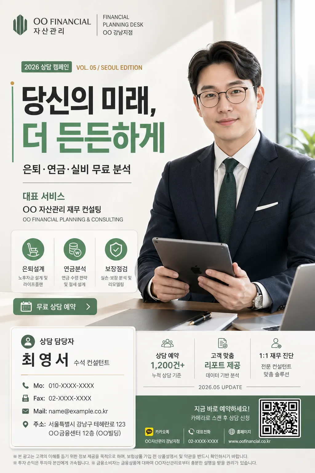
Korean insurance/financial planner personal-brand advertisement, A4 vertical flyer for social media and print lead generation.
Premium corporate editorial promo poster with a strong left-side headline, right-side portrait hero, bottom-left contact card, and realistic campaign details that make it feel like an actual advisor advertisement from a Seoul financial firm.

[Composition]
- Left 42%: large headline block with {큰 한글 헤드라인} as the dominant anchor, followed by {부제} and {대표 서비스 강조} stacked with clear hierarchy.
- Right 38%: {원본 인물} rendered as a professional hero portrait, standing or seated in a confident 3/4-to-front pose with {인물 자세}, dressed in a tailored suit suitable for {직업·전문분야}.
- Bottom-left 24%: a polished contact card containing {명함 박스}, aligned with the headline column, designed like a real advisor business-card panel with phone, email, address, role, and consultation label.
- Top-left brand mark area: {회사명·로고} placed as a compact corporate lockup with a small campaign date label and branch-style micro text.
- Mid-to-lower left service strip: add 3 compact service badges such as “은퇴설계”, “연금분석”, “보장점검”, plus a small “무료 상담 예약” CTA button.
- Bottom-right support area: add a subtle QR-code-like reservation box, a short disclaimer line, and tiny channel/contact micro icons to make the flyer feel print-ready.
- Background: bright premium studio-office setting with a pale gradient wall, faint glass partition, warm desk surface hints, and realistic shadow depth; include {배경·라이팅}, {컬러 팔레트}, {소품}, and {비율} as integrated visual elements.
- All major Korean text fields must be clearly legible, with smaller micro text used only for realistic advertising detail.

[3. CORE STRUCTURE]
1) Hero portrait area (right side, mid-to-upper 60%): {원본 인물} in a tailored suit, holding a tablet or portfolio naturally, preserved face identity from the reference image, crisp portrait edges, realistic skin texture, natural fabric wrinkles, and a soft grounded shadow on the studio-office background.
2) Main headline area (left side, upper 35%): {큰 한글 헤드라인} set in oversized bold Korean sans-serif, aligned left, with a refined sage green vertical accent line, a small gold dot marker, and balanced line breaks for strong poster readability.
3) Subheadline and service area (left-middle, 18%): place {부제} directly below the headline, then {대표 서비스 강조} as a smaller supporting line; include a realistic service list panel reading “대표 서비스”, “은퇴·연금·실비 무료 분석”, “보장 리모델링”, “가족 재무 상담”.
4) Brand and campaign header (top-left, 8%): {회사명·로고} in a premium corporate lockup with small supporting text such as “FINANCIAL PLANNING DESK”, “2026 상담 캠페인”, and “VOL. 05 / SEOUL EDITION”.
5) Advisor credibility strip (under portrait or lower center): add small stat cards and profile tags, for example “상담 예약 1,200건+”, “고객 맞춤 리포트 제공”, “1:1 재무 진단”, plus a date stamp “2026.05 UPDATE”; style them as brand badges, not official certifications.
6) Contact card area (bottom-left, 16%): {명함 박스} inside a white card with a thin border, soft shadow, section dividers, and realistic business-card hierarchy: “상담 담당자”, advisor name, “수석 컨설턴트”, “Mo:”, “Fax”, “Mail:”, “주소”.
7) Props and environment: {소품} should appear naturally near the lower-right or around the portrait, such as a tablet screen with a blurred financial chart, fountain pen, notebook, insurance brochure, coffee cup, desk calendar, and a few documents with sage-green tabs.
8) Background finishing: {배경·라이팅} should create gentle depth with a clean editorial studio-office look, faint architectural lines, realistic reflections on glass, and a soft premium atmosphere without distracting from the headline and portrait.

[4. STYLE RULES]
- Typography: Pretendard ExtraBold or Noto Sans KR Bold for the headline, Pretendard Medium for subtext, and Pretendard Regular for contact details; headline size should be visually dominant, roughly 3–4x the body copy.
- Korean advertising text should feel real and short: add readable labels such as “무료 상담 예약”, “오늘의 보장 점검”, “월 보험료 리포트”, “가족 재무 플랜”, “상담 가능 시간 09:00–18:00”.
- Color palette: use {컬러 팔레트} with white #FFFFFF, charcoal #2B2B2B, soft sage green #5A8A6F, and a small gold accent #C8A96A for premium highlights.
- Border/shadow: use layered white and warm-gray cards with 1px light gray border #E6E6E6, fine sage-green divider lines, and a soft drop shadow of 0px x-offset, 6px y-offset, 18px blur, 12% opacity.
- Layout treatment: maintain consistent baseline alignment, strong left-right balance, readable spacing, realistic print-safe edges, and a refined corporate editorial feel with small but purposeful supporting details.
- Logo treatment: {회사명·로고} may appear as an actual brand-style mark if provided; keep it sharp, aligned, and proportionate to the headline and contact card.

[5. VISUAL STYLE]
- Camera / lens: full-frame 85mm f/1.4 portrait look, shallow depth of field, crisp facial detail, commercial campaign photography framing.
- Lighting: soft window light from upper-left at about 45°, gentle fill from front-right, subtle rim separation on the portrait edges, studio-clean and flattering.
- Color grade: neutral white balance with sage green brand accents, charcoal text, and slightly warm skin tones; premium corporate editorial grade, clean and modern.
- Material detail: realistic suit weave, paper grain on contact card and brochure, slight glass reflection in the background, subtle metallic shine on pen or watch, and natural tablet reflections.

[6. MOOD]
Premium financial-advisor brand campaign — a credible Seoul business advertisement with magazine-like polish, personal trust, practical consultation information, and a warm professional tone.

[7. CRITICAL]
- Korean text accuracy: “당신의 미래, 더 든든하게”, “은퇴·연금·실비 무료 분석”, “대표 서비스”, “상담 담당자”, “수석 컨설턴트”, “Mo:”, “Fax”, “Mail:”, “주소” must appear correctly and legibly.
- Additional realistic Korean microcopy may include: “무료 상담 예약”, “오늘의 보장 점검”, “가족 재무 플랜”, “2026 상담 캠페인”, “VOL. 05 / SEOUL EDITION”, “상담 가능 시간 09:00–18:00”, “보장 리모델링”, “1:1 재무 진단”.
- Preserve the exact face from {원본 인물}; do not change identity, age, expression, or gender presentation.
- Left-side headline must remain the dominant text block; right-side portrait hero must remain prominent and professionally dressed in a suit.
- Bottom-left contact card must include name, phone, email, and address in a real business-card layout.
- The flyer must look like a finished real advertisement, not a blank template: include campaign labels, service badges, advisor profile details, contact hierarchy, and small print-production details while keeping hierarchy readable.

[8. 🚫 PROHIBITED]
- Fake official seals / certifications
- Broken Korean characters
- Celebrity composites / unauthorized likeness