Ads/Posters
치과 임플란트·교정 광고
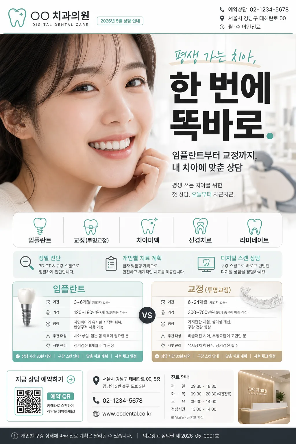
치과 임플란트·교정 광고. 미소 hero + 시술 비교 + 가격 안내.
치과 임플란트·교정 광고 summary
Copy this ChatGPT image prompt to create Ads/Posters results. Its subject, background, style, and composition are organized for quick iteration.
Related keywords: 치과 임플란트·교정 광고, 치과 임플란트·교정 광고 프롬프트, Ads/Posters 프롬프트, Ads/Posters AI 이미지 프롬프트, ChatGPT 이미지 프롬프트, AI 이미지 생성 프롬프트, AI 프롬프트, 이미지 프롬프트
How to use 치과 임플란트·교정 광고
Keep the prompt structure and swap the subject, background, palette, or composition to create new variations.
- Keep the main subject and adjust the palette and background for your brand, season, or channel.
- If the result feels busy, simplify the background and make the subject, composition, and lighting more specific.
- After copying, ask ChatGPT to adapt it for your platform, aspect ratio, or text requirements.
Original prompt
[Input]
- language: Korean
- output_size: 1024x1536

[Purpose]
Korean dental clinic advertising flyer, A4 vertical social-media/print hybrid. Realistic premium medical promo layout for implant, orthodontics, whitening, and root canal services, with clinic-contact details, consultation information, seasonal campaign labeling, and a polished healthcare advertising finish.

[Composition]
- Top-left logo zone: {치과명·로고} placed inside a professional header block, occupying about 12% of the canvas width, paired with small clinic identity text such as “DIGITAL DENTAL CARE” and a compact date label “2026년 5월 상담 안내”.
- Header utility zone: add realistic small print details on the top-right: “예약상담 02-1234-5678”, “서울시 강남구 테헤란로 00”, and “월·수 야간진료”, aligned with the clinic brand system.
- Hero zone: {미소 hero} fills the upper-middle 38–42% of the poster, photographed as a natural dental-ad smile portrait with real skin texture, realistic teeth alignment, soft cheek detail, and a confident but believable expression.
- Headline zone: {헤드라인} centered or slightly upper-right, sized as the primary attention anchor, with crisp Korean typography and supporting subcopy beneath: “임플란트부터 교정까지, 내 치아에 맞춘 상담”.
- Service information zone: {시술 안내} arranged in two balanced comparison cards in the lower-middle area, easy to scan at a glance, with realistic labels for “진료 포인트”, “예상 상담 시간”, “추천 대상”, and “사후 관리”.
- Campaign detail zone: include a slim mint/beige information band with {시술 분야} as pill-style tags, plus short Korean blurbs such as “정밀 진단”, “개인별 치료 계획”, “디지털 스캔 상담”.
- Footer action zone: include consultation CTA, QR-style reservation box, small map-pin icon area, clinic hours, and fine-print treatment notice text, maintaining a premium clinic-ad structure.
- Overall background: bright clinical white base with subtle soft beige and mint accents, smooth paper-like finish, gentle editorial layering, realistic printed-flyer depth, and clear hierarchy.
- Use {시술 분야}, {컬러 팔레트}, and {비율} as controllable content anchors while keeping the dental clinic advertising subject and premium medical structure intact.

[3. CORE STRUCTURE]
1. Header strip (top 12–15%): place {치과명·로고} left-aligned as a compact clinic identity block, with a thin separator line beneath in muted mint/charcoal. Add small right-aligned utility text: “2026.05”, “상담 예약”, “02-1234-5678”, “강남역 3번 출구 도보 3분”.
2. Main headline (upper 18–26%): set {헤드라인} large and bold, centered over the hero area, with crisp Korean spacing and modern medical-ad hierarchy. Add a smaller supporting line in Korean: “평생 쓰는 치아를 위한 첫 상담, 오늘부터 차근차근.”
3. Hero portrait area (middle 28–60%): feature {미소 hero} as a bright close-up with natural teeth detail, softly integrated into the page with a subtle beige/mint editorial frame, faint dental-chair clinic background bokeh, and realistic highlights on lips and enamel.
4. Service ribbon (mid-lower 60–72%): display {시술 분야} as segmented pill tags. Add readable micro labels such as “임플란트”, “투명교정”, “치아미백”, “신경치료”, and “정기검진” when appropriate to the theme.
5. Comparison panel (lower 68–88%): build {시술 안내} into two side-by-side boxes with subtle dividers, concise labels, and small icon-like markers for duration/price/benefit comparison. Include realistic Korean sample fields: “상담 시간 30분 내외”, “구강 스캔 안내”, “맞춤 치료 계획”, “사후 체크 일정”.
6. Footer balance (bottom 88–100%): add a grounded clinic information footer with CTA button text “지금 상담 예약하기”, QR-style square marked “예약 QR”, address line “서울시 강남구 테헤란로 00, 5층”, phone number, weekday/weekend hours, and small disclaimer-style copy “개인별 구강 상태에 따라 진료 계획은 달라질 수 있습니다.”

[4. STYLE RULES]
- Typography: Pretendard Bold for headline, Pretendard SemiBold for section labels, Pretendard Regular for body copy; headline around 60–78 px, labels 24–30 px, details 18–22 px, footer microcopy 12–15 px.
- Color palette: use {컬러 팔레트} specifically as white #FFFFFF, clean mint #66C7B7, charcoal #2F343A, soft beige #EDE3D6.
- Border/shadow: thin 1px dividers in pale mint, comparison cards with soft drop shadow 0px 6px 18px at 12% opacity, rounded corners 16px, subtle paper-card layering for realistic printed advertising depth.
- Graphic system: use mint pill tags, beige highlight bands, small line icons for calendar/phone/location/tooth, a QR-style reservation block, and fine-print clinic notes to make the flyer feel like a real Korean dental advertisement.
- Layout: clean editorial medical layout, high readability, strict alignment, structured spacing, premium clinic branding, and believable print/social ad details.

[5. VISUAL STYLE]
- Camera / lens: 85mm portrait lens at f/2.0 for the smile hero, shallow depth of field, sharp teeth detail with soft skin rendering.
- Lighting: bright diffuse studio softbox from upper-left at 45°, gentle fill from front-right, controlled specular highlights on teeth, clinical but flattering.
- Color grade: fresh white + mint + soft beige with neutral charcoal text, lightly desaturated for a premium dental-clinic brochure feel.
- Material realism: slightly tactile matte paper texture, realistic ink density, subtle card shadows, natural skin texture, enamel translucency, and a softly blurred clinic interior impression behind the hero portrait.

[6. MOOD]
Premium Korean dental clinic brochure — polished modern healthcare advertisement with a clean magazine-editorial finish, similar to a high-end clinic landing page and realistic printed appointment flyer. Trustworthy, calm, precise, warm, and approachable, emphasizing consultation clarity rather than exaggerated claims.

[7. CRITICAL]
- Korean text accuracy: 반드시 정확히 보여야 하는 문구: "평생 가는 치아, 한 번에 똑바로."
- Korean text accuracy: {치과명·로고}, {시술 분야}, {시술 안내}의 한글 표기가 깨지지 않아야 함.
- Korean text accuracy: 추가 정보 문구는 자연스러운 한글로 표시: "2026년 5월 상담 안내", "지금 상담 예약하기", "예약상담 02-1234-5678", "강남역 3번 출구 도보 3분", "개인별 구강 상태에 따라 진료 계획은 달라질 수 있습니다."
- Anatomy/layout invariants: smile hero must look anatomically natural, teeth aligned and realistic, no warped lips, no extra teeth, no distorted facial proportions.
- Composition invariants: keep a clean A4 vertical promotional layout, with headline, hero, service ribbon, consultation details, footer CTA, and comparison boxes clearly separated and easy to scan.

[8. 🚫 PROHIBITED]
- Fake official seals / certifications
- Broken Korean characters
- Celebrity composites / unauthorized likeness