広告・ポスター
치과 임플란트·교정 광고
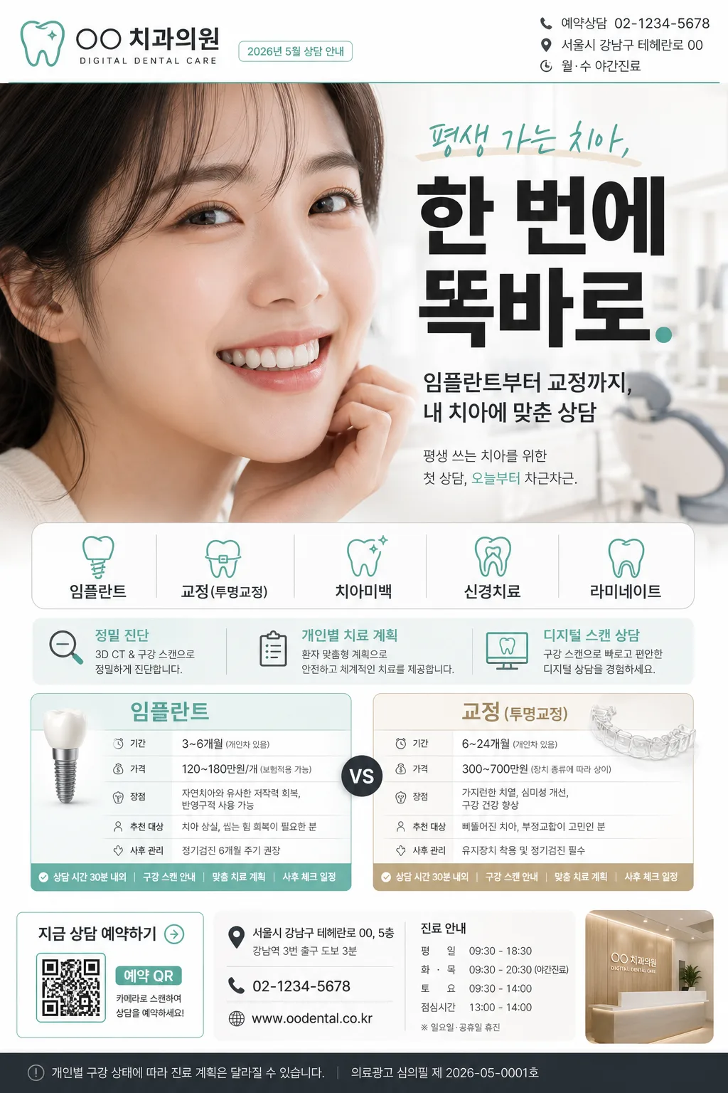
치과 임플란트·교정 광고. 미소 hero + 시술 비교 + 가격 안내.
치과 임플란트·교정 광고の概要
広告・ポスター画像を作るためのChatGPT画像プロンプトです。主題、背景、スタイル、構図を整理し、すぐに試せるよう構成しています。
関連キーワード: 치과 임플란트·교정 광고, 치과 임플란트·교정 광고 프롬프트, 広告・ポスター 프롬프트, 広告・ポスター AI 이미지 프롬프트, ChatGPT 이미지 프롬프트, AI 이미지 생성 프롬프트, AI 프롬프트, 이미지 프롬프트
치과 임플란트·교정 광고の活用方法
元の構造を保ちながら、被写体、背景、色、構図を変更して別案に展開できます。
- 主題を維持し、ブランドや季節、媒体に合わせて色と背景を変更してください。
- 結果が複雑な場合は背景要素を減らし、被写体、構図、照明を具体化してください。
- コピー後、ChatGPTに媒体、アスペクト比、文字の有無を追加で指定できます。
プロンプト原文
[Input]
- language: Korean
- output_size: 1024x1536

[Purpose]
Korean dental clinic advertising flyer, A4 vertical social-media/print hybrid. Realistic premium medical promo layout for implant, orthodontics, whitening, and root canal services, with clinic-contact details, consultation information, seasonal campaign labeling, and a polished healthcare advertising finish.

[Composition]
- Top-left logo zone: {치과명·로고} placed inside a professional header block, occupying about 12% of the canvas width, paired with small clinic identity text such as “DIGITAL DENTAL CARE” and a compact date label “2026년 5월 상담 안내”.
- Header utility zone: add realistic small print details on the top-right: “예약상담 02-1234-5678”, “서울시 강남구 테헤란로 00”, and “월·수 야간진료”, aligned with the clinic brand system.
- Hero zone: {미소 hero} fills the upper-middle 38–42% of the poster, photographed as a natural dental-ad smile portrait with real skin texture, realistic teeth alignment, soft cheek detail, and a confident but believable expression.
- Headline zone: {헤드라인} centered or slightly upper-right, sized as the primary attention anchor, with crisp Korean typography and supporting subcopy beneath: “임플란트부터 교정까지, 내 치아에 맞춘 상담”.
- Service information zone: {시술 안내} arranged in two balanced comparison cards in the lower-middle area, easy to scan at a glance, with realistic labels for “진료 포인트”, “예상 상담 시간”, “추천 대상”, and “사후 관리”.
- Campaign detail zone: include a slim mint/beige information band with {시술 분야} as pill-style tags, plus short Korean blurbs such as “정밀 진단”, “개인별 치료 계획”, “디지털 스캔 상담”.
- Footer action zone: include consultation CTA, QR-style reservation box, small map-pin icon area, clinic hours, and fine-print treatment notice text, maintaining a premium clinic-ad structure.
- Overall background: bright clinical white base with subtle soft beige and mint accents, smooth paper-like finish, gentle editorial layering, realistic printed-flyer depth, and clear hierarchy.
- Use {시술 분야}, {컬러 팔레트}, and {비율} as controllable content anchors while keeping the dental clinic advertising subject and premium medical structure intact.

[3. CORE STRUCTURE]
1. Header strip (top 12–15%): place {치과명·로고} left-aligned as a compact clinic identity block, with a thin separator line beneath in muted mint/charcoal. Add small right-aligned utility text: “2026.05”, “상담 예약”, “02-1234-5678”, “강남역 3번 출구 도보 3분”.
2. Main headline (upper 18–26%): set {헤드라인} large and bold, centered over the hero area, with crisp Korean spacing and modern medical-ad hierarchy. Add a smaller supporting line in Korean: “평생 쓰는 치아를 위한 첫 상담, 오늘부터 차근차근.”
3. Hero portrait area (middle 28–60%): feature {미소 hero} as a bright close-up with natural teeth detail, softly integrated into the page with a subtle beige/mint editorial frame, faint dental-chair clinic background bokeh, and realistic highlights on lips and enamel.
4. Service ribbon (mid-lower 60–72%): display {시술 분야} as segmented pill tags. Add readable micro labels such as “임플란트”, “투명교정”, “치아미백”, “신경치료”, and “정기검진” when appropriate to the theme.
5. Comparison panel (lower 68–88%): build {시술 안내} into two side-by-side boxes with subtle dividers, concise labels, and small icon-like markers for duration/price/benefit comparison. Include realistic Korean sample fields: “상담 시간 30분 내외”, “구강 스캔 안내”, “맞춤 치료 계획”, “사후 체크 일정”.
6. Footer balance (bottom 88–100%): add a grounded clinic information footer with CTA button text “지금 상담 예약하기”, QR-style square marked “예약 QR”, address line “서울시 강남구 테헤란로 00, 5층”, phone number, weekday/weekend hours, and small disclaimer-style copy “개인별 구강 상태에 따라 진료 계획은 달라질 수 있습니다.”

[4. STYLE RULES]
- Typography: Pretendard Bold for headline, Pretendard SemiBold for section labels, Pretendard Regular for body copy; headline around 60–78 px, labels 24–30 px, details 18–22 px, footer microcopy 12–15 px.
- Color palette: use {컬러 팔레트} specifically as white #FFFFFF, clean mint #66C7B7, charcoal #2F343A, soft beige #EDE3D6.
- Border/shadow: thin 1px dividers in pale mint, comparison cards with soft drop shadow 0px 6px 18px at 12% opacity, rounded corners 16px, subtle paper-card layering for realistic printed advertising depth.
- Graphic system: use mint pill tags, beige highlight bands, small line icons for calendar/phone/location/tooth, a QR-style reservation block, and fine-print clinic notes to make the flyer feel like a real Korean dental advertisement.
- Layout: clean editorial medical layout, high readability, strict alignment, structured spacing, premium clinic branding, and believable print/social ad details.

[5. VISUAL STYLE]
- Camera / lens: 85mm portrait lens at f/2.0 for the smile hero, shallow depth of field, sharp teeth detail with soft skin rendering.
- Lighting: bright diffuse studio softbox from upper-left at 45°, gentle fill from front-right, controlled specular highlights on teeth, clinical but flattering.
- Color grade: fresh white + mint + soft beige with neutral charcoal text, lightly desaturated for a premium dental-clinic brochure feel.
- Material realism: slightly tactile matte paper texture, realistic ink density, subtle card shadows, natural skin texture, enamel translucency, and a softly blurred clinic interior impression behind the hero portrait.

[6. MOOD]
Premium Korean dental clinic brochure — polished modern healthcare advertisement with a clean magazine-editorial finish, similar to a high-end clinic landing page and realistic printed appointment flyer. Trustworthy, calm, precise, warm, and approachable, emphasizing consultation clarity rather than exaggerated claims.

[7. CRITICAL]
- Korean text accuracy: 반드시 정확히 보여야 하는 문구: "평생 가는 치아, 한 번에 똑바로."
- Korean text accuracy: {치과명·로고}, {시술 분야}, {시술 안내}의 한글 표기가 깨지지 않아야 함.
- Korean text accuracy: 추가 정보 문구는 자연스러운 한글로 표시: "2026년 5월 상담 안내", "지금 상담 예약하기", "예약상담 02-1234-5678", "강남역 3번 출구 도보 3분", "개인별 구강 상태에 따라 진료 계획은 달라질 수 있습니다."
- Anatomy/layout invariants: smile hero must look anatomically natural, teeth aligned and realistic, no warped lips, no extra teeth, no distorted facial proportions.
- Composition invariants: keep a clean A4 vertical promotional layout, with headline, hero, service ribbon, consultation details, footer CTA, and comparison boxes clearly separated and easy to scan.

[8. 🚫 PROHIBITED]
- Fake official seals / certifications
- Broken Korean characters
- Celebrity composites / unauthorized likeness