광고/포스터
한국 문학 소설책 표지
한국 문학 소설책 표지. 박경리·한강·김애란 결의 절제.
한국 문학 소설책 표지 검색 요약
한국 문학 소설책 표지은 광고/포스터 결과물을 만들 때 바로 복사해 활용할 수 있는 ChatGPT 이미지 프롬프트입니다. 주제, 배경, 스타일, 구도 조건을 함께 담아 빠르게 시안을 만들 수 있도록 구성했습니다.
관련 키워드: 한국 문학 소설책 표지, 한국 문학 소설책 표지 프롬프트, 광고/포스터 프롬프트, 광고/포스터 AI 이미지 프롬프트, ChatGPT 이미지 프롬프트, AI 이미지 생성 프롬프트, AI 프롬프트, 이미지 프롬프트
한국 문학 소설책 표지 활용 포인트
원본 구조를 유지하면서 피사체, 배경, 색감, 구도를 바꿔 다양한 시안으로 확장할 수 있습니다.
- 핵심 소재는 유지하고 브랜드, 계절, 채널 목적에 맞는 색감과 배경을 바꿔보세요.
- 결과가 산만하면 배경 요소를 줄이고 피사체, 구도, 조명 조건을 구체화하세요.
- 복사한 뒤 ChatGPT에서 플랫폼, 화면 비율, 텍스트 포함 여부를 추가로 요청할 수 있습니다.
프롬프트 원문
[Input]
- language: Korean
- output_size: 1024x1536

[Purpose]
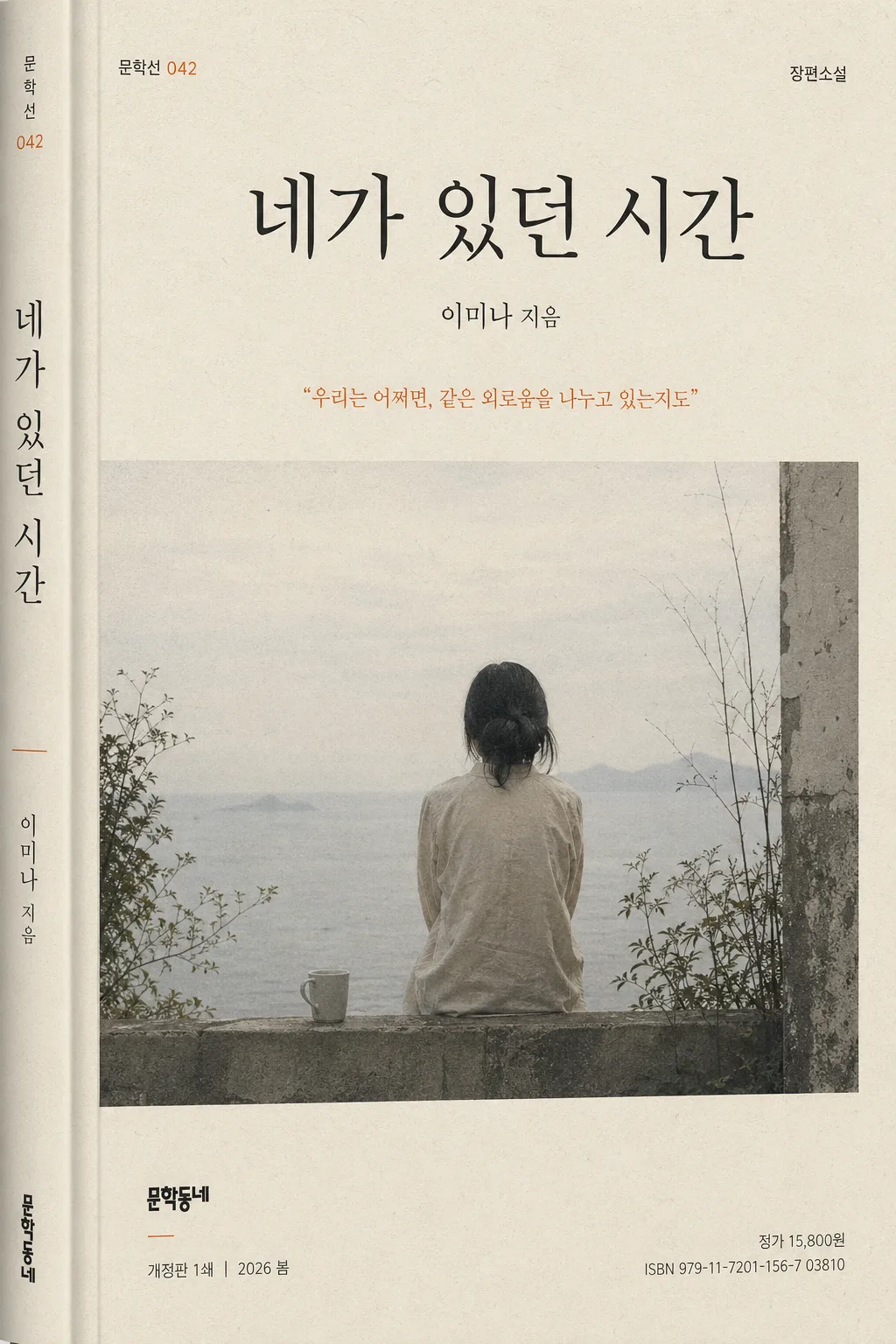
Korean literary novel book cover, B6 vertical format, restrained contemporary publishing design for print and online mockup.
Editorial cover art that feels like a serious literary paperback in a Korean bookstore, with tactile paper texture, believable jacket details, a calm but memorable focal image, and elegant typography.

[Composition]
- Center the main title block in the upper third so the cover immediately reads as a bookstore-ready Korean novel jacket.
- Place the {표지 hero} as the primary visual anchor across the middle 45–55% of the page, integrated with subtle paper grain, delicate shadow, or atmospheric illustration detail so it feels printed on a real matte cover.
- Keep the {소설 제목·저자} lockup clear and legible, with the title larger than the author name and aligned to a refined Korean publishing hierarchy.
- Position the {출판사·시리즈} mark small in a lower corner, like a real literary imprint mark, accompanied by believable micro-details such as a series number, edition line, and small price/ISBN-style text.
- Place the {서브 카피} as a small quoted literary line near the hero or below the title, never overpowering the main title.
- Use {비율} as a strict vertical paperback proportion, with practical trim-safe spacing, a subtle spine-wrap indication near one edge, and print-ready top-to-bottom rhythm.
- Background should feel like premium printed stock using {컬러 팔레트}: matte paper, fine fibers, slight ink density variation, and a subdued accent area that supports the story atmosphere.

[3. CORE STRUCTURE]
- Top header zone: render {소설 제목·저자} as the dominant cover title, with the title in a crisp Korean serif and the author name smaller beneath it; include a small genre label such as “장편소설” or “한국문학” above or near the title.
- Hero zone (mid-frame): place {표지 hero} as a symbolic literary cover illustration or editorial photograph, with layered realistic details such as soft shadows, faint printed texture, paper grain, or a quiet environmental hint that supports the novel’s mood.
- Quote zone: place {서브 카피} in a smaller, lighter-weight line near the hero or just below the title, set like a real jacket endorsement or excerpt line with Korean quotation marks.
- Series and edition zone: add small supporting Korean cover text such as “문학선 042”, “개정판 1쇄”, “2026 봄”, or “독자들이 오래 기억한 문장들” in tiny editorial type, aligned with the title grid.
- Publisher mark zone: set {출판사·시리즈} tiny at the lower left or lower right with precise alignment; include a realistic small imprint line, ISBN-style number, and price text such as “ISBN 979-11-0000-884-0” and “정가 15,800원” as micro typography.
- Typography zone: use {타이포} to create contrast between the main Korean title and smaller supporting text; include carefully spaced vertical or horizontal microtext along one edge, like a real Korean paperback cover.
- Color zone: apply {컬러 팔레트} as a literary palette with one muted accent and subtle tonal layering, ensuring the cover feels premium, serious, and physically printed rather than like a sterile template.

[4. STYLE RULES]
- Typography: use Noto Serif KR or Nanum Myeongjo for the main Korean title, Pretendard or Noto Sans KR for the author name, imprint, edition, ISBN, price, and small series text; title weight bold or semibold, author weight regular, size hierarchy clearly visible.
- Color palette: build from {컬러 팔레트}, translated into specific tones such as ivory #F4F0E6, charcoal #2B2B2B, and one subdued accent like muted orange #C56B3D, slate blue #4E6F91, moss green #6D8465, or dried rose #A86F68.
- Print finish: matte Korean paperback texture with fine paper fibers, tiny ink spread, slight off-register warmth, delicate grain, and realistic edge softness; add a subtle soft shadow 2–4px y-offset, 8–12px blur, 10–15% opacity if showing the book as a physical cover.
- Decorative publishing details may include a fine rule line, small series badge, understated vertical spine text preview, faint chapter-like numerals, or a narrow colored band, all restrained and integrated into the literary design.
- Keep the cover free of glossy effects, neon gradients, stock-poster loudness, or oversized commercial typography; the overall finish should be matte, tactile, and print-authentic.

[5. VISUAL STYLE]
- Camera / lens: if the hero is photographic, use a 50mm or 85mm lens look with f/2.8–f/4 clarity, book-cover editorial framing, or a flat-lay/portrait setup that feels like an art-book cover.
- Lighting: soft diffused window light from upper-left at about 45°, with gentle shadow falloff and natural paper surface visibility; if studio-based, use a large softbox plus subtle fill for even tonal control.
- Color grade: muted ivory and charcoal base with one restrained accent, slightly desaturated, low-contrast, print-friendly grading reminiscent of Korean literary publishing and independent bookstore cover design.
- Surface realism: show believable printed-paper behavior, including very fine halftone-like texture, subtle scuffs near the trim edge, tiny ink-density variation in dark type, and a gentle tactile shadow where visual elements overlap.

[6. MOOD]
Quiet literary editorial — like a modern Korean bookstore novel jacket with the restrained seriousness of a New York Review Books cover and the emotional understatement of a Jeon Gyeong-rin-style paperback design. The image should feel like a real book someone could pick up from an independent bookstore display, intimate, mature, and thoughtfully produced.

[7. CRITICAL]
- Korean text accuracy: 반드시 아래 문구가 이미지에 정확히 보여야 함.
  - {소설 제목·저자}
  - {출판사·시리즈}
  - {서브 카피}
  - {타이포}
  - {컬러 팔레트}
  - {비율}
- Add realistic small Korean publishing details where appropriate: “장편소설”, “한국문학”, “문학선 042”, “2026 봄”, “개정판 1쇄”, “정가 15,800원”, “ISBN 979-11-0000-884-0”.
- Composition invariants: maintain a vertical B6 paperback cover layout with clear title hierarchy, a single restrained hero image, small publisher imprint placement, and realistic printed-book surface details.
- Typography must look like real Korean book-cover type, with clean spacing and no broken characters.

[8. 🚫 PROHIBITED]
- Fake official seals / certifications
- Broken Korean characters
- Celebrity composites / unauthorized likeness