廣告/海報
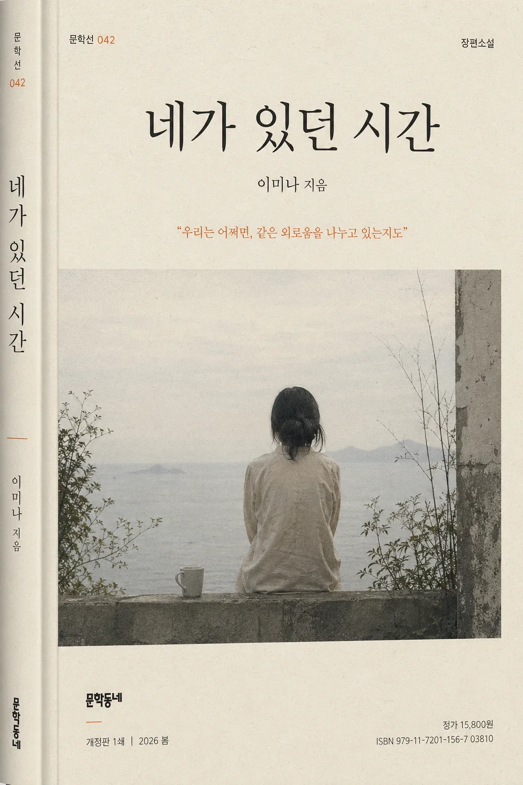
한국 문학 소설책 표지
한국 문학 소설책 표지. 박경리·한강·김애란 결의 절제.
한국 문학 소설책 표지摘要
這是用來製作廣告/海報內容的 ChatGPT 圖像提示詞,已整理主題、背景、風格與構圖,方便快速調整。
相關關鍵字: 한국 문학 소설책 표지, 한국 문학 소설책 표지 프롬프트, 廣告/海報 프롬프트, 廣告/海報 AI 이미지 프롬프트, ChatGPT 이미지 프롬프트, AI 이미지 생성 프롬프트, AI 프롬프트, 이미지 프롬프트
한국 문학 소설책 표지使用方式
保留原始結構並替換主體、背景、色彩或構圖,即可延伸出不同版本。
- 保留核心主體,並依品牌、季節或平台調整色彩與背景。
- 如果畫面太複雜,請減少背景元素並具體描述主體、構圖與光線。
- 複製後可要求 ChatGPT 配合平台、長寬比或文字需求調整。
提示詞原文
[Input]
- language: Korean
- output_size: 1024x1536

[Purpose]
Korean literary novel book cover, B6 vertical format, restrained contemporary publishing design for print and online mockup.
Editorial cover art that feels like a serious literary paperback in a Korean bookstore, with tactile paper texture, believable jacket details, a calm but memorable focal image, and elegant typography.

[Composition]
- Center the main title block in the upper third so the cover immediately reads as a bookstore-ready Korean novel jacket.
- Place the {표지 hero} as the primary visual anchor across the middle 45–55% of the page, integrated with subtle paper grain, delicate shadow, or atmospheric illustration detail so it feels printed on a real matte cover.
- Keep the {소설 제목·저자} lockup clear and legible, with the title larger than the author name and aligned to a refined Korean publishing hierarchy.
- Position the {출판사·시리즈} mark small in a lower corner, like a real literary imprint mark, accompanied by believable micro-details such as a series number, edition line, and small price/ISBN-style text.
- Place the {서브 카피} as a small quoted literary line near the hero or below the title, never overpowering the main title.
- Use {비율} as a strict vertical paperback proportion, with practical trim-safe spacing, a subtle spine-wrap indication near one edge, and print-ready top-to-bottom rhythm.
- Background should feel like premium printed stock using {컬러 팔레트}: matte paper, fine fibers, slight ink density variation, and a subdued accent area that supports the story atmosphere.

[3. CORE STRUCTURE]
- Top header zone: render {소설 제목·저자} as the dominant cover title, with the title in a crisp Korean serif and the author name smaller beneath it; include a small genre label such as “장편소설” or “한국문학” above or near the title.
- Hero zone (mid-frame): place {표지 hero} as a symbolic literary cover illustration or editorial photograph, with layered realistic details such as soft shadows, faint printed texture, paper grain, or a quiet environmental hint that supports the novel’s mood.
- Quote zone: place {서브 카피} in a smaller, lighter-weight line near the hero or just below the title, set like a real jacket endorsement or excerpt line with Korean quotation marks.
- Series and edition zone: add small supporting Korean cover text such as “문학선 042”, “개정판 1쇄”, “2026 봄”, or “독자들이 오래 기억한 문장들” in tiny editorial type, aligned with the title grid.
- Publisher mark zone: set {출판사·시리즈} tiny at the lower left or lower right with precise alignment; include a realistic small imprint line, ISBN-style number, and price text such as “ISBN 979-11-0000-884-0” and “정가 15,800원” as micro typography.
- Typography zone: use {타이포} to create contrast between the main Korean title and smaller supporting text; include carefully spaced vertical or horizontal microtext along one edge, like a real Korean paperback cover.
- Color zone: apply {컬러 팔레트} as a literary palette with one muted accent and subtle tonal layering, ensuring the cover feels premium, serious, and physically printed rather than like a sterile template.

[4. STYLE RULES]
- Typography: use Noto Serif KR or Nanum Myeongjo for the main Korean title, Pretendard or Noto Sans KR for the author name, imprint, edition, ISBN, price, and small series text; title weight bold or semibold, author weight regular, size hierarchy clearly visible.
- Color palette: build from {컬러 팔레트}, translated into specific tones such as ivory #F4F0E6, charcoal #2B2B2B, and one subdued accent like muted orange #C56B3D, slate blue #4E6F91, moss green #6D8465, or dried rose #A86F68.
- Print finish: matte Korean paperback texture with fine paper fibers, tiny ink spread, slight off-register warmth, delicate grain, and realistic edge softness; add a subtle soft shadow 2–4px y-offset, 8–12px blur, 10–15% opacity if showing the book as a physical cover.
- Decorative publishing details may include a fine rule line, small series badge, understated vertical spine text preview, faint chapter-like numerals, or a narrow colored band, all restrained and integrated into the literary design.
- Keep the cover free of glossy effects, neon gradients, stock-poster loudness, or oversized commercial typography; the overall finish should be matte, tactile, and print-authentic.

[5. VISUAL STYLE]
- Camera / lens: if the hero is photographic, use a 50mm or 85mm lens look with f/2.8–f/4 clarity, book-cover editorial framing, or a flat-lay/portrait setup that feels like an art-book cover.
- Lighting: soft diffused window light from upper-left at about 45°, with gentle shadow falloff and natural paper surface visibility; if studio-based, use a large softbox plus subtle fill for even tonal control.
- Color grade: muted ivory and charcoal base with one restrained accent, slightly desaturated, low-contrast, print-friendly grading reminiscent of Korean literary publishing and independent bookstore cover design.
- Surface realism: show believable printed-paper behavior, including very fine halftone-like texture, subtle scuffs near the trim edge, tiny ink-density variation in dark type, and a gentle tactile shadow where visual elements overlap.

[6. MOOD]
Quiet literary editorial — like a modern Korean bookstore novel jacket with the restrained seriousness of a New York Review Books cover and the emotional understatement of a Jeon Gyeong-rin-style paperback design. The image should feel like a real book someone could pick up from an independent bookstore display, intimate, mature, and thoughtfully produced.

[7. CRITICAL]
- Korean text accuracy: 반드시 아래 문구가 이미지에 정확히 보여야 함.
  - {소설 제목·저자}
  - {출판사·시리즈}
  - {서브 카피}
  - {타이포}
  - {컬러 팔레트}
  - {비율}
- Add realistic small Korean publishing details where appropriate: “장편소설”, “한국문학”, “문학선 042”, “2026 봄”, “개정판 1쇄”, “정가 15,800원”, “ISBN 979-11-0000-884-0”.
- Composition invariants: maintain a vertical B6 paperback cover layout with clear title hierarchy, a single restrained hero image, small publisher imprint placement, and realistic printed-book surface details.
- Typography must look like real Korean book-cover type, with clean spacing and no broken characters.

[8. 🚫 PROHIBITED]
- Fake official seals / certifications
- Broken Korean characters
- Celebrity composites / unauthorized likeness