廣告/海報
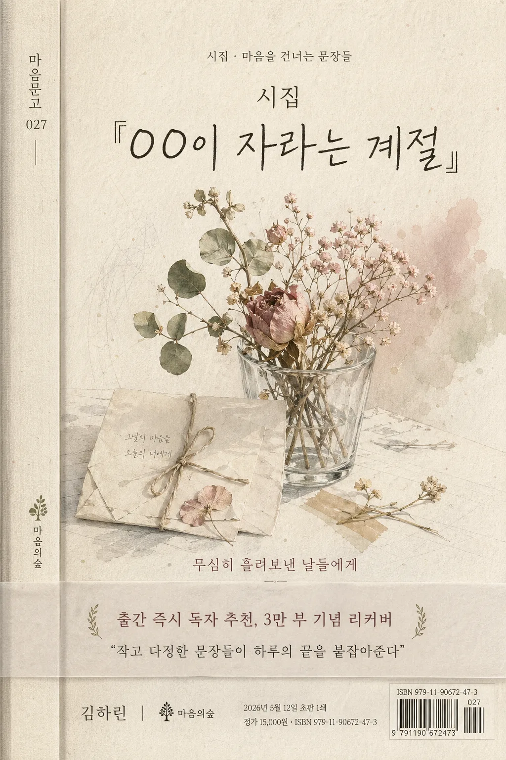
감성 시집·에세이집 표지
시집·에세이집 표지. 감성 출판 결 절제 무드.
감성 시집·에세이집 표지摘要
這是用來製作廣告/海報內容的 ChatGPT 圖像提示詞,已整理主題、背景、風格與構圖,方便快速調整。
相關關鍵字: 감성 시집·에세이집 표지, 감성 시집·에세이집 표지 프롬프트, 廣告/海報 프롬프트, 廣告/海報 AI 이미지 프롬프트, ChatGPT 이미지 프롬프트, AI 이미지 생성 프롬프트, AI 프롬프트, 이미지 프롬프트
감성 시집·에세이집 표지使用方式
保留原始結構並替換主體、背景、色彩或構圖,即可延伸出不同版本。
- 保留核心主體,並依品牌、季節或平台調整色彩與背景。
- 如果畫面太複雜,請減少背景元素並具體描述主體、構圖與光線。
- 複製後可要求 ChatGPT 配合平台、長寬比或文字需求調整。
提示詞原文
[Input]
- language: Korean
- output_size: 1024x1536
- format_hint: {비율}

[Purpose]
Korean poetry / essay book cover, vertical editorial cover layout for print and online bookstore thumbnail.
Soft literary packaging with a quiet emotional tone, suitable for B6-sized cover presentation, including realistic publisher details, series labeling, a small obi-band copy area, and print-ready colophon microtext.

[Composition]
- Main title block occupies the upper 30% of the frame, centered slightly above the visual midpoint; {도서제목} is the primary focal point with {도서유형라벨} placed above it as a small genre label.
- A thin left-edge spine-preview strip carries {시리즈라벨} and a tiny {출판사명} mark, giving the cover the feeling of an actual printed book photographed for a catalog.
- Illustration field fills the central 45% with a delicate handcrafted cover illustration based on {표지일러}; include paper fibers, faint watercolor blooms, pressed-petal marks, graphite guide traces, and subtle ink pooling at the edges.
- Subtitle / quote appears as a small accent line near the lower-middle area using {서브카피}, aligned to the title’s visual axis.
- A translucent paper obi band or belly-band crosses the lower 18–24% of the cover, containing {띠지문구} and {추천문구} in readable Korean micro editorial type.
- Author / publisher line sits in the lower 12% as supporting information: {저자명} · {출판사명}, with {출간일} and {가격ISBN} set as small colophon-like details near the bottom-right, plus a tiny ISBN barcode-style block.
- Background is a tactile paper surface with warm off-white texture, muted pastel tint from {컬러팔레트}, visible deckle-like grain, and a soft print-paper shadow.

[3. CORE STRUCTURE]
1) Series and genre zone: Place {시리즈라벨} on the left-edge spine strip and {도서유형라벨} above the title in small letterspaced Korean type.
2) Top title zone: Place {도서제목} as the largest text element, crisp and legible, with the title spanning 1–3 lines depending on length.
3) Illustration zone: Render {표지일러} as a soft watercolor or hand-drawn natural still-life composition, with visible paper grain, layered pigment, delicate edges, and small realistic stationery details such as a folded note, dried stem shadow, or translucent tape tab.
4) Subtitle zone: Add {서브카피} in a smaller quote style beneath or beside the illustration, using a calm literary rhythm and careful Korean spacing.
5) Obi-band zone: Add a semi-transparent paper band with {띠지문구} as a bold small headline and {추천문구} as a secondary review quote; use faint fold lines and paper overlap shadows.
6) Author/publisher zone: Set {저자명} and {출판사명} near the bottom in restrained small type, allowing the main title to remain dominant while still feeling like a complete retail-ready book cover.
7) Print detail zone: Include {출간일}, {가격ISBN}, a tiny barcode-style ISBN graphic, and a small publisher imprint mark as authentic book-cover production details.

[4. STYLE RULES]
- Typography: follow {타이포}; use a mix of handwritten script + Noto Serif KR / Nanum Myeongjo for the main title, with Pretendard or a small serif sans for supporting text; title weight medium to bold, subtitle light, author line regular; main title size should feel like 58–92 px equivalent, subtitle 18–28 px, author line 14–20 px, colophon and barcode text 8–12 px equivalent.
- Color palette: use the exact mood family from {컬러팔레트}; prefer ivory #F5F0E6, dusty pink #D9A7A5, sage green #B7C3A5, charcoal #3A3A3A, warm beige #D8C7AE, and pale ink-gray accents.
- Cover finish: use matte uncoated paper, slight cotton-paper tooth, natural ink absorption, faint pressed-flower stains, and a soft paper-cast shadow around the obi band and spine strip.
- Decorative details: add refined literary production marks such as small section dots, a tiny leaf icon, understated rule lines, publisher imprint symbol, and ISBN barcode micro block, all integrated into the printed-cover design.

[5. VISUAL STYLE]
- Camera / lens: flat editorial cover composition, as if photographed on a Canon EOS R5 with 85mm f/1.4 for the title feel, or a top-down 50mm equivalent for the illustration card look; keep perspective natural and print-like.
- Lighting: soft diffused studio light from upper-left at 45°, gentle fill from right, low-glare matte paper response, like a calm overcast daylight setup on textured paper.
- Color grade: muted ivory + dusty pink + sage green + charcoal, with low saturation and slightly warm paper tone; preserve fine paper texture, watercolor granulation, and crisp ink edges.

[6. MOOD]
Quiet literary editorial cover — a Kinfolk-meets-modern Korean poetry anthology aesthetic, with restrained elegance, handwritten warmth, tactile paper realism, and the intimacy of a small independent bookstore display.

[7. CRITICAL]
- Korean text accuracy: the following Korean strings must appear exactly and cleanly rendered: {도서제목}, {도서유형라벨}, {저자명}, {출판사명}, {서브카피}, {추천문구}, {띠지문구}, {시리즈라벨}, {출간일}, {가격ISBN}.
- Ensure all Korean characters are crisp, properly spaced, and readable at thumbnail scale; preserve punctuation such as 『 』, ·, ₩, and ISBN hyphens.
- Cover must remain a single vertical B6 composition with title, illustration, subtitle, obi-band copy, author line, and print detail zone clearly separated by hierarchy.
- Render the barcode-style block as a small realistic graphic element while keeping the provided ISBN text legible nearby.

[8. 🚫 PROHIBITED]
- Fake official seals / certifications
- Broken Korean characters or garbled Hangul
- Celebrity composites or real-person likeness claims
- Warped or illegible typography that changes the provided Korean text