광고/포스터
잡지 별책부록·무크지 표지
잡지 별책부록·무크지(MOOK) 표지. 큐레이션 결.
잡지 별책부록·무크지 표지 검색 요약
잡지 별책부록·무크지 표지은 광고/포스터 결과물을 만들 때 바로 복사해 활용할 수 있는 ChatGPT 이미지 프롬프트입니다. 주제, 배경, 스타일, 구도 조건을 함께 담아 빠르게 시안을 만들 수 있도록 구성했습니다.
관련 키워드: 잡지 별책부록·무크지 표지, 잡지 별책부록·무크지 표지 프롬프트, 광고/포스터 프롬프트, 광고/포스터 AI 이미지 프롬프트, ChatGPT 이미지 프롬프트, AI 이미지 생성 프롬프트, AI 프롬프트, 이미지 프롬프트
잡지 별책부록·무크지 표지 활용 포인트
원본 구조를 유지하면서 피사체, 배경, 색감, 구도를 바꿔 다양한 시안으로 확장할 수 있습니다.
- 핵심 소재는 유지하고 브랜드, 계절, 채널 목적에 맞는 색감과 배경을 바꿔보세요.
- 결과가 산만하면 배경 요소를 줄이고 피사체, 구도, 조명 조건을 구체화하세요.
- 복사한 뒤 ChatGPT에서 플랫폼, 화면 비율, 텍스트 포함 여부를 추가로 요청할 수 있습니다.
프롬프트 원문
[Input]
- language: Korean
- output_size: 1024x1536

[Purpose]
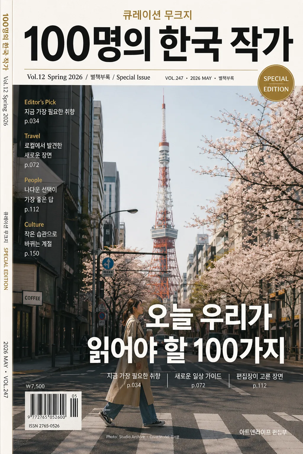
Magazine special supplement / mook cover for editorial distribution, designed as a premium A4-vertical cover with rich bookstore-shelf realism, print-ready typography, and authentic editorial cover details.

[Composition]
- Top header zone (15–18%): {잡지·무크 제목} set as the primary masthead, centered or slightly top-aligned depending on the cover style, with strong visual dominance and refined editorial authority.
- Secondary info band (8–10%): {호수·시즌} placed near the masthead in smaller editorial type, combined with realistic issue metadata such as "VOL.247", "2026년 5월호", "SPECIAL EDITION", and a small date label.
- Main visual field (55–60%): {대표 컷} occupies the central hero area with real magazine-cover framing, natural editorial context, tactile materials, believable shadows, and space for layered text overlays.
- Headline zone (12–15%): {헤드라인 카피} placed across the lower-middle or lower-third area in bold, highly legible Korean sans-serif, supported by 2–3 short Korean feature blurbs such as "지금 가장 필요한 취향", "새로운 일상 가이드", "편집장이 고른 장면".
- Feature keyword strip: {피처 키워드} arranged as a compact English/Korean feature list on the left side, right edge, or lower margin, paired with small separator rules, page references, and editorial microcopy.
- Cover realism details: add a small barcode area near the lower-left or lower-right corner, price text such as "₩7,500", small spine/credit text, model or photo credit such as "Cover Model: 김서윤" or "Photo: Studio Archive", and a short publisher line.
- Background treatment: premium editorial paper surface, subtle ink grain, printed halftone texture, seasonal paper tint, and {컬러 팔레트} applied as the cover’s signature palette.
- Framing direction: strict A4 vertical cover layout, print-editorial proportions, layered cover lines, realistic magazine finishing, and a polished physical-cover presence.

[3. CORE STRUCTURE]
1) Masthead area: {잡지·무크 제목} large and crisp at the top, with magazine cover authority, controlled letter spacing, and a refined editorial display-font impression.
2) Issue line: {호수·시즌} immediately under or near the masthead in smaller type, readable but secondary, styled like a special issue identifier with additional microcopy: "VOL.247 · 2026 MAY · 별책부록".
3) Hero content: {대표 컷} presented as the main cover image, either as a single strong visual, a cityscape, a people collage, an interior scene, or an illustration still-life treatment with editorial polish and believable printed depth.
4) Main headline: {헤드라인 카피} placed prominently across the hero or lower third, using bold hierarchy to anchor the cover and interact naturally with the main image.
5) Feature blurbs: include 2–3 short Korean cover lines around the hero image, for example "나다운 선택이 가장 좋은 답", "작은 습관으로 바뀌는 계절", "로컬에서 발견한 새로운 장면", with page-number style details such as "p.034" or "p.112".
6) Feature keywords: {피처 키워드} set as small editorial text on the left side, in a neat column or compact stack, reinforcing magazine structure with items like "Editor's Pick", "Travel", "People", "Culture" when suitable.
7) Editorial metadata: add a barcode block, price "₩7,500", ISSN-like placeholder text "ISSN 2765-0526", a tiny credit line, and a slim spine-style vertical text strip along one side for bookstore realism.
8) Color application: {컬러 팔레트} used consistently across masthead accents, rules, badges, caption boxes, barcode label, and background balance to create a cohesive issue identity.
9) Format finishing: {비율} respected exactly with professional cover alignment, sharp typography, realistic printed-paper texture, and final cover readiness.

[4. STYLE RULES]
- Typography: use Pretendard Bold or Noto Sans KR Bold for {헤드라인 카피}, Pretendard SemiBold for {호수·시즌}, and a clean condensed sans-serif feel for {피처 키워드}; masthead should feel like a refined editorial display font with strong weight and tight control.
- Color palette: apply {컬러 팔레트} as the dominant issue identity, with black/white/gold or season-specific accent tones depending on the chosen palette; maintain high contrast for legibility while allowing subtle accent panels, divider lines, and label blocks.
- Magazine details: include realistic cover furniture such as issue number, date label, barcode area, price, page references, small captions, photo/model credit, and a publisher or editorial department line.
- Border/shadow: subtle print-like shadowing only if needed, such as a soft 3px–6px y-offset shadow at 10%–15% opacity; avoid heavy 3D effects.
- Text treatment: crisp vector-like edges, accurate Korean glyphs, balanced kerning, natural editorial hierarchy, and readable small text wherever it is intended to be legible.

[5. VISUAL STYLE]
- Camera / lens: editorial cover photography feel captured on Canon EOS R5 with an 85mm f/1.8 portrait lens for people covers, or Canon EOS R5 with a 50mm f/1.4 standard lens for mixed editorial layouts; if the cover is a collage or illustration-led issue, emulate professional magazine art direction and printed production quality rather than a casual snapshot.
- Lighting: studio editorial lighting with controlled softbox illumination from upper-left at 45°, gentle fill from front-right, and clean contrast that preserves text readability while allowing natural highlights, paper texture, and tactile shadows.
- Color grade: premium magazine grade with restrained blacks, clean whites, and accent tones from {컬러 팔레트}; if seasonal, use a polished spring/fall editorial palette with refined saturation and realistic print warmth.

[6. MOOD]
High-end magazine supplement — Kinfolk / Monocle editorial cover energy with a polished bookstore-shelf presence, rich editorial detail, collectible mook quality, and believable Korean publishing design.

[7. CRITICAL]
- Korean text accuracy: {잡지·무크 제목}, {호수·시즌}, {대표 컷}, and {헤드라인 카피} must appear exactly as provided in the final image text where applicable.
- Add realistic Korean cover text strings where appropriate, such as "2026년 5월호", "별책부록", "나다운 선택이 가장 좋은 답", "편집장이 고른 장면", "새로운 일상 가이드", "₩7,500", and "Cover Model: 김서윤".
- English text accuracy: "Editor's Pick", "Travel", "People", "Culture", "SPECIAL EDITION", and "VOL.247" must appear cleanly and correctly if used.
- Layout invariants: maintain a strict vertical magazine-cover hierarchy with masthead, issue line, hero visual, headline, feature blurbs, barcode/price area, credit line, and feature keywords all clearly organized.
- All typography must remain sharp, correctly spaced, and fully legible in Korean.

[8. 🚫 PROHIBITED]
- Fake official seals / certifications
- Broken Korean characters
- Celebrity composites or unauthorized real-person likeness