廣告/海報
잡지 별책부록·무크지 표지
잡지 별책부록·무크지(MOOK) 표지. 큐레이션 결.
잡지 별책부록·무크지 표지摘要
這是用來製作廣告/海報內容的 ChatGPT 圖像提示詞,已整理主題、背景、風格與構圖,方便快速調整。
相關關鍵字: 잡지 별책부록·무크지 표지, 잡지 별책부록·무크지 표지 프롬프트, 廣告/海報 프롬프트, 廣告/海報 AI 이미지 프롬프트, ChatGPT 이미지 프롬프트, AI 이미지 생성 프롬프트, AI 프롬프트, 이미지 프롬프트
잡지 별책부록·무크지 표지使用方式
保留原始結構並替換主體、背景、色彩或構圖,即可延伸出不同版本。
- 保留核心主體,並依品牌、季節或平台調整色彩與背景。
- 如果畫面太複雜,請減少背景元素並具體描述主體、構圖與光線。
- 複製後可要求 ChatGPT 配合平台、長寬比或文字需求調整。
提示詞原文
[Input]
- language: Korean
- output_size: 1024x1536

[Purpose]
Magazine special supplement / mook cover for editorial distribution, designed as a premium A4-vertical cover with rich bookstore-shelf realism, print-ready typography, and authentic editorial cover details.

[Composition]
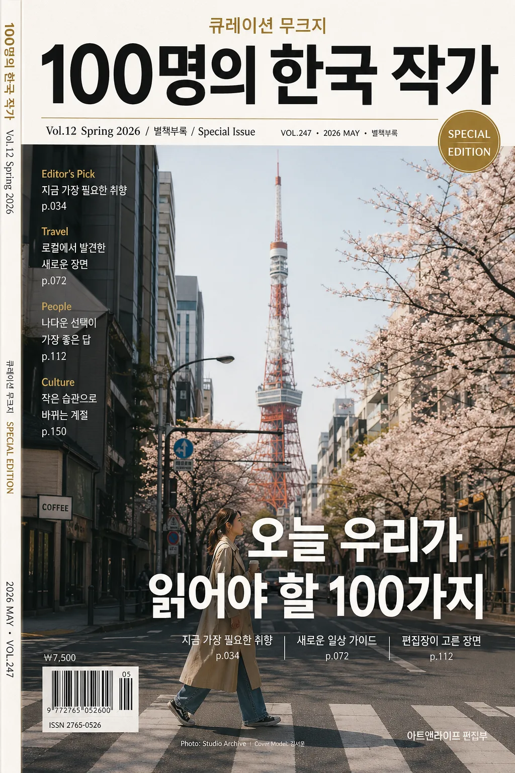
- Top header zone (15–18%): {잡지·무크 제목} set as the primary masthead, centered or slightly top-aligned depending on the cover style, with strong visual dominance and refined editorial authority.
- Secondary info band (8–10%): {호수·시즌} placed near the masthead in smaller editorial type, combined with realistic issue metadata such as "VOL.247", "2026년 5월호", "SPECIAL EDITION", and a small date label.
- Main visual field (55–60%): {대표 컷} occupies the central hero area with real magazine-cover framing, natural editorial context, tactile materials, believable shadows, and space for layered text overlays.
- Headline zone (12–15%): {헤드라인 카피} placed across the lower-middle or lower-third area in bold, highly legible Korean sans-serif, supported by 2–3 short Korean feature blurbs such as "지금 가장 필요한 취향", "새로운 일상 가이드", "편집장이 고른 장면".
- Feature keyword strip: {피처 키워드} arranged as a compact English/Korean feature list on the left side, right edge, or lower margin, paired with small separator rules, page references, and editorial microcopy.
- Cover realism details: add a small barcode area near the lower-left or lower-right corner, price text such as "₩7,500", small spine/credit text, model or photo credit such as "Cover Model: 김서윤" or "Photo: Studio Archive", and a short publisher line.
- Background treatment: premium editorial paper surface, subtle ink grain, printed halftone texture, seasonal paper tint, and {컬러 팔레트} applied as the cover’s signature palette.
- Framing direction: strict A4 vertical cover layout, print-editorial proportions, layered cover lines, realistic magazine finishing, and a polished physical-cover presence.

[3. CORE STRUCTURE]
1) Masthead area: {잡지·무크 제목} large and crisp at the top, with magazine cover authority, controlled letter spacing, and a refined editorial display-font impression.
2) Issue line: {호수·시즌} immediately under or near the masthead in smaller type, readable but secondary, styled like a special issue identifier with additional microcopy: "VOL.247 · 2026 MAY · 별책부록".
3) Hero content: {대표 컷} presented as the main cover image, either as a single strong visual, a cityscape, a people collage, an interior scene, or an illustration still-life treatment with editorial polish and believable printed depth.
4) Main headline: {헤드라인 카피} placed prominently across the hero or lower third, using bold hierarchy to anchor the cover and interact naturally with the main image.
5) Feature blurbs: include 2–3 short Korean cover lines around the hero image, for example "나다운 선택이 가장 좋은 답", "작은 습관으로 바뀌는 계절", "로컬에서 발견한 새로운 장면", with page-number style details such as "p.034" or "p.112".
6) Feature keywords: {피처 키워드} set as small editorial text on the left side, in a neat column or compact stack, reinforcing magazine structure with items like "Editor's Pick", "Travel", "People", "Culture" when suitable.
7) Editorial metadata: add a barcode block, price "₩7,500", ISSN-like placeholder text "ISSN 2765-0526", a tiny credit line, and a slim spine-style vertical text strip along one side for bookstore realism.
8) Color application: {컬러 팔레트} used consistently across masthead accents, rules, badges, caption boxes, barcode label, and background balance to create a cohesive issue identity.
9) Format finishing: {비율} respected exactly with professional cover alignment, sharp typography, realistic printed-paper texture, and final cover readiness.

[4. STYLE RULES]
- Typography: use Pretendard Bold or Noto Sans KR Bold for {헤드라인 카피}, Pretendard SemiBold for {호수·시즌}, and a clean condensed sans-serif feel for {피처 키워드}; masthead should feel like a refined editorial display font with strong weight and tight control.
- Color palette: apply {컬러 팔레트} as the dominant issue identity, with black/white/gold or season-specific accent tones depending on the chosen palette; maintain high contrast for legibility while allowing subtle accent panels, divider lines, and label blocks.
- Magazine details: include realistic cover furniture such as issue number, date label, barcode area, price, page references, small captions, photo/model credit, and a publisher or editorial department line.
- Border/shadow: subtle print-like shadowing only if needed, such as a soft 3px–6px y-offset shadow at 10%–15% opacity; avoid heavy 3D effects.
- Text treatment: crisp vector-like edges, accurate Korean glyphs, balanced kerning, natural editorial hierarchy, and readable small text wherever it is intended to be legible.

[5. VISUAL STYLE]
- Camera / lens: editorial cover photography feel captured on Canon EOS R5 with an 85mm f/1.8 portrait lens for people covers, or Canon EOS R5 with a 50mm f/1.4 standard lens for mixed editorial layouts; if the cover is a collage or illustration-led issue, emulate professional magazine art direction and printed production quality rather than a casual snapshot.
- Lighting: studio editorial lighting with controlled softbox illumination from upper-left at 45°, gentle fill from front-right, and clean contrast that preserves text readability while allowing natural highlights, paper texture, and tactile shadows.
- Color grade: premium magazine grade with restrained blacks, clean whites, and accent tones from {컬러 팔레트}; if seasonal, use a polished spring/fall editorial palette with refined saturation and realistic print warmth.

[6. MOOD]
High-end magazine supplement — Kinfolk / Monocle editorial cover energy with a polished bookstore-shelf presence, rich editorial detail, collectible mook quality, and believable Korean publishing design.

[7. CRITICAL]
- Korean text accuracy: {잡지·무크 제목}, {호수·시즌}, {대표 컷}, and {헤드라인 카피} must appear exactly as provided in the final image text where applicable.
- Add realistic Korean cover text strings where appropriate, such as "2026년 5월호", "별책부록", "나다운 선택이 가장 좋은 답", "편집장이 고른 장면", "새로운 일상 가이드", "₩7,500", and "Cover Model: 김서윤".
- English text accuracy: "Editor's Pick", "Travel", "People", "Culture", "SPECIAL EDITION", and "VOL.247" must appear cleanly and correctly if used.
- Layout invariants: maintain a strict vertical magazine-cover hierarchy with masthead, issue line, hero visual, headline, feature blurbs, barcode/price area, credit line, and feature keywords all clearly organized.
- All typography must remain sharp, correctly spaced, and fully legible in Korean.

[8. 🚫 PROHIBITED]
- Fake official seals / certifications
- Broken Korean characters
- Celebrity composites or unauthorized real-person likeness