SNS/카드뉴스
팟캐스트 커버 디자인
팟캐스트 커버 (Spotify·애플팟·유튜브 결). 16종 톤 응용.
팟캐스트 커버 디자인 검색 요약
팟캐스트 커버 디자인은 SNS/카드뉴스 결과물을 만들 때 바로 복사해 활용할 수 있는 ChatGPT 이미지 프롬프트입니다. 주제, 배경, 스타일, 구도 조건을 함께 담아 빠르게 시안을 만들 수 있도록 구성했습니다.
관련 키워드: 팟캐스트 커버 디자인, 팟캐스트 커버 디자인 프롬프트, SNS/카드뉴스 프롬프트, SNS/카드뉴스 AI 이미지 프롬프트, ChatGPT 이미지 프롬프트, AI 이미지 생성 프롬프트, AI 프롬프트, 이미지 프롬프트
팟캐스트 커버 디자인 활용 포인트
원본 구조를 유지하면서 피사체, 배경, 색감, 구도를 바꿔 다양한 시안으로 확장할 수 있습니다.
- 핵심 소재는 유지하고 브랜드, 계절, 채널 목적에 맞는 색감과 배경을 바꿔보세요.
- 결과가 산만하면 배경 요소를 줄이고 피사체, 구도, 조명 조건을 구체화하세요.
- 복사한 뒤 ChatGPT에서 플랫폼, 화면 비율, 텍스트 포함 여부를 추가로 요청할 수 있습니다.
프롬프트 원문
[Input]
- language: Korean
- output_size: 1024x1024

[Purpose]
Podcast cover design for streaming platforms, square 1:1 format with bold editorial readability and thumbnail-level impact.
Create a recognizable show identity that feels like a real podcast program cover, with broadcast metadata, episode cues, and strong app-grid visibility.

[Composition]
- Compose a square 1024x1024 podcast cover for {채널 이름}, using a strong centered hierarchy and a polished editorial streaming-platform look.
- Place the main title block in the upper-middle 35–40% of the frame; set {영문 부제} as a compact secondary line directly below or beside the Korean title.
- Put {대표 일러·아이콘} in the central area as the visual hero: a microphone, headphones, speech bubble, waveform, bookshelf, host silhouette, or category-specific emblem with bold graphic presence.
- Anchor {호스트·게스트} and {청취 안내} in the lower third as real podcast metadata, with {에피소드 번호}, {공개일}, and {시즌 정보} displayed as small but legible broadcast labels.
- Add 2 short editorial teaser lines, {핵심 문구 1} and {핵심 문구 2}, as feature-style callouts around the central icon or lower title area.
- Include a small category badge for {주제 카테고리}, a channel handle {채널 핸들}, and subtle decorative audio elements such as waveform ticks, play-button marks, dotted rhythm lines, or caption stickers.
- Use {타이포} and {컬러 팔레트} as the primary brand system, with saturated contrast and clear typographic hierarchy.

[3. CORE STRUCTURE]
- Title zone: Render {채널 이름} as the dominant headline, large, centered, and instantly readable. If the name contains both Korean and English, keep Korean primary and {영문 부제} secondary.
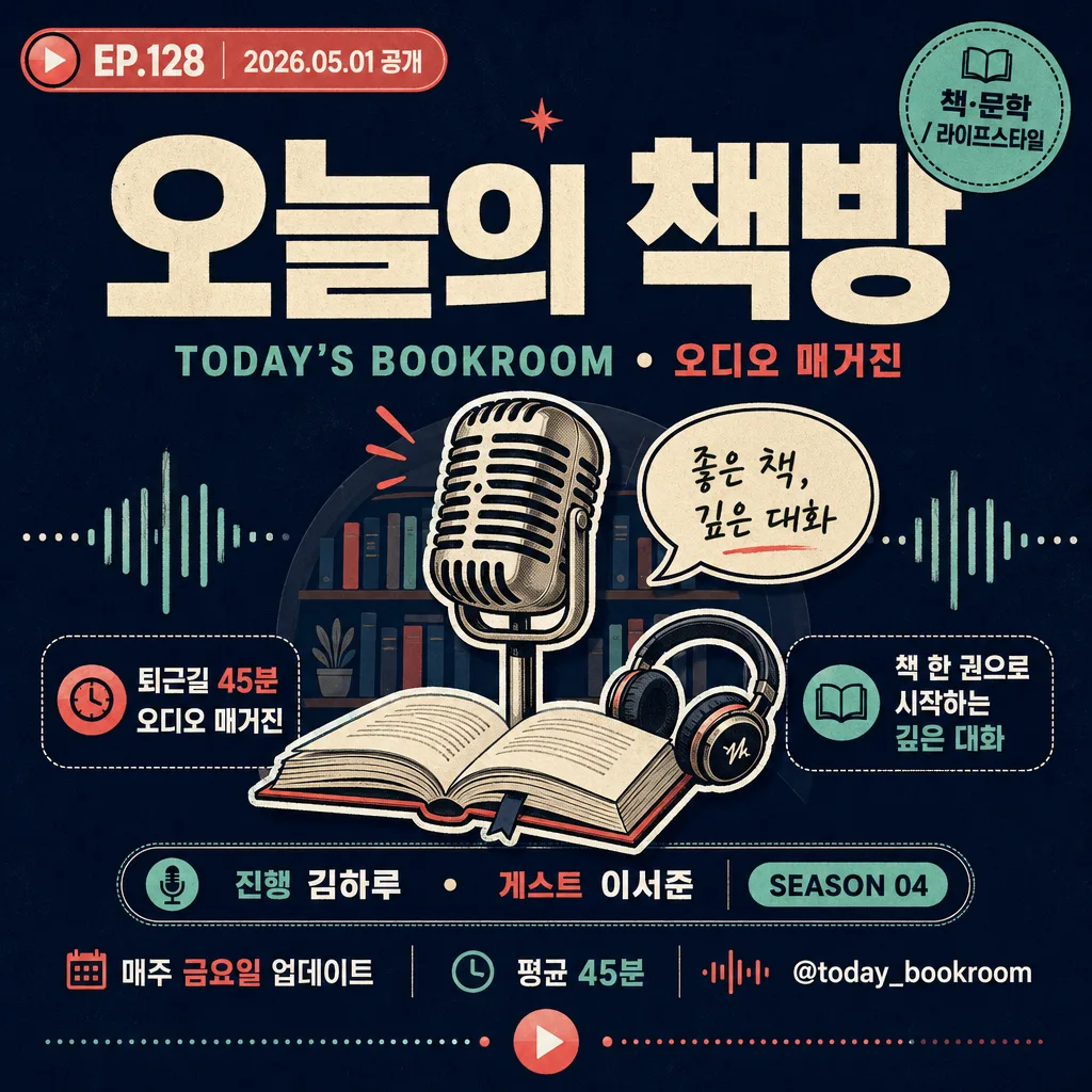
- Episode identity zone: Display {에피소드 번호} and {공개일} in a capsule, sticker, or small broadcast label near the top corner or directly under the title, like “EP.128 · 2026.05.01”.
- Illustration zone: Render {대표 일러·아이콘} as a bold central graphic with layered shapes, slight offset shadow, clean outlines, and podcast-relevant symbolism.
- Metadata zone: Set {호스트·게스트}, {시즌 정보}, and {청취 안내} in the lower third using compact rows, dividers, or pill-shaped labels.
- Teaser zone: Add {핵심 문구 1} and {핵심 문구 2} as short, punchy Korean cover lines; they should feel like real episode hooks rather than generic decoration.
- Category and handle zone: Place {주제 카테고리} and {채널 핸들} as micro-branding elements, styled like a streaming app tag, social handle, or corner label.
- Texture and detail: Add subtle paper grain, halftone dots, waveform strokes, tiny equalizer bars, or flat-vector texture that supports the podcast identity while keeping the title clear.
- Format control: Keep a strict square composition optimized for streaming app thumbnails, with all major text inside a balanced central reading area.

[4. STYLE RULES]
- Typography: Pretendard ExtraBold or Noto Sans KR Black for the main title, with Noto Sans KR Medium, Inter SemiBold, or a condensed sans for metadata. Title size should feel like 14–18% of canvas height; metadata and teaser text should remain readable at thumbnail scale.
- Color palette: Use the tone family from {컬러 팔레트}, anchored by one saturated dominant color and one or two accent colors for title blocks, capsules, waveform graphics, and icon outlines.
- Graphic detailing: Use layered flat-vector shapes, clean outlines, rounded capsules, broadcast stickers, audio waveform marks, play icons, and small divider rules to make the cover feel like a real published podcast asset.
- Border/shadow: A thin outline, offset drop shadow, or sticker-style edge is allowed for separation; keep shadows soft and controlled, around 2–4px offset, 10–15px blur, and 12–18% opacity.
- Text hierarchy: Main title first, episode title second, host and metadata third, category/handle fourth. Avoid letting decorative audio graphics compete with the title.

[5. VISUAL STYLE]
- Camera / lens: Clean flat graphic design, no camera realism; if any object styling is used, treat it like a studio poster mockup with a 50mm product-photo perspective and orthographic-like front presentation.
- Lighting: Even, controlled studio-style illumination with soft poster-like shading on icon layers and sticker elements.
- Color grade: Bold digital poster grade with vivid primary accents, strong contrast, sharp vector edges, and mobile-app readability.

[6. MOOD]
Modern Korean podcast brand identity — energetic, editorial, smart, and broadcast-ready, like a polished streaming cover mixed with a magazine masthead and audio-app UI details.

[7. CRITICAL]
- Korean text accuracy: 반드시 정확히 보여야 하는 문구: {채널 이름}, {영문 부제}, {호스트·게스트}, {주제 카테고리}, {에피소드 번호}, {공개일}, {에피소드 제목}, {핵심 문구 1}, {핵심 문구 2}, {채널 핸들}, {청취 안내}.
- 실제 표지에 들어갈 추천 텍스트 예시: “EP.128”, “2026.05.01 공개”, “이번 주의 질문”, “퇴근길 45분 오디오 매거진”, “매주 금요일 업데이트”.
- Layout invariants: 1:1 square cover, centered hierarchy, title as the visual anchor, sharp Korean typography, and podcast-related iconography that reads instantly.
- The design should look like a finished, upload-ready podcast cover, not a blank logo tile.

[8. 🚫 PROHIBITED]
- Fake official seals / certifications
- Broken Korean characters
- Unauthorized celebrity composites
- Illegible, warped, or randomly invented Korean text