社群/圖卡
팟캐스트 커버 디자인
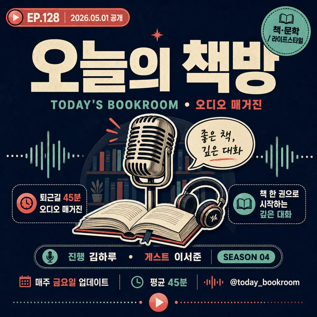
팟캐스트 커버 (Spotify·애플팟·유튜브 결). 16종 톤 응용.
팟캐스트 커버 디자인摘要
這是用來製作社群/圖卡內容的 ChatGPT 圖像提示詞,已整理主題、背景、風格與構圖,方便快速調整。
相關關鍵字: 팟캐스트 커버 디자인, 팟캐스트 커버 디자인 프롬프트, 社群/圖卡 프롬프트, 社群/圖卡 AI 이미지 프롬프트, ChatGPT 이미지 프롬프트, AI 이미지 생성 프롬프트, AI 프롬프트, 이미지 프롬프트
팟캐스트 커버 디자인使用方式
保留原始結構並替換主體、背景、色彩或構圖,即可延伸出不同版本。
- 保留核心主體,並依品牌、季節或平台調整色彩與背景。
- 如果畫面太複雜,請減少背景元素並具體描述主體、構圖與光線。
- 複製後可要求 ChatGPT 配合平台、長寬比或文字需求調整。
提示詞原文
[Input]
- language: Korean
- output_size: 1024x1024

[Purpose]
Podcast cover design for streaming platforms, square 1:1 format with bold editorial readability and thumbnail-level impact.
Create a recognizable show identity that feels like a real podcast program cover, with broadcast metadata, episode cues, and strong app-grid visibility.

[Composition]
- Compose a square 1024x1024 podcast cover for {채널 이름}, using a strong centered hierarchy and a polished editorial streaming-platform look.
- Place the main title block in the upper-middle 35–40% of the frame; set {영문 부제} as a compact secondary line directly below or beside the Korean title.
- Put {대표 일러·아이콘} in the central area as the visual hero: a microphone, headphones, speech bubble, waveform, bookshelf, host silhouette, or category-specific emblem with bold graphic presence.
- Anchor {호스트·게스트} and {청취 안내} in the lower third as real podcast metadata, with {에피소드 번호}, {공개일}, and {시즌 정보} displayed as small but legible broadcast labels.
- Add 2 short editorial teaser lines, {핵심 문구 1} and {핵심 문구 2}, as feature-style callouts around the central icon or lower title area.
- Include a small category badge for {주제 카테고리}, a channel handle {채널 핸들}, and subtle decorative audio elements such as waveform ticks, play-button marks, dotted rhythm lines, or caption stickers.
- Use {타이포} and {컬러 팔레트} as the primary brand system, with saturated contrast and clear typographic hierarchy.

[3. CORE STRUCTURE]
- Title zone: Render {채널 이름} as the dominant headline, large, centered, and instantly readable. If the name contains both Korean and English, keep Korean primary and {영문 부제} secondary.
- Episode identity zone: Display {에피소드 번호} and {공개일} in a capsule, sticker, or small broadcast label near the top corner or directly under the title, like “EP.128 · 2026.05.01”.
- Illustration zone: Render {대표 일러·아이콘} as a bold central graphic with layered shapes, slight offset shadow, clean outlines, and podcast-relevant symbolism.
- Metadata zone: Set {호스트·게스트}, {시즌 정보}, and {청취 안내} in the lower third using compact rows, dividers, or pill-shaped labels.
- Teaser zone: Add {핵심 문구 1} and {핵심 문구 2} as short, punchy Korean cover lines; they should feel like real episode hooks rather than generic decoration.
- Category and handle zone: Place {주제 카테고리} and {채널 핸들} as micro-branding elements, styled like a streaming app tag, social handle, or corner label.
- Texture and detail: Add subtle paper grain, halftone dots, waveform strokes, tiny equalizer bars, or flat-vector texture that supports the podcast identity while keeping the title clear.
- Format control: Keep a strict square composition optimized for streaming app thumbnails, with all major text inside a balanced central reading area.

[4. STYLE RULES]
- Typography: Pretendard ExtraBold or Noto Sans KR Black for the main title, with Noto Sans KR Medium, Inter SemiBold, or a condensed sans for metadata. Title size should feel like 14–18% of canvas height; metadata and teaser text should remain readable at thumbnail scale.
- Color palette: Use the tone family from {컬러 팔레트}, anchored by one saturated dominant color and one or two accent colors for title blocks, capsules, waveform graphics, and icon outlines.
- Graphic detailing: Use layered flat-vector shapes, clean outlines, rounded capsules, broadcast stickers, audio waveform marks, play icons, and small divider rules to make the cover feel like a real published podcast asset.
- Border/shadow: A thin outline, offset drop shadow, or sticker-style edge is allowed for separation; keep shadows soft and controlled, around 2–4px offset, 10–15px blur, and 12–18% opacity.
- Text hierarchy: Main title first, episode title second, host and metadata third, category/handle fourth. Avoid letting decorative audio graphics compete with the title.

[5. VISUAL STYLE]
- Camera / lens: Clean flat graphic design, no camera realism; if any object styling is used, treat it like a studio poster mockup with a 50mm product-photo perspective and orthographic-like front presentation.
- Lighting: Even, controlled studio-style illumination with soft poster-like shading on icon layers and sticker elements.
- Color grade: Bold digital poster grade with vivid primary accents, strong contrast, sharp vector edges, and mobile-app readability.

[6. MOOD]
Modern Korean podcast brand identity — energetic, editorial, smart, and broadcast-ready, like a polished streaming cover mixed with a magazine masthead and audio-app UI details.

[7. CRITICAL]
- Korean text accuracy: 반드시 정확히 보여야 하는 문구: {채널 이름}, {영문 부제}, {호스트·게스트}, {주제 카테고리}, {에피소드 번호}, {공개일}, {에피소드 제목}, {핵심 문구 1}, {핵심 문구 2}, {채널 핸들}, {청취 안내}.
- 실제 표지에 들어갈 추천 텍스트 예시: “EP.128”, “2026.05.01 공개”, “이번 주의 질문”, “퇴근길 45분 오디오 매거진”, “매주 금요일 업데이트”.
- Layout invariants: 1:1 square cover, centered hierarchy, title as the visual anchor, sharp Korean typography, and podcast-related iconography that reads instantly.
- The design should look like a finished, upload-ready podcast cover, not a blank logo tile.

[8. 🚫 PROHIBITED]
- Fake official seals / certifications
- Broken Korean characters
- Unauthorized celebrity composites
- Illegible, warped, or randomly invented Korean text