廣告/海報
수학 학습지 표지
수학 학습지 표지 (연산·도형·문장제). 어린이 결.
수학 학습지 표지摘要
這是用來製作廣告/海報內容的 ChatGPT 圖像提示詞,已整理主題、背景、風格與構圖,方便快速調整。
相關關鍵字: 수학 학습지 표지, 수학 학습지 표지 프롬프트, 廣告/海報 프롬프트, 廣告/海報 AI 이미지 프롬프트, ChatGPT 이미지 프롬프트, AI 이미지 생성 프롬프트, AI 프롬프트, 이미지 프롬프트
수학 학습지 표지使用方式
保留原始結構並替換主體、背景、色彩或構圖,即可延伸出不同版本。
- 保留核心主體,並依品牌、季節或平台調整色彩與背景。
- 如果畫面太複雜,請減少背景元素並具體描述主體、構圖與光線。
- 複製後可要求 ChatGPT 配合平台、長寬比或文字需求調整。
提示詞原文
[Input]
- language: Korean
- output_size: 1024x1536

[Purpose]
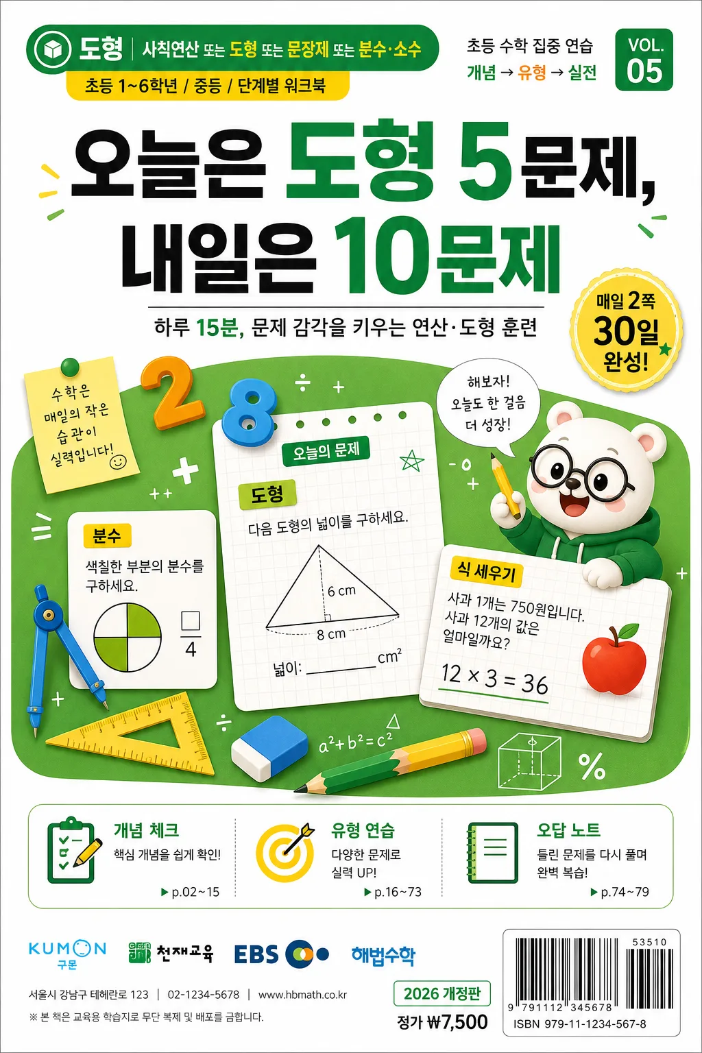
Korean math worksheet cover, vertical educational print cover for elementary and middle school learners.
Bright, approachable study-sheet design that clearly communicates worksheet type, level, headline, unit focus, and classroom-use details at a glance, like a real workbook sold in a Korean bookstore.

[Composition]
- Center the main headline in the upper third, with a lively workbook illustration block occupying the middle 45% and the publisher/series mark placed as a small footer detail.
- Use a crisp white paper base with bright green and yellow accent panels, plus realistic textbook-cover details such as level badges, unit tabs, small sample-problem cards, curriculum tags, and a barcode/price area.
- Keep the layout readable and well-structured with authentic Korean workbook spacing, allowing useful cover information to sit around the main illustration without feeling empty.
- Place {학습지 종류}, {레벨·대상}, {헤드라인}, {표지 일러}, {출판사·시리즈}, {컬러 팔레트}, {비율} as editable content zones that remain balanced even when the text length changes.

[3. CORE STRUCTURE]
- Top header zone (upper 18%): set {학습지 종류} as a compact category label inside a rounded green tab, followed by {레벨·대상} in a smaller yellow sublabel; add small Korean curriculum text such as "초등 수학 집중 연습", "개념 → 유형 → 실전", and "VOL.05" near the header like a real series cover.
- Main headline zone (upper-mid 20%): render {헤드라인} in bold Korean typography with strong visual weight, using a schoolbook-style hierarchy that feels like a genuine workbook cover; add a short supporting line in Korean such as "하루 15분, 문제 감각을 키우는 연산·도형 훈련".
- Illustration zone (mid 45%): place {표지 일러} as a bright educational illustration cluster with numbers, geometric shapes, graph paper tiles, pencils, ruler, compass, eraser, small sticky-note labels, and a friendly mascot-like character solving a problem; include visible sample cards with Korean math phrases such as "오늘의 문제", "도형", "분수", "식 세우기", and simple equations like "12×3=36".
- Study-info strip (lower-mid 12%): add three small feature blocks with short Korean labels, for example "개념 체크", "유형 연습", "오답 노트", each with a tiny icon and page-like marker; add a subtle progress sticker reading "30일 완성" or "매일 2쪽".
- Publisher/series zone (lower 10%): place {출판사·시리즈} as a realistic logo-like publisher/series mark near the bottom, accompanied by a small address/contact line, edition/date label such as "2026 개정판", price text such as "정가 ₩7,500", and a barcode/ISBN-style rectangle at the lower right.
- Color system: apply {컬러 팔레트} across title bands, icon accents, divider rules, tabs, badges, sticker shapes, and small separators so the cover stays lively, disciplined, and print-ready.
- Ratio/layout zone: maintain {비율} as a strict vertical B5-style workbook cover structure with centered educational publishing balance and realistic trim-safe page organization.

[4. STYLE RULES]
- Typography: use Pretendard or Noto Sans KR for the main headline in extra bold weight, with smaller medium-weight sans-serif text for labels, feature blocks, date labels, and sample-problem captions; all Korean text should look typeset, not handwritten unless it appears on a sticky note.
- Color palette: use bright green, yellow, white, and charcoal from {컬러 팔레트}, with white as the dominant paper color, green and yellow as energetic learning accents, and charcoal for readable text contrast.
- Cover details: include realistic workbook publishing elements such as unit numbering, tiny page references, curriculum icons, rounded labels, sticker badges, small ruled-paper textures, and a barcode block, while keeping the main headline visually dominant.
- Border/shadow: use subtle flat-panel separation, thin divider lines, soft paper-layer shadows under illustration cards and sticker shapes, about 4px y-offset, 10px blur, 12% opacity.

[5. VISUAL STYLE]
- Camera / lens: flat editorial layout rendered like a high-resolution product scan, 50mm equivalent top-down graphic framing with no perspective distortion.
- Lighting: even studio-style diffuse illumination across the full page, with gentle paper texture, clean print ink edges, soft layer shadows, and realistic matte workbook-cover finish.
- Color grade: fresh school-supply palette with crisp white paper, lime green, sunflower yellow, and deep charcoal accents, matching {컬러 팔레트} while preserving a bright Korean educational-publishing look.

[6. MOOD]
Cheerful Korean elementary and middle-school math workbook cover — practical, trustworthy, content-rich educational publishing design with a real textbook-store shelf presence.

[7. CRITICAL]
- Korean text accuracy: "오늘은 도형 5문제, 내일은 10문제", "한글 정확", "하루 15분", "개념 체크", "유형 연습", "오답 노트", "30일 완성", "정가 ₩7,500".
- The cover must feel like a genuine Korean math worksheet/book cover with clear hierarchy, centered balance, readable typography, curriculum-style labels, sample math content, and realistic publisher/barcode details.
- Keep all Korean text sharp, properly spelled, and fully legible with no broken Korean characters.

[8. 🚫 PROHIBITED]
- Fake official seals / certifications
- Broken Korean characters