Ads/Posters
푸드트럭·플리마켓 광고
푸드트럭·플리마켓 행사·매장 광고. 활기 결.
푸드트럭·플리마켓 광고 summary
Copy this ChatGPT image prompt to create Ads/Posters results. Its subject, background, style, and composition are organized for quick iteration.
Related keywords: 푸드트럭·플리마켓 광고, 푸드트럭·플리마켓 광고 프롬프트, Ads/Posters 프롬프트, Ads/Posters AI 이미지 프롬프트, ChatGPT 이미지 프롬프트, AI 이미지 생성 프롬프트, AI 프롬프트, 이미지 프롬프트
How to use 푸드트럭·플리마켓 광고
Keep the prompt structure and swap the subject, background, palette, or composition to create new variations.
- Keep the main subject and adjust the palette and background for your brand, season, or channel.
- If the result feels busy, simplify the background and make the subject, composition, and lighting more specific.
- After copying, ask ChatGPT to adapt it for your platform, aspect ratio, or text requirements.
Original prompt
[Input]
- language: Korean
- output_size: 1024x1536

[Purpose]
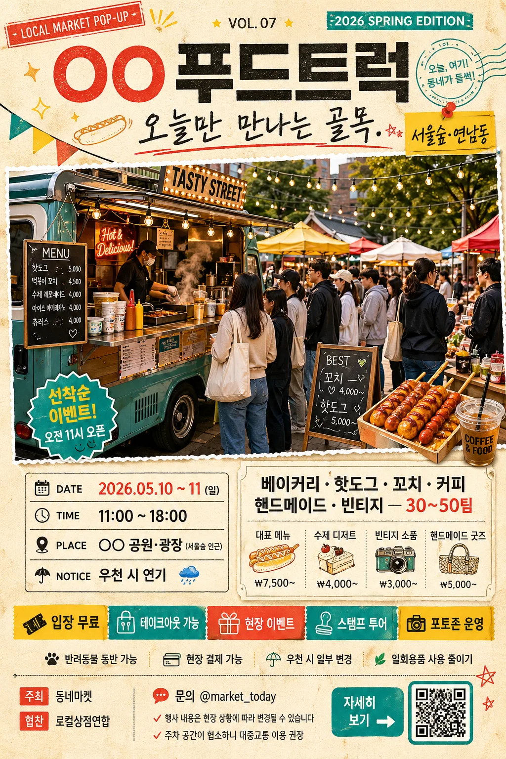
Korean food truck and flea market promotional poster, A4 vertical ad for social-media and print use.
A lively, information-rich neighborhood event flyer that combines a main hero scene, schedule block, participating vendors, event details, sponsor strip, ticket/entry info, and bold Korean headline hierarchy.

[Composition]
- Center the main event title at the upper 18% of the frame, with the hero image occupying the middle 42–48% and layered information blocks stacked through the lower third.
- Use {행사·트럭명} as the primary event identifier, with {헤드라인} directly below it in a handwritten supporting style.
- Place {hero 이미지} as the largest visual element, framed like a pasted poster cutout or printed photo card with lively market energy, visible food truck details, vendor tents, shoppers, menu boards, price tags, string lights, bunting, and clear depth separation.
- Keep {일정·장소} and {참여 가게·메뉴} in compact poster panels with strong spacing and separators, so the layout reads quickly at a glance.
- Add a realistic event-detail system around the main content: small labels such as “입장 무료”, “현장 결제 가능”, “반려동물 동반 가능”, “우천 시 일부 변경”, plus ticket/entry info and a small QR-style placeholder area labeled “자세히 보기”.
- Include a sponsor/support area near the footer with small Korean labels like “주최 동네마켓”, “협찬 로컬상점연합”, “문의 @market_today”, set as tiny but legible poster microcopy.
- Apply {컬러 팔레트} across headers, accents, dividers, stickers, ribbons, price-label shapes, and decorative graphic elements, while using a warm printed-paper base with subtle grain and ink texture.
- Follow {비율} as a tall vertical editorial-ad composition with energetic event-flyer density and tight, intentional margins.

[3. CORE STRUCTURE]
1. Header zone (top 18%): set {행사·트럭명} in a bold Korean display headline, then place {헤드라인} beneath it in a casual brush-script or hand-drawn subline; add a small issue/event label such as “LOCAL MARKET POP-UP”, “2026 SPRING EDITION”, or “VOL. 07” in tiny uppercase text near the title.
2. Hero zone (middle 45%): show {hero 이미지} as the central attention anchor, with a dynamic open-air market scene feel: food truck counter, steam from hot food, colorful canopy tents, shoppers holding paper cups, handmade goods tables, chalkboard signs, crates, picnic stools, and realistic street-fair depth; use crisp cutout edges and subtle shadowing so it sits clearly on the printed page.
3. Schedule zone (lower-middle left or centered strip): display {일정·장소} inside a compact rectangular label area with clear separators, using date/time/location/notice formatting that reads instantly; enrich it with small labels like “DATE”, “TIME”, “PLACE”, “NOTICE” and Korean microcopy such as “오전 11시 오픈”, “선착순 이벤트”.
4. Vendor/menu zone (lower-middle right or stacked panel): organize {참여 가게·메뉴} as short, punchy lines or dot-separated items; add small price-tag style examples like “대표 메뉴 ₩7,500~”, “수제 디저트”, “빈티지 소품”, “핸드메이드 굿즈” without replacing the required placeholder text.
5. Event details band: add a narrow ribbon or sticker row with concise Korean info: “입장 무료”, “테이크아웃 가능”, “현장 이벤트”, “스탬프 투어”, “포토존 운영”; include arrow icons, small stars, dots, ticket stubs, and stamp-like badges in {컬러 팔레트}.
6. Sponsor and contact footer: include a small sponsor strip, contact handle, QR-style square, and tiny legal/event notes such as “문의 @market_today”, “행사 내용은 현장 상황에 따라 변경될 수 있습니다”, “주차 공간이 협소하니 대중교통 이용 권장”.
7. Accent system: use stickers, dots, arrows, stamp-like shapes, torn-paper tabs, hand-drawn food doodles, mini map-pin icons, and decorative dividers in {컬러 팔레트} to amplify the flea-market energy while preserving the title-to-hero-to-info reading order.

[4. STYLE RULES]
- Typography: use Pretendard ExtraBold or Noto Sans KR Black for the main title at roughly 72–96px feel, with a hand-drawn brush font or Nanum Pen Script for the subtitle at roughly 28–40px feel; keep supporting text in Pretendard Medium, and use small condensed sans-serif for labels, sponsor names, and footer microcopy.
- Color palette: follow {컬러 팔레트} with vivid yellow, red, teal, and charcoal accents; background should feel like warm off-white printed stock with subtle paper fiber, ink speckle, faint halftone texture, and lightly imperfect screen-print edges.
- Border/shadow: add thin charcoal divider lines, sticker-like outlines, torn-paper borders, ticket-stub perforation details, washi-tape corners, and a soft drop shadow of about 4px y-offset, 12px blur, 15% opacity for the hero and panel blocks.
- Poster realism: make the flyer feel like a real local event advertisement photographed or rendered as a finished print design, with believable spacing, layered paper pieces, tiny registration marks, small icons, price tags, and lively but readable information density.

[5. VISUAL STYLE]
- Camera / lens: documentary event-poster feel with a 35mm lens look for the crowd-and-booth scene, slightly wide perspective, crisp foreground emphasis, and mild depth layering.
- Lighting: bright daylight outdoor market lighting, like late-morning open-air coverage with soft overhead diffusion and gentle directional contrast; keep highlights lively but not blown out.
- Color grade: lively street-festival grade with saturated yellow/red/teal accents, charcoal text, and slightly warm neutral skin/food tones.
- Print finish: tactile matte poster finish with slight risograph/screen-print influence, visible paper grain, mild ink misregistration on decorative accents, and realistic shadows under taped labels and cutout panels.

[6. MOOD]
Energetic local market flyer — feels like a well-designed neighborhood festival poster with the upbeat density of a modern street fair campaign, full of food smells, handmade goods, friendly crowds, colorful stalls, and practical event information.

[7. CRITICAL]
- Korean text accuracy: 반드시 정확히 표시되어야 하는 문구: {행사·트럭명}, {헤드라인}, {일정·장소}, {참여 가게·메뉴}
- Additional Korean poster text may include: “입장 무료”, “현장 결제 가능”, “스탬프 투어”, “포토존 운영”, “문의 @market_today”, “주최 동네마켓”, “협찬 로컬상점연합”, “자세히 보기”, “대표 메뉴 ₩7,500~”.
- Preserve a clear poster hierarchy: title first, hero second, information blocks third; do not distort the layout into a random collage.
- Keep all Korean text readable and properly aligned, with no broken Korean characters, garbled spacing, or illegible typography.

[8. 🚫 PROHIBITED]
- Fake official seals / certifications
- Broken Korean characters
- Celebrity composites / unauthorized likeness