광고/포스터
푸드트럭·플리마켓 광고
푸드트럭·플리마켓 행사·매장 광고. 활기 결.
푸드트럭·플리마켓 광고 검색 요약
푸드트럭·플리마켓 광고은 광고/포스터 결과물을 만들 때 바로 복사해 활용할 수 있는 ChatGPT 이미지 프롬프트입니다. 주제, 배경, 스타일, 구도 조건을 함께 담아 빠르게 시안을 만들 수 있도록 구성했습니다.
관련 키워드: 푸드트럭·플리마켓 광고, 푸드트럭·플리마켓 광고 프롬프트, 광고/포스터 프롬프트, 광고/포스터 AI 이미지 프롬프트, ChatGPT 이미지 프롬프트, AI 이미지 생성 프롬프트, AI 프롬프트, 이미지 프롬프트
푸드트럭·플리마켓 광고 활용 포인트
원본 구조를 유지하면서 피사체, 배경, 색감, 구도를 바꿔 다양한 시안으로 확장할 수 있습니다.
- 핵심 소재는 유지하고 브랜드, 계절, 채널 목적에 맞는 색감과 배경을 바꿔보세요.
- 결과가 산만하면 배경 요소를 줄이고 피사체, 구도, 조명 조건을 구체화하세요.
- 복사한 뒤 ChatGPT에서 플랫폼, 화면 비율, 텍스트 포함 여부를 추가로 요청할 수 있습니다.
프롬프트 원문
[Input]
- language: Korean
- output_size: 1024x1536

[Purpose]
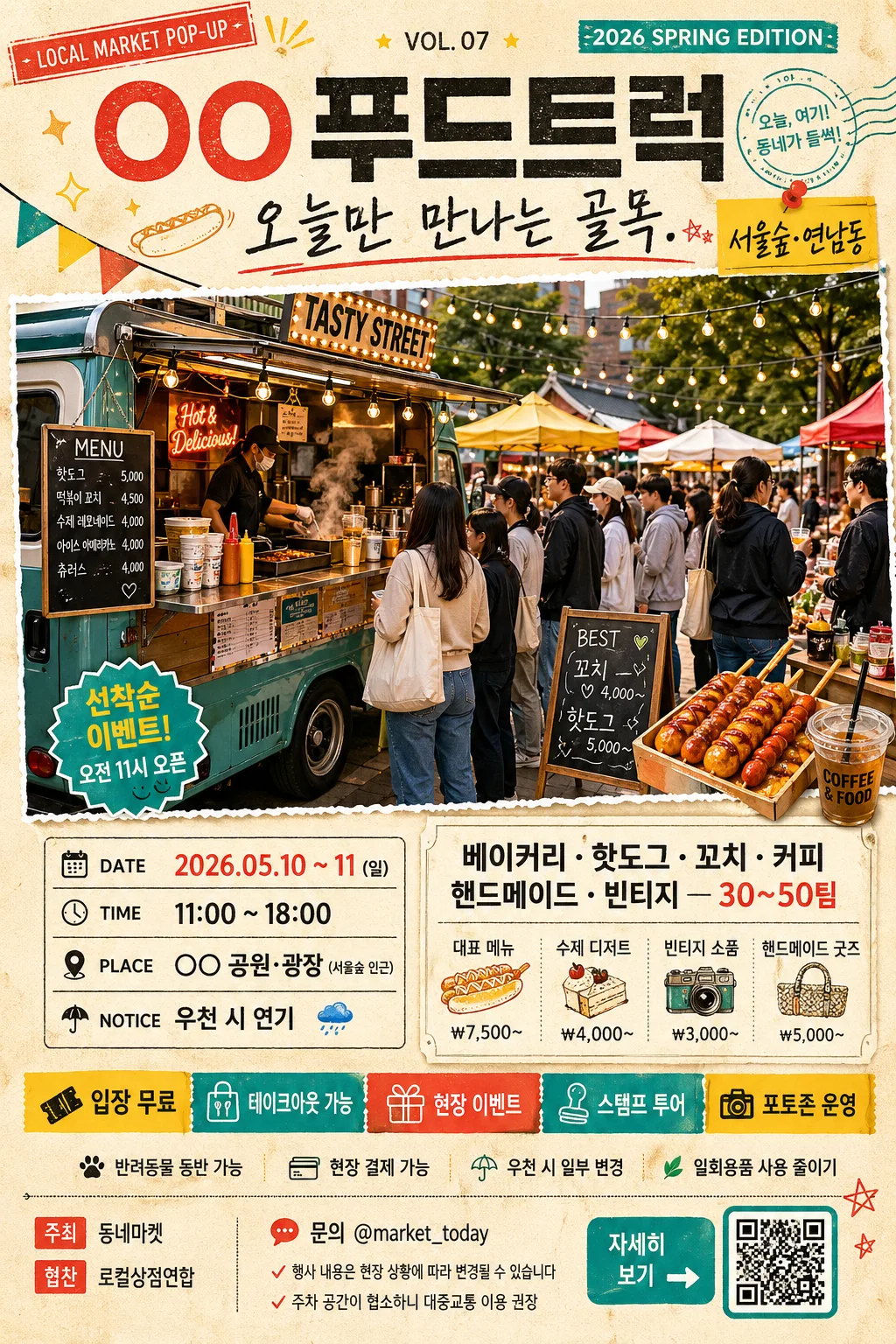
Korean food truck and flea market promotional poster, A4 vertical ad for social-media and print use.
A lively, information-rich neighborhood event flyer that combines a main hero scene, schedule block, participating vendors, event details, sponsor strip, ticket/entry info, and bold Korean headline hierarchy.

[Composition]
- Center the main event title at the upper 18% of the frame, with the hero image occupying the middle 42–48% and layered information blocks stacked through the lower third.
- Use {행사·트럭명} as the primary event identifier, with {헤드라인} directly below it in a handwritten supporting style.
- Place {hero 이미지} as the largest visual element, framed like a pasted poster cutout or printed photo card with lively market energy, visible food truck details, vendor tents, shoppers, menu boards, price tags, string lights, bunting, and clear depth separation.
- Keep {일정·장소} and {참여 가게·메뉴} in compact poster panels with strong spacing and separators, so the layout reads quickly at a glance.
- Add a realistic event-detail system around the main content: small labels such as “입장 무료”, “현장 결제 가능”, “반려동물 동반 가능”, “우천 시 일부 변경”, plus ticket/entry info and a small QR-style placeholder area labeled “자세히 보기”.
- Include a sponsor/support area near the footer with small Korean labels like “주최 동네마켓”, “협찬 로컬상점연합”, “문의 @market_today”, set as tiny but legible poster microcopy.
- Apply {컬러 팔레트} across headers, accents, dividers, stickers, ribbons, price-label shapes, and decorative graphic elements, while using a warm printed-paper base with subtle grain and ink texture.
- Follow {비율} as a tall vertical editorial-ad composition with energetic event-flyer density and tight, intentional margins.

[3. CORE STRUCTURE]
1. Header zone (top 18%): set {행사·트럭명} in a bold Korean display headline, then place {헤드라인} beneath it in a casual brush-script or hand-drawn subline; add a small issue/event label such as “LOCAL MARKET POP-UP”, “2026 SPRING EDITION”, or “VOL. 07” in tiny uppercase text near the title.
2. Hero zone (middle 45%): show {hero 이미지} as the central attention anchor, with a dynamic open-air market scene feel: food truck counter, steam from hot food, colorful canopy tents, shoppers holding paper cups, handmade goods tables, chalkboard signs, crates, picnic stools, and realistic street-fair depth; use crisp cutout edges and subtle shadowing so it sits clearly on the printed page.
3. Schedule zone (lower-middle left or centered strip): display {일정·장소} inside a compact rectangular label area with clear separators, using date/time/location/notice formatting that reads instantly; enrich it with small labels like “DATE”, “TIME”, “PLACE”, “NOTICE” and Korean microcopy such as “오전 11시 오픈”, “선착순 이벤트”.
4. Vendor/menu zone (lower-middle right or stacked panel): organize {참여 가게·메뉴} as short, punchy lines or dot-separated items; add small price-tag style examples like “대표 메뉴 ₩7,500~”, “수제 디저트”, “빈티지 소품”, “핸드메이드 굿즈” without replacing the required placeholder text.
5. Event details band: add a narrow ribbon or sticker row with concise Korean info: “입장 무료”, “테이크아웃 가능”, “현장 이벤트”, “스탬프 투어”, “포토존 운영”; include arrow icons, small stars, dots, ticket stubs, and stamp-like badges in {컬러 팔레트}.
6. Sponsor and contact footer: include a small sponsor strip, contact handle, QR-style square, and tiny legal/event notes such as “문의 @market_today”, “행사 내용은 현장 상황에 따라 변경될 수 있습니다”, “주차 공간이 협소하니 대중교통 이용 권장”.
7. Accent system: use stickers, dots, arrows, stamp-like shapes, torn-paper tabs, hand-drawn food doodles, mini map-pin icons, and decorative dividers in {컬러 팔레트} to amplify the flea-market energy while preserving the title-to-hero-to-info reading order.

[4. STYLE RULES]
- Typography: use Pretendard ExtraBold or Noto Sans KR Black for the main title at roughly 72–96px feel, with a hand-drawn brush font or Nanum Pen Script for the subtitle at roughly 28–40px feel; keep supporting text in Pretendard Medium, and use small condensed sans-serif for labels, sponsor names, and footer microcopy.
- Color palette: follow {컬러 팔레트} with vivid yellow, red, teal, and charcoal accents; background should feel like warm off-white printed stock with subtle paper fiber, ink speckle, faint halftone texture, and lightly imperfect screen-print edges.
- Border/shadow: add thin charcoal divider lines, sticker-like outlines, torn-paper borders, ticket-stub perforation details, washi-tape corners, and a soft drop shadow of about 4px y-offset, 12px blur, 15% opacity for the hero and panel blocks.
- Poster realism: make the flyer feel like a real local event advertisement photographed or rendered as a finished print design, with believable spacing, layered paper pieces, tiny registration marks, small icons, price tags, and lively but readable information density.

[5. VISUAL STYLE]
- Camera / lens: documentary event-poster feel with a 35mm lens look for the crowd-and-booth scene, slightly wide perspective, crisp foreground emphasis, and mild depth layering.
- Lighting: bright daylight outdoor market lighting, like late-morning open-air coverage with soft overhead diffusion and gentle directional contrast; keep highlights lively but not blown out.
- Color grade: lively street-festival grade with saturated yellow/red/teal accents, charcoal text, and slightly warm neutral skin/food tones.
- Print finish: tactile matte poster finish with slight risograph/screen-print influence, visible paper grain, mild ink misregistration on decorative accents, and realistic shadows under taped labels and cutout panels.

[6. MOOD]
Energetic local market flyer — feels like a well-designed neighborhood festival poster with the upbeat density of a modern street fair campaign, full of food smells, handmade goods, friendly crowds, colorful stalls, and practical event information.

[7. CRITICAL]
- Korean text accuracy: 반드시 정확히 표시되어야 하는 문구: {행사·트럭명}, {헤드라인}, {일정·장소}, {참여 가게·메뉴}
- Additional Korean poster text may include: “입장 무료”, “현장 결제 가능”, “스탬프 투어”, “포토존 운영”, “문의 @market_today”, “주최 동네마켓”, “협찬 로컬상점연합”, “자세히 보기”, “대표 메뉴 ₩7,500~”.
- Preserve a clear poster hierarchy: title first, hero second, information blocks third; do not distort the layout into a random collage.
- Keep all Korean text readable and properly aligned, with no broken Korean characters, garbled spacing, or illegible typography.

[8. 🚫 PROHIBITED]
- Fake official seals / certifications
- Broken Korean characters
- Celebrity composites / unauthorized likeness