Ads/Posters
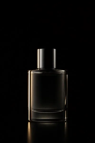
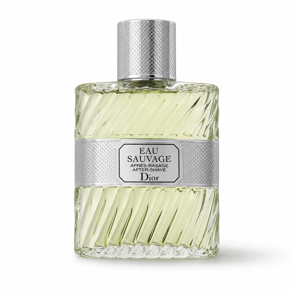
제품 흰 배경 자연 그림자 누끼
흰 배경 + 자연 그림자 떨어짐 — 평면 누끼보다 입체감.
제품 흰 배경 자연 그림자 누끼 summary
Copy this ChatGPT image prompt to create Ads/Posters results. Its subject, background, style, and composition are organized for quick iteration.
Related keywords: 제품 흰 배경 자연 그림자 누끼, 제품 흰 배경 자연 그림자 누끼 프롬프트, Ads/Posters 프롬프트, Ads/Posters AI 이미지 프롬프트, ChatGPT 이미지 프롬프트, AI 이미지 생성 프롬프트, AI 프롬프트, 이미지 프롬프트
How to use 제품 흰 배경 자연 그림자 누끼
Keep the prompt structure and swap the subject, background, palette, or composition to create new variations.
- Keep the main subject and adjust the palette and background for your brand, season, or channel.
- If the result feels busy, simplify the background and make the subject, composition, and lighting more specific.
- After copying, ask ChatGPT to adapt it for your platform, aspect ratio, or text requirements.
Original prompt
[Input]
- reference_image: {참고 이미지}
- language: Korean
- output_size: 1024x1024

[Purpose]
High-end e-commerce product cutout from a reference photo, with a pure white professional studio background and natural contact shadow. Realistic catalog-style re-photograph for marketplace, brand listing, detail-page hero image, and ad-ready product display, retaining the authentic material presence of the original item.

[Composition]
- {원본 제품} is the primary subject, occupying about 68–75% of the frame according to {비율}, centered and presented as a premium marketplace hero product.
- The product sits on a seamless white studio sweep using {배경}, with a visually pure #FFFFFF field and a very subtle floor-to-backdrop tonal transition that still reads as white.
- A realistic contact shadow sits directly under the product, slightly offset toward the lower-right, with believable ambient occlusion at the contact point and a soft fade into the white surface.
- Preserve the product silhouette, label placement, printed text, surface wear, material texture, transparency, gloss, edges, seams, caps, folds, embossing, and branding exactly as seen in the reference.
- The composition should feel like a real premium studio packshot: crisp cutout edges, grounded physical weight, accurate product scale, natural studio reflections on glossy or metallic areas, and refined commercial retouching.

[3. CORE STRUCTURE]
- Base layer: build a seamless white cyclorama-style background using {배경}, with the floor and backdrop visually merging into one clean commercial studio field while retaining subtle real-world light falloff.
- Subject layer: place {원본 제품} in the center, perfectly upright when appropriate to the object, with crisp edges, no cutout halos, accurate transparency handling, and preserved original material texture and branding.
- Shadow layer: apply {그림자 결} beneath the product only, with the darkest point closest to the contact edge, soft ambient occlusion under weight-bearing areas, and a smooth fade outward across the white surface.
- Lighting logic: shape the subject with {라이팅} so the product has dimensionality, realistic highlight gradients, readable surface texture, and faithful color without changing the design.
- Imaging treatment: emulate {카메라·렌즈} for a premium commercial product-photo look, keeping the subject tack-sharp, edges clean, and the white background evenly exposed.
- Final color handling: maintain {컬러 톤} so the original product color stays faithful, with controlled contrast, neutral whites, and no unwanted tint casts.

[4. STYLE RULES]
- Typography: do not create new graphic typography; any embedded product text on the original item must be preserved exactly without redesign.
- Color palette: pure white #FFFFFF, soft gray shadow #D9D9D9, near-black shadow core #6E6E6E, neutral highlight white #F7F7F7, with subtle real studio gray gradients only where shadow and form require them.
- Surface realism: add believable studio-floor interaction such as soft ambient occlusion, gentle reflection cues for glossy bases, and clean high-resolution edge detail that makes the product feel physically photographed.
- Border/shadow: use a subtle studio contact shadow with 0–8% edge softness, 15–20% opacity at the darkest point, and a smooth 24–40px blur falloff depending on product size.

[5. VISUAL STYLE]
- Camera / lens: Phase One XF IQ4 150MP with a 120mm f/4 product lens, straight-on catalog framing, high detail, minimal distortion.
- Lighting: large softbox from upper-left at roughly 45° plus gentle left-side fill, producing a soft, controlled studio shadow, dimensional highlights, and clean material separation.
- Color grade: clean neutral studio grade with accurate whites, restrained contrast, natural micro-contrast on the product surface, and preserved original colorimetry.
- Retouching finish: premium commercial retouching with realistic sharpness, refined shadow transitions, clean background exposure, and faithful retention of all product-specific marks and printed details.

[6. MOOD]
Premium studio product packshot — a luxury catalog re-photograph feel similar to high-end Apple Store e-commerce imagery and Aesop-style restraint, but with realistic physical grounding, tactile material detail, and polished marketplace-ready presence.

[7. CRITICAL]
- Korean text accuracy: preserve every Korean character exactly as it appears in {원본 제품}, including labels, logos, product names, warnings, ingredients, capacity marks, and printed details.
- Preserve the exact product shape, proportion, texture, color, branding, surface finish, and any printed text from the reference image.
- Replace only the background and shadow treatment; do not redesign, beautify, relabel, simplify, or invent any part of the product.
- Keep the result as a believable single-product e-commerce cutout with natural grounding, crisp edges, and faithful real-world material behavior.

[8. 🚫 PROHIBITED]
- Fake official seals / certifications
- Broken Korean characters