資訊圖表/指南
경제 기사 인포그래픽 헤더
주식·부동산·금리·물가 등 경제 데이터를 헤더 인포그래픽으로 시각화. 데이터·주제 입력하면 신뢰감 있는 차트 + 키 비주얼.
경제 기사 인포그래픽 헤더摘要
這是用來製作資訊圖表/指南內容的 ChatGPT 圖像提示詞,已整理主題、背景、風格與構圖,方便快速調整。
相關關鍵字: 경제 기사 인포그래픽 헤더, 경제 기사 인포그래픽 헤더 프롬프트, 資訊圖表/指南 프롬프트, 資訊圖表/指南 AI 이미지 프롬프트, ChatGPT 이미지 프롬프트, AI 이미지 생성 프롬프트, AI 프롬프트, 이미지 프롬프트
경제 기사 인포그래픽 헤더使用方式
保留原始結構並替換主體、背景、色彩或構圖,即可延伸出不同版本。
- 保留核心主體,並依品牌、季節或平台調整色彩與背景。
- 如果畫面太複雜,請減少背景元素並具體描述主體、構圖與光線。
- 複製後可要求 ChatGPT 配合平台、長寬比或文字需求調整。
提示詞原文
[Input]
- language: Korean
- output_size: 1536x1024

[Purpose]
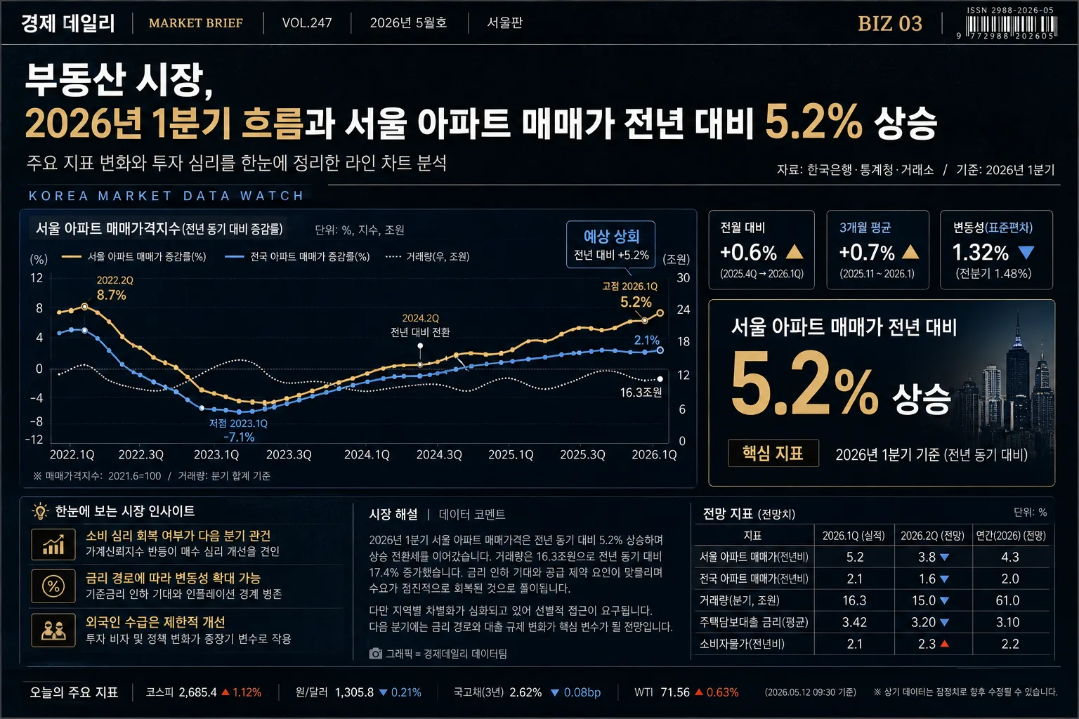
Korean economic news infographic header, realistic data-driven editorial chart layout for a newspaper, newsletter hero, or financial article lead image.
Designed to summarize {경제 분야} market movement with a headline, chart, big number, issue/date metadata, source line, compact article snippets, and publication-style micro details.

[Composition]
- Wide 16:9 composition with the top editorial header occupying about 18% of the frame, central chart area about 52%, and bottom insight/news brief block about 20%.
- Place a small publication masthead strip at the very top with Korean newspaper-style metadata such as “경제 데일리”, “VOL.247”, “2026년 5월호”, “서울판”, and page marker “BIZ 03”.
- Place the main headline at the upper-left, the English subheadline directly beneath it, and a source/date label aligned to the upper-right or just below the subheadline using {시간/기간}.
- Keep the chart as the visual anchor in the middle, with the large key figure layered near the chart’s right side or lower center for strong hierarchy.
- Use {경제 분야}, {핵심 데이터}, {시간/기간}, {차트 유형}, {디자인 팔레트}, {화면 비율} placeholders naturally in the headline, chart labels, annotation text, and footer notes.
- Background should feel like a premium financial editorial page: deep matte dark base, subtle grid texture, scanned-paper grain, soft data glow accents, thin dividers, tiny ticker labels, and realistic publication metadata.
- Maintain sharp editorial alignment with enough surrounding article texture, chart labels, captions, and microcopy so the image feels like a real Korean financial news graphic rather than a sterile template.

[3. CORE STRUCTURE]
1. Publication masthead strip (very top): Add small but legible Korean metadata such as “경제 데일리”, “MARKET BRIEF”, “VOL.247”, “2026년 5월호”, “서울판”, and “BIZ 03”; include a tiny barcode-like area or issue code on the far right.
2. Header zone (top 18%): Set a bold Korean headline referencing {경제 분야}, for example “{경제 분야}, {시간/기간} 흐름과 {핵심 데이터}”; add an English subheadline in smaller uppercase text underneath such as “KOREA MARKET DATA WATCH”; add a tiny source line reading “자료: 한국은행·통계청·거래소 / 기준: {시간/기간}”.
3. Title support line: Insert a concise one-line explanation of the trend directly below the headline, using a clean sans-serif and tighter tracking, such as “주요 지표 변화와 투자 심리를 한눈에 정리한 {차트 유형} 분석”.
4. Main chart zone (center 50%): Render the {차트 유형} as the primary data visualization, with crisp axes, date ticks, value labels, highlighted peak/trough markers, a small legend, and a subtle caption label “단위: %, 지수, 조원”. The chart should reflect {핵심 데이터} and connect visually to the headline.
5. Key number callout: Place a large numeric emphasis panel beside or partially overlapping the chart, showing the most important percentage or value from {핵심 데이터} in oversized type, with a short Korean descriptor below such as “전월 대비 변화”, “시장 반응”, or “핵심 지표”.
6. Secondary data cards: Add two or three compact mini-stat cards near the chart edge, each with short Korean labels like “전일 대비”, “3개월 평균”, “변동성”, “전망치”, and tiny arrow indicators in gold or blue.
7. Insight block (bottom 20%): Add two to three short supporting insight bullets or micro-statements, each no more than one line, summarizing market implications for {경제 분야}; include realistic Korean snippets such as “소비 심리 회복 여부가 다음 분기 관건”, “금리 경로에 따라 변동성 확대 가능”, “외국인 수급은 제한적 개선”.
8. Article texture and captions: Add a small right-side or lower-left column of short Korean article-style body text lines, not dominant, with a caption such as “시장 해설” or “데이터 코멘트”; include a tiny photo-caption-like label even if no photo is present, for example “그래픽=경제데일리 데이터팀”.
9. Data annotations: Include small tooltip-style notes, trend arrows, comparison tags, and marker labels near the chart lines/bars, such as “고점”, “저점”, “예상 상회”, “전년 동기 대비”, making them editorial rather than dashboard-like.
10. Footer microtext: Place a tiny disclaimer or source note at the very bottom edge in low-contrast text, such as “본 그래픽은 공개 자료와 자체 집계를 바탕으로 작성되었습니다. 투자 판단의 책임은 독자에게 있습니다.”

[4. STYLE RULES]
- Typography: Use Pretendard or Noto Sans KR for Korean body text, Pretendard ExtraBold or Noto Sans KR Bold for the headline, and Inter or Helvetica Neue for English subheads; headline around 42–56px, support text 18–24px, microtext 11–13px.
- Color palette: Follow {디자인 팔레트} with deep navy #0B1F3A, black #0A0A0A, gold #C8A24A, and blue accent #4A90E2; use off-white #F4F6FA for small text contrast when needed.
- Border/shadow: Use thin gold divider lines, soft 4px y-offset shadows with 12px blur at 15% opacity, faint inner glow around key numerals, and subtle chart panel depth to make the editorial graphic feel printed and layered.
- Layout discipline: sharp alignment, consistent gutters, professional newspaper hierarchy, readable chart labeling, and publication-grade spacing with realistic micro-elements such as issue code, page number, source note, legend, and ticker strip.
- Decorative graphic elements: Use fine gridlines, faint candlestick or sparkline fragments, small arrow badges, thin rule lines, and editorial section labels to enrich the financial-news atmosphere while keeping the data story dominant.

[5. VISUAL STYLE]
- Camera / lens: Clean vector editorial infographic style with subtle photoreal depth cues, as if composited in a Bloomberg / Financial Times style motion-graphics still; if textures appear, keep them as scanned-paper grain at 5–8% opacity rather than photographic distortion.
- Lighting: Simulated studio-grade top-left softbox look with gentle contrast falloff and a faint right-side rim glow to separate chart elements from the background.
- Color grade: Cool financial editorial grade with navy base, muted gold highlights, and restrained electric-blue accents; avoid saturated rainbow colors.

[6. MOOD]
Premium Korean financial newspaper infographic — Bloomberg terminal clarity mixed with Financial Times editorial restraint, with the density and authenticity of a real market briefing page.

[7. CRITICAL]
- Korean text accuracy: 반드시 정확히 표시되어야 하는 문구: "{경제 분야}", "{핵심 데이터}", "{시간/기간}", "{차트 유형}".
- Additional Korean text rendered in the image should be short and realistic, such as “경제 데일리”, “2026년 5월호”, “서울판”, “시장 해설”, “전월 대비 변화”, “자료: 한국은행·통계청·거래소”, “그래픽=경제데일리 데이터팀”.
- The chart, headline, numeric emphasis, mini-stat cards, and insight bullets must all be internally consistent with the same economic story.
- All Korean text must be cleanly rendered with no broken characters, no garbled spacing, and no mixed-up Hangul glyphs.
- Keep the big number visually dominant and readable within a split second.

[8. 🚫 PROHIBITED]
- Fake official seals / certifications
- Broken Korean characters