個人檔案/頭像
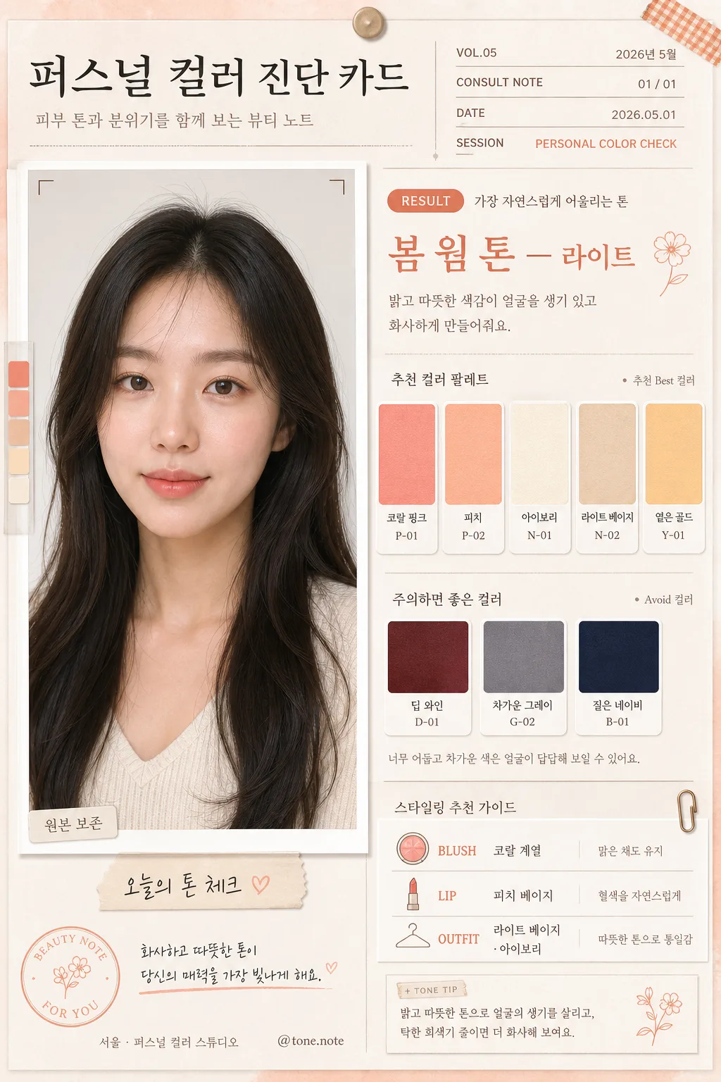
퍼스널 컬러 진단 카드
본인 사진 분석 → 퍼스널 컬러 진단 결과 카드. 4계절 톤 분류 + 어울리는 컬러 팔레트 + 메이크업·옷 추천.
퍼스널 컬러 진단 카드摘要
這是用來製作個人檔案/頭像內容的 ChatGPT 圖像提示詞,已整理主題、背景、風格與構圖,方便快速調整。
相關關鍵字: 퍼스널 컬러 진단 카드, 퍼스널 컬러 진단 카드 프롬프트, 個人檔案/頭像 프롬프트, 個人檔案/頭像 AI 이미지 프롬프트, ChatGPT 이미지 프롬프트, AI 이미지 생성 프롬프트, AI 프롬프트, 이미지 프롬프트
퍼스널 컬러 진단 카드使用方式
保留原始結構並替換主體、背景、色彩或構圖,即可延伸出不同版本。
- 保留核心主體,並依品牌、季節或平台調整色彩與背景。
- 如果畫面太複雜,請減少背景元素並具體描述主體、構圖與光線。
- 複製後可要求 ChatGPT 配合平台、長寬比或文字需求調整。
提示詞原文
[Input]
- reference_image: {참고 이미지}
- language: Korean
- output_size: 1024x1536

[Purpose]
Personal color diagnosis card for an attached portrait photo, designed like a premium Korean beauty consultation editorial page rather than a flat template.
Vertical mobile-friendly i2i layout with a preserved portrait, diagnostic result panel, realistic color swatch system, date/location labels, short Korean captions, and subtle beauty-studio stationery details for social sharing and consultation use.

[AUTO-DIAGNOSE — CRITICAL]
Before rendering, perform an internal personal-color analysis of the attached portrait:
1. Examine skin undertone (warm/yellow vs cool/pink), vein color hint, hair tone, eye color, and overall atmosphere.
2. Determine the best-fitting season among 봄 웜(라이트/브라이트), 여름 쿨(라이트/뮤트), 가을 웜(딥/뮤트), 겨울 쿨(딥/브라이트).
3. Use that diagnosis to FILL all [AUTO]-marked fields ({진단 결과}, {추천 컬러 팔레트}, {피해야 할 컬러}, {추천 메이크업·옷}, {컬러 톤}) — do NOT use the placeholder string literally.
4. Render the diagnosed season clearly on the card; the result MUST vary based on the actual photo (different photos → different seasons).

[Composition]
- Left side 48%: {원본 보존} portrait stays dominant and cleanly integrated, cropped from mid-chest upward, with natural skin texture preserved and no beauty-filter smoothing. Add a realistic printed-photo feel: slight paper thickness, soft cast shadow, tiny corner registration mark, and a small caption strip below the portrait reading "오늘의 톤 체크".
- Right side 52%: diagnostic information column with clear hierarchy; top header, consultation metadata, result line, palette swatches, avoid colors, makeup/clothing tips, and small social-card details stacked in an editorial rhythm.
- Overall framing: balanced beauty-magazine diagnostic grid adapted to 9:16, with tactile paper layers, small divider rules, tiny index numbers, and subtle label stickers that support the card without covering the face.
- Background surface: warm off-white paper texture (#F4F0E6) with visible matte grain, faint pressed-paper fibers, and a lightly tinted wash matching {컬러 톤}.
- Include realistic micro content: date label "2026.05.01", session tag "PERSONAL COLOR CHECK", small handle "@tone.note", page marker "01 / 01", and compact Korean captions near the swatches.
- Use {진단 결과}, {추천 컬러 팔레트}, {피해야 할 컬러}, {추천 메이크업·옷}, {레이아웃}, {컬러 톤} placeholders throughout the layout.

[3. CORE STRUCTURE]
1. Header zone (top 12%): bold title block reading "퍼스널 컬러 진단 카드" with a small subtitle "피부 톤과 분위기를 함께 보는 뷰티 노트". Add issue-style metadata such as "VOL.05", "2026년 5월", "CONSULT NOTE", aligned to the right panel.
2. Portrait zone (left 48%): {원본 보존} image placed as the primary visual anchor, with soft realistic shadow, printed-photo edge thickness, and a small lower-left label reading "원본 보존". Add subtle transparent color-check tabs beside the portrait, matching {컬러 톤}.
3. Diagnosis result zone (right upper 18%): {진단 결과} displayed as the main result line in larger type, with the most important term visually emphasized. Include a small badge-style label "RESULT" and a Korean helper line "가장 자연스럽게 어울리는 톤".
4. Color swatch zone (right middle 22%): {추천 컬러 팔레트} shown as 4–6 evenly spaced rectangular swatches with tiny Korean labels beneath each chip, all aligned in a neat grid. Add realistic swatch-card details: subtle paper texture on each chip, tiny color-code style text such as "P-01", "P-02", and a caption "추천 컬러 팔레트".
5. Avoid-color zone (right lower 12%): {피해야 할 컬러} presented as 2–3 muted swatches or text chips in a subdued tone, clearly separated from the recommended palette with a thin taupe divider and the label "주의하면 좋은 컬러".
6. Styling tip zone (bottom right 16%): {추천 메이크업·옷} arranged as short readable lines for blush, lip, and clothing suggestions. Use realistic consultation labels: "BLUSH", "LIP", "OUTFIT", with Korean guidance lines such as "맑은 채도 유지", "탁한 회색기 줄이기" where appropriate.
7. Layout anchor zone: {레이아웃} is interpreted as a structured split composition with portrait left and analysis content right, enhanced by small page indicators, a date/location label "서울 · 퍼스널 컬러 스튜디오", and decorative but practical note-card marks.
8. Tone treatment: {컬러 톤} subtly affects accent lines, swatch framing, title highlights, sticker tabs, and small dividers while keeping skin tone accuracy as the top priority.

[4. STYLE RULES]
- Typography: Pretendard and Noto Sans KR combination, title in Bold 700–800 at large size, result text in SemiBold 700, body in Medium 500, swatch labels in 12–14px small Korean text, metadata in condensed editorial-style uppercase.
- Color palette: off-white #F4F0E6, warm beige #D8C7AE, coral pink #F2A7A0, peach #F7C8A5, ivory #FFF8EE, pale gold #D9BE7A, soft taupe #A9967D, plus {컬러 톤} accents.
- Border/shadow: thin 1px divider rules in soft taupe, portrait shadow 4px y-offset, 12px blur, 15% opacity, layered paper shadows around labels and swatch cards, refined editorial separators rather than heavy framing.
- Decorative details: add small translucent sticker tabs, micro icons for save/share near the bottom, tiny dot grid notes, and a compact QR-like texture block used as a design motif, not as a scannable official code.

[5. VISUAL STYLE]
- Camera / lens: 85mm f/1.8 portrait look, shallow but controlled depth of field, skin and facial structure kept crisp enough for diagnosis readability.
- Lighting: soft window light from upper-left at about 45°, gentle fill from right, natural catchlights, realistic paper shadows, and truthful skin rendering.
- Color grade: clean beauty-editorial grade with warm cream, peach, and muted gold balancing natural complexion and palette visibility.
- Material realism: matte stationery paper, slightly raised swatch chips, soft adhesive label texture, and believable printed ink edges so the card feels like a photographed consultation sheet.

[6. MOOD]
Premium Korean beauty consultation editorial — like a refined studio color-analysis report mixed with a lifestyle magazine note card, warm, personal, polished, and shareable.

[7. CRITICAL]
- Korean text accuracy: 반드시 정확히 표시할 문자열 — "원본 보존", "진단 결과", "추천 컬러 팔레트", "피해야 할 컬러", "추천 메이크업·옷", "레이아웃", "컬러 톤".
- Additional Korean text should be cleanly legible and realistic: "퍼스널 컬러 진단 카드", "오늘의 톤 체크", "가장 자연스럽게 어울리는 톤", "주의하면 좋은 컬러", "서울 · 퍼스널 컬러 스튜디오", "2026년 5월".
- Keep the face anatomically correct, preserve original identity, and do not alter facial proportions, eyes, nose, or mouth shape.
- Recommended swatches must total 4–6 colors, avoid-color chips must total 2–3 colors, and all text must be cleanly legible in Korean.
- The card must look like a real photographed or carefully rendered beauty consultation sheet with portrait, swatches, metadata, captions, and tactile paper details.

[8. 🚫 PROHIBITED]
- Fake official seals / certifications
- Broken Korean characters