インフォグラフィック・案内
타임라인 인포그래픽 (역사·진행 단계)
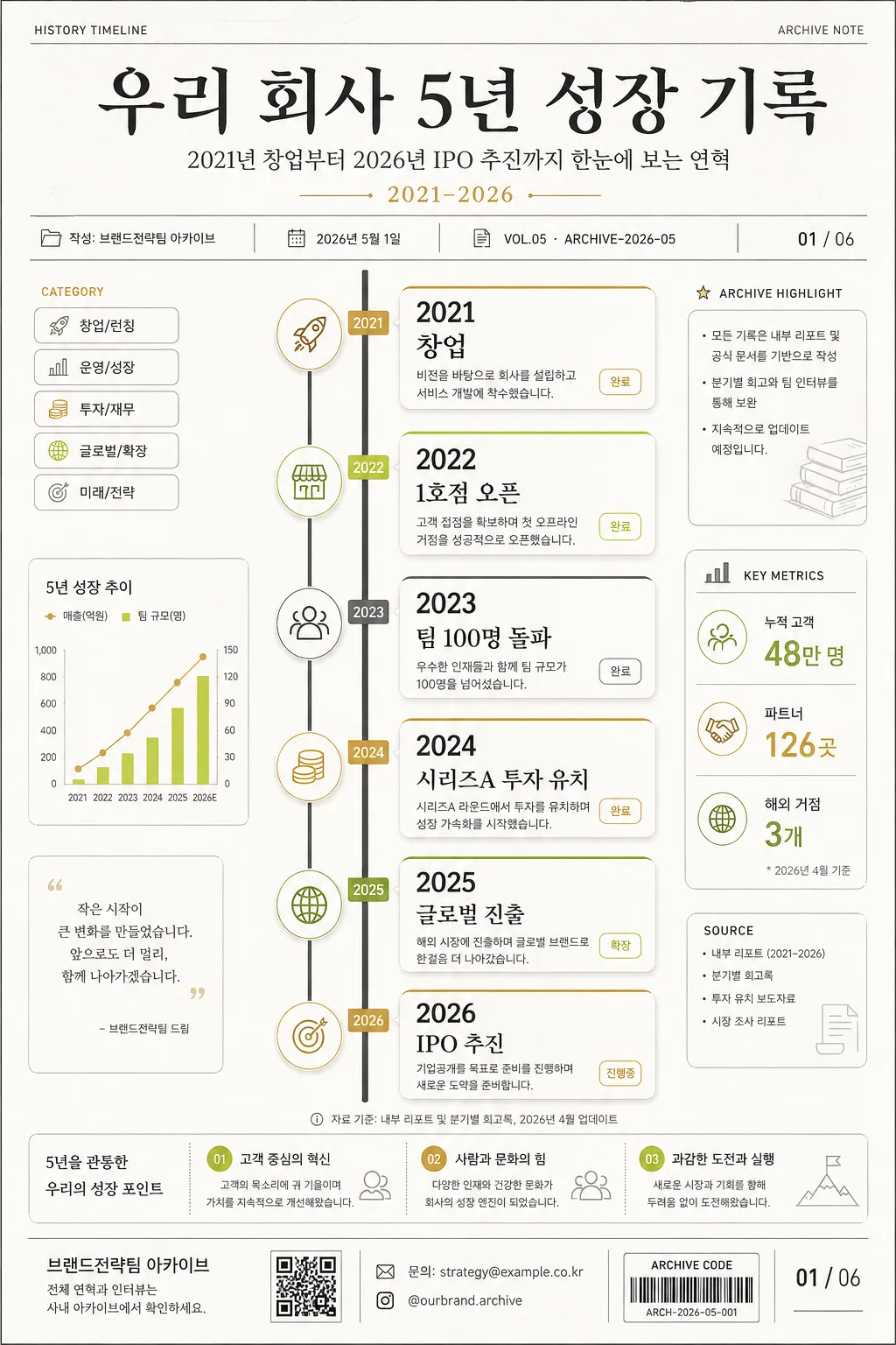
타임라인 인포 카드. 시간순 단계 시각화.
타임라인 인포그래픽 (역사·진행 단계)の概要
インフォグラフィック・案内画像を作るためのChatGPT画像プロンプトです。主題、背景、スタイル、構図を整理し、すぐに試せるよう構成しています。
関連キーワード: 타임라인 인포그래픽 (역사·진행 단계), 타임라인 인포그래픽 (역사·진행 단계) 프롬프트, インフォグラフィック・案内 프롬프트, インフォグラフィック・案内 AI 이미지 프롬프트, ChatGPT 이미지 프롬프트, AI 이미지 생성 프롬프트, AI 프롬프트, 이미지 프롬프트
타임라인 인포그래픽 (역사·진행 단계)の活用方法
元の構造を保ちながら、被写体、背景、色、構図を変更して別案に展開できます。
- 主題を維持し、ブランドや季節、媒体に合わせて色と背景を変更してください。
- 結果が複雑な場合は背景要素を減らし、被写体、構図、照明を具体化してください。
- コピー後、ChatGPTに媒体、アスペクト比、文字の有無を追加で指定できます。
プロンプト原文
[Input]
- language: Korean
- output_size: 1024x1536

[Purpose]
Historical/process timeline infographic for a company or personal project, designed as a vertical editorial poster and report-page hybrid with milestone cards, metadata, source notes, and presentation-ready Korean text.

[Composition]
- Main timeline runs vertically through the center 55% of the frame, with milestone nodes spaced evenly from top to bottom and connected by a continuous charcoal spine.
- Title area occupies the top 16% with strong hierarchy: use {주제} as the headline, {부제} as the subtitle, and {기간} as a compact date range label.
- Add a realistic publication metadata row near the title: {발행처}, {발행일}, {문서번호}, and {페이지표시} rendered like an annual report or archive poster.
- Use {주요 마일스톤} as the timeline content, {비주얼} as the structural layout cue, {컬러} as the palette direction, and {타이포} as the typography direction.
- Include small documentary details around the timeline: category chips, tiny source captions, a 3-item summary strip, miniature chart marks, and one QR-style information block labeled {문의정보}.
- Background should be white or very light warm gray with subtle paper grain, faint grid ticks, pale archival lines, and quiet editorial dividers that support the information hierarchy.

[3. CORE STRUCTURE]
- Title block (top 16%): Set {주제} in a large Korean serif headline, with {부제} beneath it and a small uppercase/numeric line showing {기간}, {발행일}, and {문서번호}.
- Header metadata: Add small labels such as “HISTORY TIMELINE”, “ARCHIVE NOTE”, “VOL.05”, and “작성: {발행처}” in neatly aligned type.
- Timeline spine (middle 55%): Draw a thin charcoal line with circular nodes; each node anchors one milestone from {주요 마일스톤}. Nodes may use accent rings, tiny year tabs, and small icon markers related to launch, growth, funding, expansion, and future plan.
- Milestone cards: Place small rounded rectangles beside each node, each card containing a year label, a short event phrase, a 1-line supporting note, and a small status tag such as “완료”, “확장”, “진행중”, or “예정”.
- Data strip: Add {통계요약} as a horizontal mini-dashboard with three compact numbers and captions, separated by fine vertical dividers.
- Context annotation: Include {섹션라벨} as a small side label and {출처문구} as a footnote-style caption near the lower timeline.
- Publisher/footer area (bottom 10%): Place {발행처}, {문의정보}, {하단CTA}, a page indicator {페이지표시}, and a thin editorial rule, with one small QR-style square and a barcode-like archive code.

[4. STYLE RULES]
- Typography: Use a Korean serif such as Noto Serif KR or Nanum Myeongjo for the title at 44–64 px, paired with Pretendard or Noto Sans KR for body text at 18–24 px; years can use a clean sans-serif with semi-bold weight.
- Color palette: Follow {컬러} with white #FFFFFF, charcoal #222222, warm gray #F4F1EA, and accent tones like gold #C8A96A or lime #B8D34A applied to nodes, year tabs, badges, and key statistic highlights.
- Cards and dividers: Cards use 1px light-gray borders, rounded 14–18 px corners, very soft shadows, small colored top bars, and subtle internal dividers for year, event, note, and status label.
- Information density: The poster should feel like a polished annual-report timeline, with readable Korean labels, realistic captions, and structured secondary details rather than empty poster space.
- Decorative graphics: Use restrained editorial ornaments such as dotted guide lines, tiny arrows, archival ticks, small pictogram badges, and a QR-style block, all aligned to the grid.

[5. VISUAL STYLE]
- Camera / lens: Graphic design poster look, flat editorial layout, as if photographed with a 50mm lens perspective but rendered as a clean print composition; no painterly distortion.
- Lighting: Even studio-like illumination with no harsh directionality, mimicking a catalog page or annual report spread.
- Color grade: Neutral premium base with restrained accent contrast, charcoal + warm white + selective gold/lime highlights.

[6. MOOD]
Corporate retrospective editorial — a premium annual-report timeline page with archive-document realism, calm confidence, and a polished Korean business presentation feel.

[7. CRITICAL]
- Korean text accuracy: 반드시 정확히 표시되어야 하는 문구: “{주제}”, “{부제}”, “{기간}”, “{주요 마일스톤}”, “{발행처}”, “{발행일}”, “{문서번호}”, “{통계요약}”, “{섹션라벨}”, “{출처문구}”, “{문의정보}”, “{하단CTA}”, “{페이지표시}”.
- Rendered Korean microcopy examples may include: “연혁 요약”, “핵심 지표”, “다음 단계”, “자료 기준일”, “내부 아카이브”, “문의: 전략기획팀”.
- Layout invariant: milestone nodes must remain evenly spaced along a single coherent vertical timeline, with all cards aligned to the same grid logic and no overlapping text.
- Year labels and short milestone phrases must be legible, correctly ordered from earliest to latest, and visually matched to the timeline sequence.
- The final image must read as a real 1024x1536 infographic poster/report page, not a blank template.

[8. 🚫 PROHIBITED]
- Fake official seals / certifications
- Broken Korean characters
- Illegible tiny text or garbled microcopy
- Celebrity composites or unauthorized likeness blending