資訊圖表/指南
타임라인 인포그래픽 (역사·진행 단계)
타임라인 인포 카드. 시간순 단계 시각화.
타임라인 인포그래픽 (역사·진행 단계)摘要
這是用來製作資訊圖表/指南內容的 ChatGPT 圖像提示詞,已整理主題、背景、風格與構圖,方便快速調整。
相關關鍵字: 타임라인 인포그래픽 (역사·진행 단계), 타임라인 인포그래픽 (역사·진행 단계) 프롬프트, 資訊圖表/指南 프롬프트, 資訊圖表/指南 AI 이미지 프롬프트, ChatGPT 이미지 프롬프트, AI 이미지 생성 프롬프트, AI 프롬프트, 이미지 프롬프트
타임라인 인포그래픽 (역사·진행 단계)使用方式
保留原始結構並替換主體、背景、色彩或構圖,即可延伸出不同版本。
- 保留核心主體,並依品牌、季節或平台調整色彩與背景。
- 如果畫面太複雜,請減少背景元素並具體描述主體、構圖與光線。
- 複製後可要求 ChatGPT 配合平台、長寬比或文字需求調整。
提示詞原文
[Input]
- language: Korean
- output_size: 1024x1536

[Purpose]
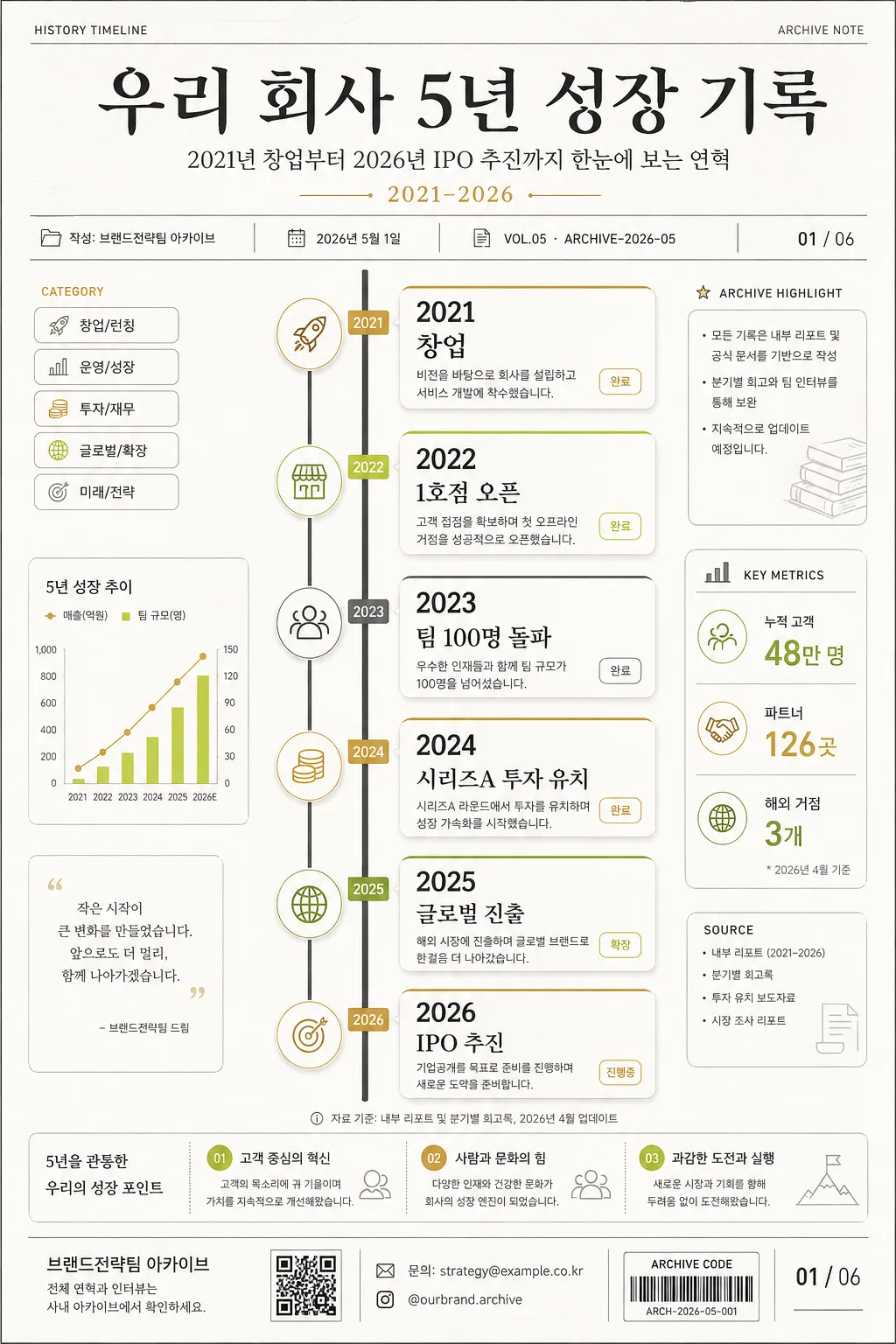
Historical/process timeline infographic for a company or personal project, designed as a vertical editorial poster and report-page hybrid with milestone cards, metadata, source notes, and presentation-ready Korean text.

[Composition]
- Main timeline runs vertically through the center 55% of the frame, with milestone nodes spaced evenly from top to bottom and connected by a continuous charcoal spine.
- Title area occupies the top 16% with strong hierarchy: use {주제} as the headline, {부제} as the subtitle, and {기간} as a compact date range label.
- Add a realistic publication metadata row near the title: {발행처}, {발행일}, {문서번호}, and {페이지표시} rendered like an annual report or archive poster.
- Use {주요 마일스톤} as the timeline content, {비주얼} as the structural layout cue, {컬러} as the palette direction, and {타이포} as the typography direction.
- Include small documentary details around the timeline: category chips, tiny source captions, a 3-item summary strip, miniature chart marks, and one QR-style information block labeled {문의정보}.
- Background should be white or very light warm gray with subtle paper grain, faint grid ticks, pale archival lines, and quiet editorial dividers that support the information hierarchy.

[3. CORE STRUCTURE]
- Title block (top 16%): Set {주제} in a large Korean serif headline, with {부제} beneath it and a small uppercase/numeric line showing {기간}, {발행일}, and {문서번호}.
- Header metadata: Add small labels such as “HISTORY TIMELINE”, “ARCHIVE NOTE”, “VOL.05”, and “작성: {발행처}” in neatly aligned type.
- Timeline spine (middle 55%): Draw a thin charcoal line with circular nodes; each node anchors one milestone from {주요 마일스톤}. Nodes may use accent rings, tiny year tabs, and small icon markers related to launch, growth, funding, expansion, and future plan.
- Milestone cards: Place small rounded rectangles beside each node, each card containing a year label, a short event phrase, a 1-line supporting note, and a small status tag such as “완료”, “확장”, “진행중”, or “예정”.
- Data strip: Add {통계요약} as a horizontal mini-dashboard with three compact numbers and captions, separated by fine vertical dividers.
- Context annotation: Include {섹션라벨} as a small side label and {출처문구} as a footnote-style caption near the lower timeline.
- Publisher/footer area (bottom 10%): Place {발행처}, {문의정보}, {하단CTA}, a page indicator {페이지표시}, and a thin editorial rule, with one small QR-style square and a barcode-like archive code.

[4. STYLE RULES]
- Typography: Use a Korean serif such as Noto Serif KR or Nanum Myeongjo for the title at 44–64 px, paired with Pretendard or Noto Sans KR for body text at 18–24 px; years can use a clean sans-serif with semi-bold weight.
- Color palette: Follow {컬러} with white #FFFFFF, charcoal #222222, warm gray #F4F1EA, and accent tones like gold #C8A96A or lime #B8D34A applied to nodes, year tabs, badges, and key statistic highlights.
- Cards and dividers: Cards use 1px light-gray borders, rounded 14–18 px corners, very soft shadows, small colored top bars, and subtle internal dividers for year, event, note, and status label.
- Information density: The poster should feel like a polished annual-report timeline, with readable Korean labels, realistic captions, and structured secondary details rather than empty poster space.
- Decorative graphics: Use restrained editorial ornaments such as dotted guide lines, tiny arrows, archival ticks, small pictogram badges, and a QR-style block, all aligned to the grid.

[5. VISUAL STYLE]
- Camera / lens: Graphic design poster look, flat editorial layout, as if photographed with a 50mm lens perspective but rendered as a clean print composition; no painterly distortion.
- Lighting: Even studio-like illumination with no harsh directionality, mimicking a catalog page or annual report spread.
- Color grade: Neutral premium base with restrained accent contrast, charcoal + warm white + selective gold/lime highlights.

[6. MOOD]
Corporate retrospective editorial — a premium annual-report timeline page with archive-document realism, calm confidence, and a polished Korean business presentation feel.

[7. CRITICAL]
- Korean text accuracy: 반드시 정확히 표시되어야 하는 문구: “{주제}”, “{부제}”, “{기간}”, “{주요 마일스톤}”, “{발행처}”, “{발행일}”, “{문서번호}”, “{통계요약}”, “{섹션라벨}”, “{출처문구}”, “{문의정보}”, “{하단CTA}”, “{페이지표시}”.
- Rendered Korean microcopy examples may include: “연혁 요약”, “핵심 지표”, “다음 단계”, “자료 기준일”, “내부 아카이브”, “문의: 전략기획팀”.
- Layout invariant: milestone nodes must remain evenly spaced along a single coherent vertical timeline, with all cards aligned to the same grid logic and no overlapping text.
- Year labels and short milestone phrases must be legible, correctly ordered from earliest to latest, and visually matched to the timeline sequence.
- The final image must read as a real 1024x1536 infographic poster/report page, not a blank template.

[8. 🚫 PROHIBITED]
- Fake official seals / certifications
- Broken Korean characters
- Illegible tiny text or garbled microcopy
- Celebrity composites or unauthorized likeness blending