Ads/Posters
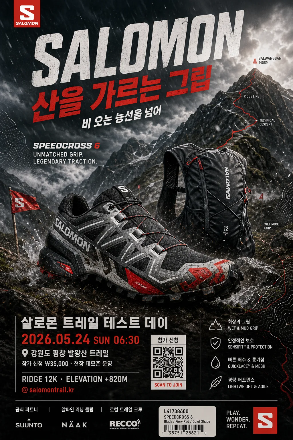
Salomon 트레일 러닝 광고
Salomon 톤 — 트레일 + 산악
Salomon 트레일 러닝 광고 summary
Copy this ChatGPT image prompt to create Ads/Posters results. Its subject, background, style, and composition are organized for quick iteration.
Related keywords: Salomon 트레일 러닝 광고, Salomon 트레일 러닝 광고 프롬프트, Ads/Posters 프롬프트, Ads/Posters AI 이미지 프롬프트, ChatGPT 이미지 프롬프트, AI 이미지 생성 프롬프트, AI 프롬프트, 이미지 프롬프트
How to use Salomon 트레일 러닝 광고
Keep the prompt structure and swap the subject, background, palette, or composition to create new variations.
- Keep the main subject and adjust the palette and background for your brand, season, or channel.
- If the result feels busy, simplify the background and make the subject, composition, and lighting more specific.
- After copying, ask ChatGPT to adapt it for your platform, aspect ratio, or text requirements.
Original prompt
[Input]
- language: Korean
- output_size: 1024x1536
- format: vertical outdoor performance advertising poster, 2:3 ratio aligned to {비율}

[Purpose]
Salomon trail running advertisement poster, high-energy outdoor sports editorial with premium brand-facing composition.
Vertical ad designed for social and display use, emphasizing rugged performance, speed, wet-rock grip, mountain-terrain credibility, and a realistic campaign-poster finish with event information and retail CTA.

[Composition]
- Hero product placement: {제품} dominates the lower-mid 60% of the frame, angled in dynamic 3/4 view so the outsole lugs, side profile, laces, mesh, and mud splatter read clearly.
- Background treatment: layered mountain terrain with dark rock textures, alpine grass, mist, gravel trail, trail-marker flags, contour-map graphic fragments, and cold sky gradients; keep the environment realistic and cinematic, not illustration-like.
- Framing direction: strong diagonal motion from lower-left to upper-right, with the headline integrated into the stormy sky and ridgeline, plus small event details and sponsor information stacked near the lower poster area.
- Use {브랜드 톤}, {시그니처 결}, {제품}, {무드 라이팅}, {컬러 팔레트}, {메인 카피}, {한글 부제}, {레이아웃 방향} as the content direction anchors.

[3. CORE STRUCTURE]
1. Background layer: build a deep alpine scene with jagged mountains, dark slate stone, wet trail dirt, patches of moss, low clouds, and a low horizon so the product feels larger-than-life.
2. Midground atmosphere: add dust, rain mist, gravel spray, wind streaks, water droplets, and faint trail particles around the product zone to suggest motion and terrain impact.
3. Hero product layer: place {제품} sharply lit and cut with crisp edges, with textured material detail visible on laces, mesh, outsole lugs, seams, buckles, pull tabs, or pack fabric.
4. Motion accent layer: add diagonal blur elements, terrain spray, torn-paper speed marks, red route-line overlays, and wind-swept light streaks while keeping the product itself tack sharp.
5. Typography block: position the large brand masthead “SALOMON” and {메인 카피} in the upper third with bold condensed outdoor-performance typography; place {한글 부제} just below as a compact Korean subtitle.
6. Poster information layer: include {캠페인명}, {행사일시}, {행사장소}, {참가정보}, {지형라벨}, {채널핸들}, and a small QR-style registration box as realistic campaign poster details.
7. Sponsor and retail strip: place {스폰서라인} near the bottom edge with fine dividers, tiny partner marks, a small product-code label, and a matte barcode/QR sticker texture to make the poster feel printed and real.
8. Layout system: follow {레이아웃 방향} by keeping the product anchored low and central while mountain forms, contour lines, route arrows, and feature copy frame it from both sides.
9. Brand tone application: apply {브랜드 톤} across all surfaces, color contrast, route graphics, and spacing so the poster feels like a genuine Salomon campaign rather than a generic sports ad.
10. Final polish: reinforce {시그니처 결} with aggressive terrain texture, crisp contrast, authentic outdoor-racing details, matte ink grain, and decisive mountain-speed energy.

[4. STYLE RULES]
- Typography: use bold condensed sans fonts such as DIN Condensed, Bebas Neue, or Pretendard ExtraBold for the English masthead; use Noto Sans KR Bold and Noto Sans KR Medium for Korean subtitle, event details, location labels, and CTA microcopy.
- Color palette: use Salomon red, deep charcoal, black graphite, cold moss green, slate gray, muddy brown, wet-stone blue, and muted alpine white from {컬러 팔레트}; prioritize high contrast with red as the hero accent.
- Poster graphics: add contour-map linework, small route arrows, distance markers, checkpoint icons, rain-speck texture, torn diagonal panels, thin data labels, and a sponsor/info strip while maintaining premium sports-ad clarity.
- Product realism: show believable mud on outsole edges, moisture on mesh, scuffs on rubber toe cap, tiny stones near the sole, and natural shadow contact on the trail surface.
- Print finish: matte poster surface, slightly gritty paper texture, clean ink density, controlled highlights, and subtle halftone grain in dark mountain areas.

[5. VISUAL STYLE]
- Camera / lens: use a 70-200mm sports lens look at around 120mm, f/4, for compressed mountain perspective and crisp product separation.
- Lighting: dramatic overcast alpine light with a strong directional rim from upper-right, plus a cool fill from the front-left; add low-lying fog diffusion for depth.
- Color grade: cinematic slate-and-forest grading with controlled Salomon red saturation, deep blacks, wet-rock highlights, and cool green shadows.
- Render quality: high-resolution commercial product photography, realistic material response, tactile print-poster texture, sharp typography, and clean vertical 1024x1536 poster framing.

[6. MOOD]
Premium trail-running campaign editorial — feels like an Arc’teryx x Salomon outdoor launch poster with the intensity of a high-end sports magazine spread, plus the practical realism of a mountain race event poster pinned at an outdoor specialty shop.

[7. CRITICAL]
- Korean text accuracy: when default text is used, render these strings cleanly and exactly: “산을 가르는 그립”, “비 오는 능선을 넘어”, “살로몬 트레일 테스트 데이”, “2026.05.24 SUN 06:30”, “강원도 평창 발왕산 트레일”, “참가 신청 ₩35,000 · 현장 데모존 운영”, “공식 파트너 · 알파인 러닝 클럽 · 로컬 트레일 크루”, “@salomontrail.kr”, “RIDGE 12K · ELEVATION +820M”.
- English text accuracy: “SALOMON” must appear cleanly and correctly in the main copy block; small product-code text may read “S/LAB TRAIL SYSTEM”.
- Keep the product anatomy and outdoor gear proportions realistic; no warped shoe geometry, no distorted buckles, no random extra straps.
- Preserve the exact framing logic: hero product low in frame, mountain environment surrounding it, strong headline above, event/sponsor strip integrated near the bottom.

[8. 🚫 PROHIBITED]
- Fake official seals / certifications
- Broken Korean characters
- Celebrity composites or recognizable public figures
- Melted, warped, or overly smooth AI product surfaces