広告・ポスター
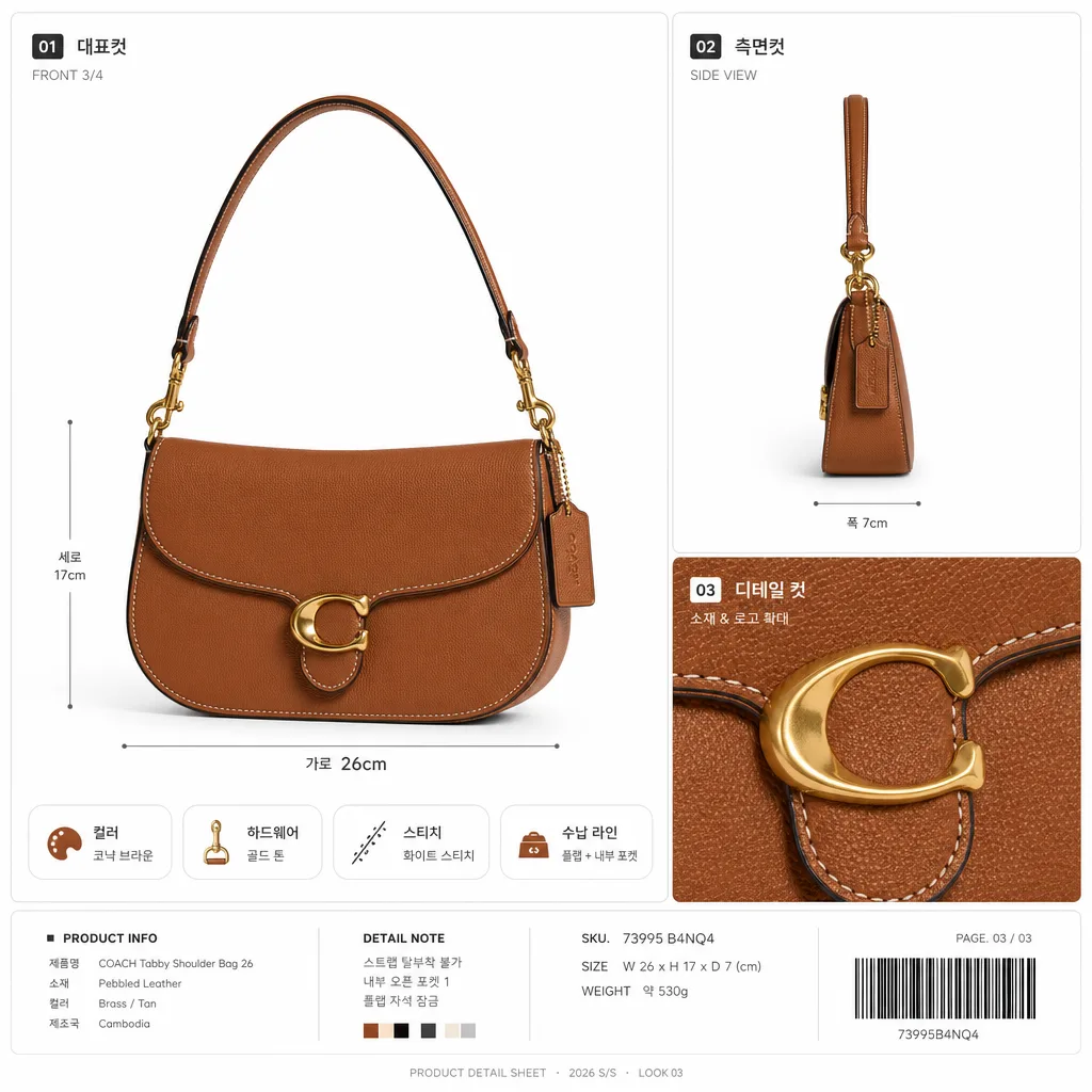
가방·신발 다각도 디테일 누끼
가방·신발 다각도 + 매크로 (스티치·로고).
가방·신발 다각도 디테일 누끼の概要
広告・ポスター画像を作るためのChatGPT画像プロンプトです。主題、背景、スタイル、構図を整理し、すぐに試せるよう構成しています。
関連キーワード: 가방·신발 다각도 디테일 누끼, 가방·신발 다각도 디테일 누끼 프롬프트, 広告・ポスター 프롬프트, 広告・ポスター AI 이미지 프롬프트, ChatGPT 이미지 프롬프트, AI 이미지 생성 프롬프트, AI 프롬프트, 이미지 프롬프트
가방·신발 다각도 디테일 누끼の活用方法
元の構造を保ちながら、被写体、背景、色、構図を変更して別案に展開できます。
- 主題を維持し、ブランドや季節、媒体に合わせて色と背景を変更してください。
- 結果が複雑な場合は背景要素を減らし、被写体、構図、照明を具体化してください。
- コピー後、ChatGPTに媒体、アスペクト比、文字の有無を追加で指定できます。
プロンプト原文
[Input]
- reference_image: {원본 제품}
- language: Korean
- output_size: 1024x1024

[Purpose]
1-2 English lines: high-end e-commerce product cutout sheet for bags or shoes, multi-angle detail presentation, square format.
Designed for marketplace detail pages, catalog thumbnails, premium product listing visuals, with realistic retail-spec annotations and close-up material storytelling.

[Composition]
- Main subject: {원본 제품} must remain the exact photographed product, with no redesign; place it as the hero object across a 2-cut or 3-cut multi-panel layout depending on {레이아웃}.
- Panel arrangement: build a polished square catalog board with one larger hero view and supporting side/detail views; use refined panel dividers, small Korean angle labels, measurement-style guide marks, and subtle product information chips that feel like a premium shopping detail page.
- Background treatment: use {배경} as the base, primarily clean white / warm off-white studio paper with subtle paper grain, faint gray dividers, realistic contact shadows, and crisp product edges while preserving the product’s real material sheen.
- Category adaptation: match {카테고리} presentation logic by emphasizing shape, stitching, logo placement, sole structure, handle curves, leather grain, canvas weave, outsole texture, strap attachment, zipper pull, buckle hardware, or edge finishing as appropriate.
- Add a small catalog footer area with realistic micro text such as SKU-like code, size/angle notes, and a barcode-style block; keep it secondary so the product remains dominant.

[3. CORE STRUCTURE]
- Panel 1 (primary hero, about 45-50% visual weight): show {원본 제품} in a clean front or 3/4 angle with full silhouette visibility; keep proportions exact and place a short Korean label nearby such as “대표컷”, “FRONT 3/4”, or “메인 실루엣”.
- Panel 2 (supporting side view): show the same {원본 제품} from the most informative lateral angle, revealing profile thickness, strap fall, sole height, handle depth, or side seam construction; add small callout text such as “측면 라인”, “굽 높이”, “스트랩 구조”, or “사이드 쉐입”.
- Panel 3 (macro detail, when used): zoom into the most brand-relevant material detail such as stitching, logo embossing, buckle hardware, zipper pull, canvas weave, outsole texture, leather grain, or edge coating; make it physically faithful, sharp, and labeled “디테일 컷” or “소재 확대”.
- Edge handling: use precise masking around contours, with natural anti-aliased cutout edges, no halo, no background spill, and no artificial blur bleeding into the object boundary.
- Shadow logic: add a soft realistic contact shadow directly beneath the object in each panel, matching the object’s mass and direction of light under {라이팅}; shadows may vary subtly between hero, side, and macro panels for realism.
- Retail metadata: include 2-4 tiny Korean information chips that fit the product type, for example “컬러 확인”, “하드웨어”, “스티치”, “아웃솔”, “수납 라인”, “착화 각도”; include a small bottom caption line like “PRODUCT DETAIL SHEET · 2026 S/S · LOOK 03” without implying certification.

[4. STYLE RULES]
- Typography: use Pretendard SemiBold / Medium for Korean labels, 18-28px for panel titles and 9-13px for micro metadata; dark charcoal #222222, medium gray #777777, and light gray #BDBDBD are preferred.
- Color palette: white #FFFFFF, soft gray #E9E9E9, charcoal #222222, warm paper white #FAFAF7, and the product’s original colors preserved exactly; no color shift away from the source.
- Border/shadow: refined 1px hairline gray dividers #EAEAEA, subtle rounded panel corners if appropriate, soft product shadow with 4px y-offset, 12px blur, 12-15% opacity, plus very faint UI-card shadow for realistic catalog layering.
- Graphic details: allow tasteful measurement ticks, tiny arrows, zoom brackets, barcode-like SKU block, page code, and Korean angle captions; these must support the product-detail purpose and not cover important product features.
- Layout density: make the sheet feel like a real premium online-store detail image, with enough information to look useful and editorial, while keeping the product visually dominant.

[5. VISUAL STYLE]
- Camera / lens: Hasselblad X2D 100C with 120mm Macro at f/8 for detail fidelity; maintain accurate perspective and crisp surface rendering. If {카메라} provides a specific product-photo direction, follow it while retaining the Hasselblad macro commercial clarity.
- Lighting: studio side light from the left at about 45° with controlled fill from the right; preserve natural sheen on leather or synthetic surfaces and make stitching shadows legible. Adapt intensity to {라이팅} while keeping realistic highlights.
- Color grade: neutral commercial product grade with clean whites, true-to-source material color, slightly elevated contrast for edge definition, and believable surface texture in macro panels.
- Rendering quality: high-resolution e-commerce retouching, sharp material detail, realistic shadow falloff, clean mask edges, accurate logo/text reproduction from the source product, and square composition matching {비율}.

[6. MOOD]
Premium fashion e-commerce catalog — Net-a-Porter / SSENSE product-detail aesthetic with richer Korean retail annotation, refined studio realism, and editorial-grade product clarity.

[7. CRITICAL]
- Korean text accuracy: any rendered Korean labels must be short, clean, and legible. Suggested text: “대표컷”, “측면 라인”, “디테일 컷”, “소재 확대”, “컬러 확인”, “스트랩 구조”, “굽 높이”, “수납 라인”, “제품 디테일”, “2026 S/S”.
- Preserve the EXACT product from {원본 제품}: keep precise shape, proportion, texture, color, label, logo, branding, and any printed text unchanged.
- The layout must stay a multi-angle product presentation for {카테고리}; do not change the object into a different product, do not alter its construction, and do not beautify beyond realistic studio cleanup.
- Panel consistency: all views must clearly depict the same single product instance, with no mismatched parts or inconsistent materials across cuts.
- Added catalog graphics, labels, barcode-like marks, and callouts must be clearly secondary and must never obscure defining product details, logos, stitching, hardware, soles, handles, or material texture.

[8. 🚫 PROHIBITED]
- Fake official seals / certifications
- Broken Korean characters